Comprehensive Analysis of Airline Passenger Satisfaction in python
In today’s ever-connected world, air travel serves as a vital conduit, linking people and places across the globe. Delving into the realm of airline passenger satisfaction, our analysis unearths the intricate threads that shape travelers’ experiences in the skies. By dissecting data encompassing diverse parameters such as customer type, travel preferences, and class, we uncover insights that offer airlines a compass to enhance their services. Embark on this journey with us to decode the nuances of passenger contentment and pave the way for elevated travel experiences.
Table of Contents
ToggleDataSet Link
Sure, here’s a concise summary of the dataset in bullet points:
Dataset Overview:
- Contains 129,880 entries, offering a substantial dataset for analysis.
- Encompasses 24 columns, each providing distinct insights into passenger experiences.
Demographic Details: - Captures key demographics such as gender, age, and customer type.
Provides a foundation for understanding the passenger profile.
Travel Specifics:
- Includes variables like flight distance and departure delays.
- Offers insight into the logistical aspects of the journey.
- Flight Experience Categories:
Delves into various aspects of the flight experience:
- Ease of online booking, check-in service, online boarding, gate location.
- On-board service, seat comfort, leg room service, cleanliness.
- Food and drink, in-flight service, in-flight WiFi, in-flight entertainment.
- Baggage handling.
Explores passenger perceptions of different service aspects.
Satisfaction Measurement:
- Evaluates passenger satisfaction through the “Satisfaction” column.
- Gauges passenger contentment based on provided services.
Comprehensive Insights:
- The dataset covers a wide range of factors influencing the flying experience.
Enables detailed analysis of both positive and negative aspects of air travel.
Potential Analysis:
- Allows for in-depth exploration of correlations between variables.
Offers an opportunity to understand factors contributing to passenger satisfaction.
Key Takeaways:
- A rich dataset offering a comprehensive view of airline passenger experiences.
- Provides a platform to unravel the dynamics of passenger satisfaction across diverse dimensions.
- This dataset promises a deep dive into the realm of airline satisfaction, presenting a unique opportunity to glean actionable insights for enhancing the passenger journey.
Import Libraries in Jupyter Notebook
import pandas as pd
import numpy as np
import matplotlib.pyplot as plt
import seaborn as sns
- pandas (imported as pd): Pandas is a powerful library for data manipulation and analysis. It provides data structures like DataFrames and Series that allow you to work with structured data efficiently.
- numpy (imported as np): NumPy is a library for numerical computations in Python. It provides support for large, multi-dimensional arrays and matrices, along with mathematical functions to operate on these arrays.
- matplotlib.pyplot (imported as plt): Matplotlib is a widely used library for creating static, interactive, and animated visualizations in Python. The pyplot module within Matplotlib provides a MATLAB-like interface for generating plots and charts.
- seaborn (imported as sns): Seaborn is built on top of Matplotlib and provides a higher-level interface for creating informative and attractive statistical graphics. It simplifies the process of creating complex visualizations and comes with several built-in themes and color palettes.
Exploring the seaborn Library:
Seaborn is particularly useful for statistical data visualization. It provides a variety of functions to create visually appealing plots with less code compared to using Matplotlib directly. Seaborn’s features include:
- High-Level Functions: Seaborn offers functions to create common types of statistical plots such as scatter plots, bar plots, histograms, box plots, etc. These functions often take a DataFrame or Series as input and handle much of the underlying plotting logic automatically.
- Enhanced Aesthetics: Seaborn provides a set of built-in themes and color palettes that make your plots more visually appealing by default. This reduces the need for manual customization.
- Statistical Estimations: Many Seaborn plots include options for adding statistical estimations to the visualization, such as regression lines on scatter plots or confidence intervals on bar plots.
- Categorical Plotting: Seaborn simplifies working with categorical data by providing functions for creating plots that summarize and compare data within different categories.
- Overall, Seaborn complements Matplotlib by simplifying the process of creating complex visualizations, making it a popular choice for data analysts and scientists.
Please note that while the code snippet imports the libraries, it doesn’t include any actual code for data manipulation or visualization. You would typically write additional code to load data using Pandas, perform data analysis or transformations using both Pandas and NumPy, and then use Seaborn (and Matplotlib) to create visualizations based on the analyzed data.
Read Csv File
data = pd.read_csv(r"C:\Users\yogesh\Downloads\Airline+Passenger+Satisfaction\airline.csv")
import pandas as pd:
This imports the Pandas library and assigns it the alias pd. This is a common convention to make the code shorter when referring to Pandas functions.
data = pd.read_csv(r”C:\Users\yogesh\Downloads\Airline+Passenger+Satisfaction\airline.csv”): Here’s what each part of this line does:
data:
This is a variable name that you’re using to store the data read from the CSV file. You can choose any variable name you prefer.
- pd.read_csv(): This is a Pandas function that reads a CSV file and returns its content as a DataFrame.
- r”C:\Users\yogesh\Downloads\Airline+Passenger+Satisfaction\airline.csv”: This is the path to the CSV file that you want to read. The r before the string indicates that it’s a “raw” string, which means backslashes are treated as literal characters and not escape characters. Adjust the path to match the location of your actual “airline.csv” file.
- Once the code is executed, the CSV file’s contents will be loaded into the data DataFrame.
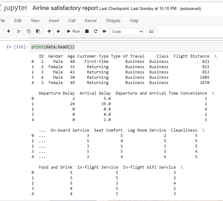
print(data.head())
The print(data.head()) command is used to display the first few rows of the DataFrame data. The .head() method in Pandas returns the top rows of a DataFrame, by default the first 5 rows.The print(data.head()) command is used to display the first few rows of the DataFrame data. The .head() method in Pandas returns the top rows of a DataFrame, by default the first 5 rows.
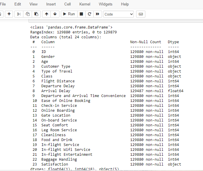
Display basic info about the dataset
print(data.info())
- The information displayed typically includes:
- The total number of non-null entries in each column.
- The data type of each column (e.g., integer, float, string, datetime, etc.).
- The memory usage of the DataFrame.
- The index information.
Additional metadata about the DataFrame.
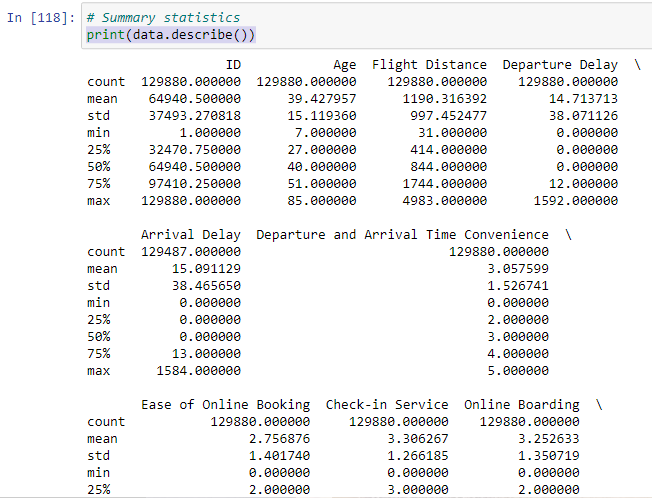
The describe() function
print(data.describe())
When applied to a Pandas DataFrame or Series, the describe() function provides a summary of descriptive statistics for the data. These statistics include measures such as mean, standard deviation, minimum, maximum, and quartiles for numerical data, as well as count and unique values for categorical data.
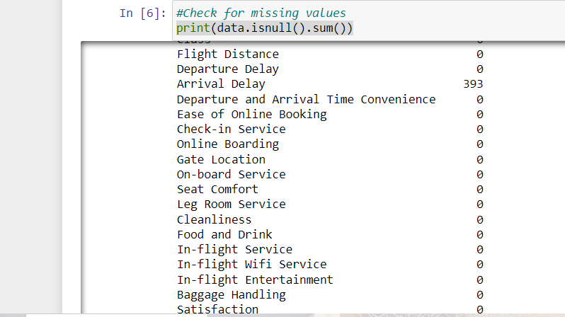
Isnull Function in Pandas for Data analytics
#Check for missing values
print(data.isnull().sum())
when you run print(data.isnull().sum()), it will print the count of missing values in each column of your DataFrame. In below out put arrival delay have 393 missing values.
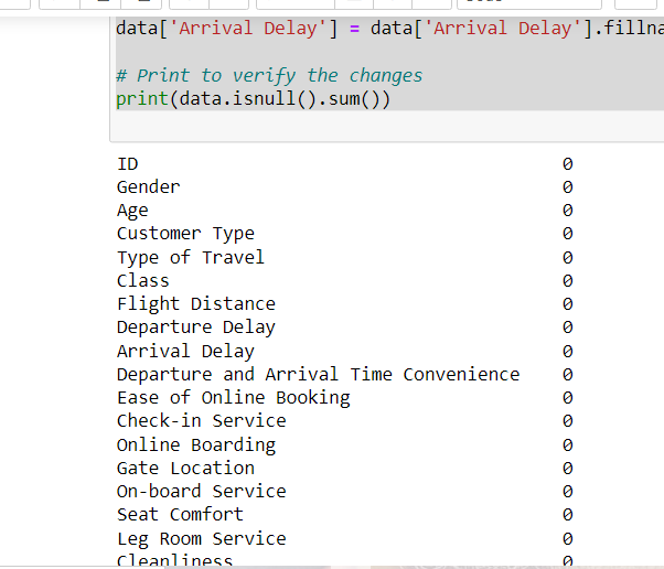
fillna function for filling values in Pandas
# Assuming 'data' is your DataFrame
data['Arrival Delay'] = data['Arrival Delay'].fillna(0)

# Print to verify the changes
print(data.isnull().sum())
Fill 0 in missing value in dataframe.
Charting in Python
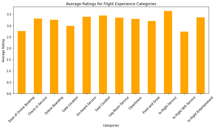
# Define the categories of columns
categories = ['Ease of Online Booking', 'Check-in Service', 'Online Boarding',
              'Gate Location', 'On-board Service', 'Seat Comfort',
              'Leg Room Service', 'Cleanliness', 'Food and Drink',
              'In-flight Service', 'In-flight Wifi Service', 'In-flight Entertainment']

# Calculate the averages for each category
category_averages = data[categories].mean()

# Create a bar chart
plt.figure(figsize=(10, 6))
category_averages.plot(kind='bar', color='orange')
plt.title('Average Ratings for Flight Experience Categories')
plt.xlabel('Categories')
plt.ylabel('Average Rating')
plt.xticks(rotation=45)
plt.tight_layout()

# Show the chart
plt.show()
Column Categories Definition:
A list called categories is defined, containing the names of different categories that are likely related to the evaluation of a flight experience. These categories might include things like ease of online booking, check-in service, seat comfort, in-flight entertainment, etc.
Calculating Category Averages:
The code assumes the existence of a DataFrame named data, which presumably contains ratings or scores for each of the specified categories. The mean() function is used to calculate the average value for each category based on the ratings provided in the DataFrame.
Creating a Bar Chart:
The code uses the matplotlib library to create a bar chart. It sets the figure size to 10×6 inches with plt.figure(figsize=(10, 6)). Then, it plots the average ratings using the category_averages Series as data, and sets the bars to be colored orange (color=’orange’). The kind parameter is set to ‘bar’ to indicate that a bar chart should be created.
Chart Title and Labels:
Various attributes are set to customize the appearance of the chart. The plt.title() function sets the chart title to ‘Average Ratings for Flight Experience Categories’. The plt.xlabel() and plt.ylabel() functions set the labels for the x-axis and y-axis respectively. The plt.xticks(rotation=45) function rotates the x-axis labels by 45 degrees for better readability.
Adjusting Layout and Displaying:
The plt.tight_layout() function is called to ensure that the plot elements do not overlap. Finally, plt.show() is called to display the generated bar chart.
In summary, this code takes ratings or scores for different flight experience categories from a DataFrame, calculates the average ratings for each category, and then creates and displays a bar chart to visually represent these average ratings. The chart provides insights into which categories of the flight experience are rated more favorably or less favorably on average.
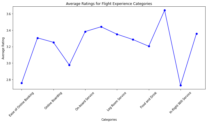
Create a line plot
 #Create a line plot
plt.figure(figsize=(10, 6))
category_averages.plot(kind='line', marker='o', color='blue')
plt.title('Average Ratings for Flight Experience Categories')
plt.xlabel('Categories')
plt.ylabel('Average Rating')
plt.xticks(rotation=45)
plt.tight_layout()

# Show the chart
plt.show() - plt.figure(figsize=(10, 6)): This line creates a new figure (plotting area) with a specified size of 10 inches in width and 6 inches in height. This sets up the canvas on which the plot will be drawn.
- category_averages.plot(kind=’line’, marker=’o’, color=’blue’): This line is creating the line plot itself. It’s assumed that category_averages is a DataFrame or a Series containing data for the plot. Here’s what each parameter does:
- kind=’line’: Specifies that a line plot should be created.
marker=’o’: Sets circular markers at data points on the line.
color=’blue’: Sets the color of the line and markers to blue.
plt.title(‘Average Ratings for Flight Experience Categories’): This sets the title of the plot to “Average Ratings for Flight Experience Categories”. - plt.xlabel(‘Categories’): This sets the label for the x-axis to “Categories”.
- plt.ylabel(‘Average Rating’): This sets the label for the y-axis to “Average Rating”.
- plt.xticks(rotation=45): This rotates the x-axis labels by 45 degrees. This is often done to prevent overlapping when labels are long or numerous.
- plt.tight_layout(): This function adjusts the spacing between the plot elements to ensure they fit well within the figure area.
- plt.show(): This line displays the plot on the screen.
In summary, the code creates a line plot that displays average ratings for different flight experience categories. The categories are labeled on the x-axis, the average ratings are on the y-axis, and each data point is marked with a blue circular marker. The plot has a title and axis labels, and the x-axis labels are rotated for better readability. Finally, the plot is displayed using plt.show().
Create a histogram
#Create a histogram for the "Age" column
plt.figure(figsize=(10, 6))
plt.hist(data['Age'], bins=20, color='skyblue', edgecolor='black')
plt.title('Age Distribution')
plt.xlabel('Age')
plt.ylabel('Frequency')
plt.tight_layout()

# Show the histogram
plt.show() 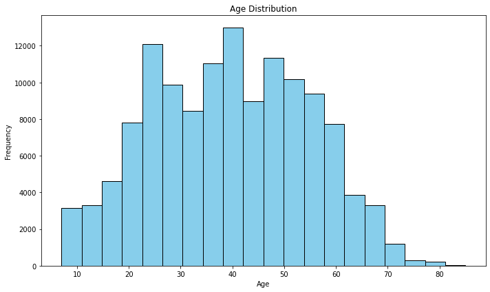
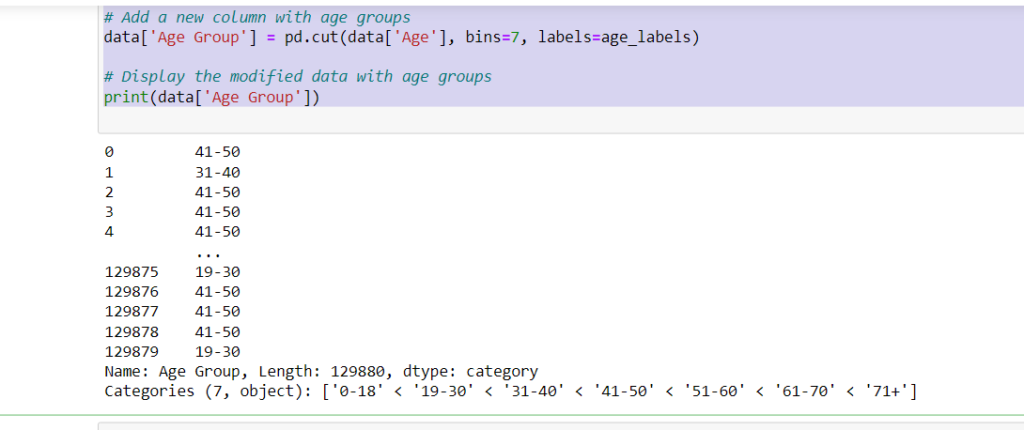
Age Groups to the Dataset:
# Define labels for the age bins
age_labels = ['0-18', '19-30', '31-40', '41-50', '51-60', '61-70', '71+']

# Add a new column with age groups
data['Age Group'] = pd.cut(data['Age'], bins=7, labels=age_labels)

# Display the modified data with age groups
print(data['Age Group'])
- age_labels: This is a list of labels representing different age bins or groups. Each label corresponds to a specific age range.
- data[‘Age Group’] = pd.cut(data[‘Age’], bins=7, labels=age_labels): This line of code adds a new column called ‘Age Group’ to the DataFrame data.
- The pd.cut() function is used to categorize the values in the ‘Age’ column into 7 bins (or age groups) based on the specified labels and number of bins. The resulting categories are assigned the labels from the age_labels list.
- print(data[‘Age Group’]): This line prints out the newly created ‘Age Group’ column, displaying the age group label for each row of data.
In summary, the code takes an existing DataFrame with an ‘Age’ column, divides the age values into 7 different age groups, assigns corresponding labels to these groups, and then adds a new ‘Age Group’ column to the DataFrame to store these group labels. This can be useful for segmenting and analyzing data based on different age ranges.
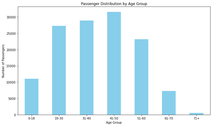
Passenger Distribution by Age Group
age_group_counts = data['Age Group'].value_counts().sort_index()
#Create a bar chart
plt.figure(figsize=(10, 6))
age_group_counts.plot(kind='bar', color='skyblue')
plt.title('Passenger Distribution by Age Group')
plt.xlabel('Age Group')
plt.ylabel('Number of Passengers')
plt.xticks(rotation=0)
plt.tight_layout()

# Show the chart
plt.show()
age_group_counts = data[‘Age Group’].value_counts().sort_index():
This line calculates the count of passengers in each age group using the ‘Age Group’ column of the DataFrame. The .value_counts() function counts the occurrences of each unique value (in this case, the different age group labels), and .sort_index() sorts these counts based on the order of the age labels.
Creating the Bar Chart:
- plt.figure(figsize=(10, 6)): This line sets the size of the figure (the plot) to have dimensions of 10 units in width and 6 units in height.
- age_group_counts.plot(kind=’bar’, color=’skyblue’):
- This line creates a bar plot using the counts calculated in the previous step. Each age group will have a corresponding bar, and the bars will be colored with a sky blue color.
- plt.title(‘Passenger Distribution by Age Group’): Sets the title of the plot to ‘Passenger Distribution by Age Group’.
- plt.xlabel(‘Age Group’): Sets the label for the x-axis to ‘Age Group’.
- plt.ylabel(‘Number of Passengers’): Sets the label for the y-axis to ‘Number of Passengers’.
plt.xticks(rotation=0): Sets the rotation angle of the x-axis labels to 0 degrees, meaning the labels will be displayed horizontally. - plt.tight_layout(): Automatically adjusts the subplot parameters to ensure that all elements of the plot fit within the figure area without overlapping.
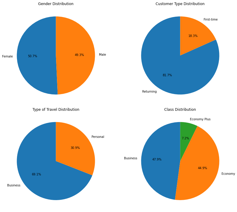
Create Pie Chart
gender_counts = data['Gender'].value_counts() customer_type_counts = data['Customer Type'].value_counts() travel_type_counts = data['Type of Travel'].value_counts() class_counts = data['Class'].value_counts()Here, you’re calculating the count of unique values in the ‘Gender’, ‘Customer Type’, ‘Type of Travel’, and ‘Class’ columns of the DataFrame data and storing them in separate variables.
Creating Subplots:
fig, axes = plt.subplots(2, 2, figsize=(12, 10))You’re creating a 2×2 grid of subplots (four subplots in total) using the subplots function from the matplotlib.pyplot library. The figsize parameter determines the size of the entire figure.
Pie Chart Creation
axes[0, 0].pie(gender_counts, labels=gender_counts.index, autopct='%1.1f%%', startangle=90)
axes[0, 1].pie(customer_type_counts, labels=customer_type_counts.index, autopct='%1.1f%%', startangle=90)
axes[1, 0].pie(travel_type_counts, labels=travel_type_counts.index, autopct='%1.1f%%', startangle=90)
axes[1, 1].pie(class_counts, labels=class_counts.index, autopct='%1.1f%%', startangle=90)
You’re creating individual pie charts for each categorical variable. For each subplot, you’re using the pie function to create the pie chart. The labels parameter specifies the labels for each slice of the pie chart, the autopct parameter formats the percentage labels on the chart, and startangle determines the angle at which the first slice starts.
Setting Titles:
axes[0, 0].set_title('Gender Distribution')
axes[0, 1].set_title('Customer Type Distribution')
axes[1, 0].set_title('Type of Travel Distribution')
axes[1, 1].set_title('Class Distribution')
Layout Adjustment and Displaying:
plt.tight_layout()
plt.show()
plt.tight_layout() adjusts the spacing between subplots for better visualization. Finally, plt.show() displays the entire figure with the pie charts.
bar chart of satisfaction Mapping
satisfaction_mapping = {
    'Neutral or Dissatisfied': 0,
    'Satisfied': 1
}
In this step, a dictionary named satisfaction_mapping is created. It maps categorical satisfaction values (‘Neutral or Dissatisfied’ and ‘Satisfied’) to numerical values (0 and 1, respectively).
Step 2: Map the Satisfaction Values
data['Satisfaction'] = data['Satisfaction'].map(satisfaction_mapping)the ‘Satisfaction’ column in the DataFrame named data by applying the mapping defined earlier. This maps the categorical values to their corresponding numerical values in the DataFrame.
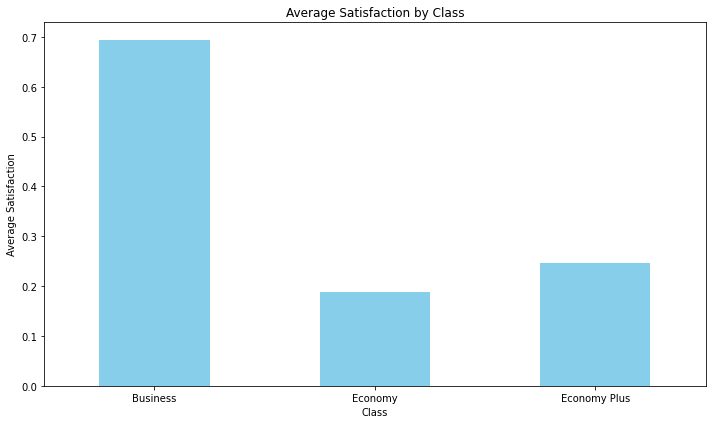
Step 3: Calculate Average Satisfaction for Each Class
class_satisfaction = data.groupby('Class')['Satisfaction'].mean()
This line groups the data in the DataFrame by the ‘Class’ column and calculates the mean (average) of the ‘Satisfaction’ values for each class. The result is stored in the class_satisfaction Series.
Step 4: Create a Bar Chart
plt.figure(figsize=(10, 6))
class_satisfaction.plot(kind='bar', color='skyblue')
In this step, a bar chart is created using the matplotlib library. The plt.figure(figsize=(10, 6)) sets the size of the figure, and class_satisfaction.plot(kind=’bar’, color=’skyblue’) plots the average satisfaction values for each class as bars, using the color ‘skyblue’.
Step 5: Add Chart Details
plt.title('Average Satisfaction by Class')
plt.xlabel('Class')
plt.ylabel('Average Satisfaction')
plt.xticks(rotation=0)
plt.tight_layout()
These lines add various details to the chart:
- plt.title(‘Average Satisfaction by Class’): Sets the chart title.
- plt.xlabel(‘Class’): Labels the x-axis.
- plt.ylabel(‘Average Satisfaction’): Labels the y-axis.
- plt.xticks(rotation=0): Sets the rotation angle of the x-axis labels to 0 degrees (no rotation). plt.tight_layout(): Adjusts the layout of the plot to make sure everything fits nicely
Step 6: Show the Chart
plt.show()
Bar chart Average satisfaction for each type of travel
# Calculate the average satisfaction for each type of travel
travel_satisfaction = data.groupby('Type of Travel')['Satisfaction'].mean()

# Create a bar chart
plt.figure(figsize=(10, 6))
travel_satisfaction.plot(kind='bar', color='skyblue')
plt.title('Average Satisfaction by Type of Travel')
plt.xlabel('Type of Travel')
plt.ylabel('Average Satisfaction')
plt.xticks(rotation=0)
plt.tight_layout()

# Show the chart
plt.show() 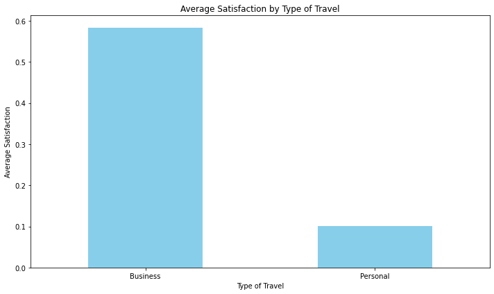
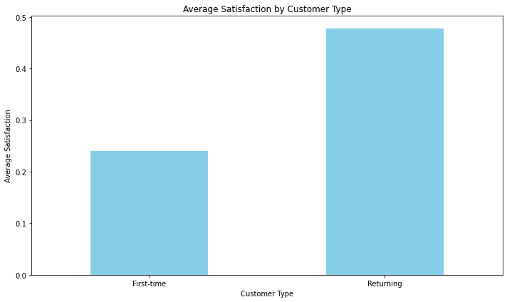
Bar Chart by average satisfaction for each customer type
# Calculate the average satisfaction for each customer type
customer_type_satisfaction = data.groupby('Customer Type')['Satisfaction'].mean()

# Create a bar chart
plt.figure(figsize=(10, 6))
customer_type_satisfaction.plot(kind='bar', color='skyblue')
plt.title('Average Satisfaction by Customer Type')
plt.xlabel('Customer Type')
plt.ylabel('Average Satisfaction')
plt.xticks(rotation=0)
plt.tight_layout()

# Show the chart
plt.show()