In today’s ever-connected world, air travel serves as a vital conduit, linking people and places across the globe. Delving into the realm of airline passenger satisfaction, our analysis unearths the intricate threads that shape travelers’ experiences in the skies. By dissecting data encompassing diverse parameters such as customer type, travel preferences, and class, we uncover insights that offer airlines a compass to enhance their services. Embark on this journey with us to decode the nuances of passenger contentment and pave the way for elevated travel experiences.

Sure, here’s a concise summary of the dataset in bullet points:
Table of Contents
Toggleimport pandas as pd import numpy as np import matplotlib.pyplot as plt import seaborn as sns
Seaborn is particularly useful for statistical data visualization. It provides a variety of functions to create visually appealing plots with less code compared to using Matplotlib directly. Seaborn’s features include:
Please note that while the code snippet imports the libraries, it doesn’t include any actual code for data manipulation or visualization. You would typically write additional code to load data using Pandas, perform data analysis or transformations using both Pandas and NumPy, and then use Seaborn (and Matplotlib) to create visualizations based on the analyzed data.
data = pd.read_csv(r"C:\Users\yogesh\Downloads\Airline+Passenger+Satisfaction\airline.csv")
This imports the Pandas library and assigns it the alias pd. This is a common convention to make the code shorter when referring to Pandas functions.
data = pd.read_csv(r”C:\Users\yogesh\Downloads\Airline+Passenger+Satisfaction\airline.csv”): Here’s what each part of this line does:
This is a variable name that you’re using to store the data read from the CSV file. You can choose any variable name you prefer.
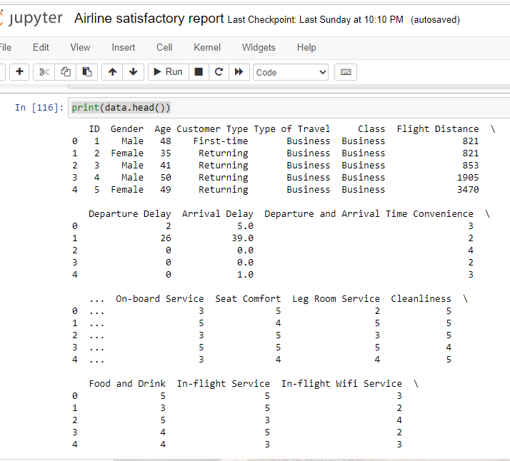
The print(data.head()) command is used to display the first few rows of the DataFrame data. The .head() method in Pandas returns the top rows of a DataFrame, by default the first 5 rows.The print(data.head()) command is used to display the first few rows of the DataFrame data. The .head() method in Pandas returns the top rows of a DataFrame, by default the first 5 rows.
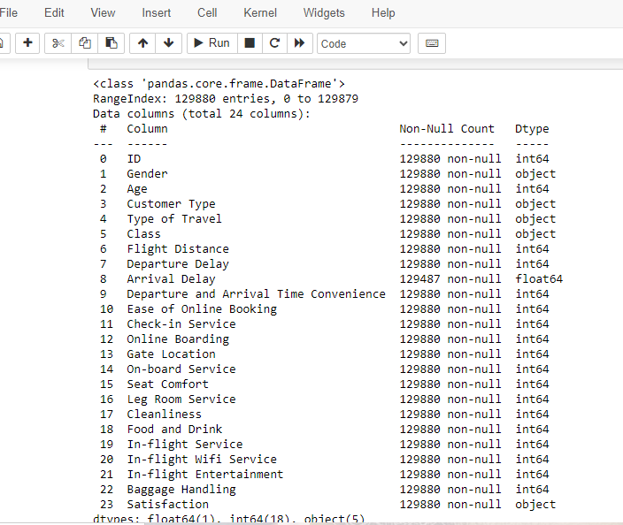
print(data.info())
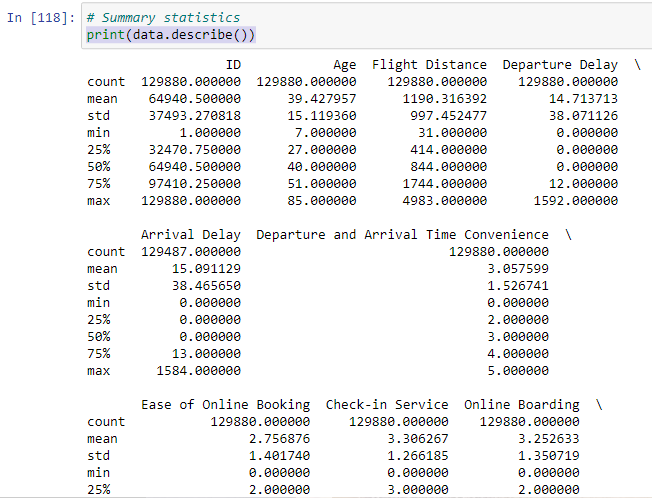
print(data.describe())
When applied to a Pandas DataFrame or Series, the describe() function provides a summary of descriptive statistics for the data. These statistics include measures such as mean, standard deviation, minimum, maximum, and quartiles for numerical data, as well as count and unique values for categorical data.
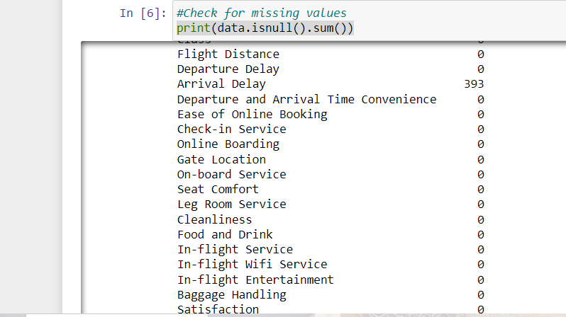
#Check for missing values
print(data.isnull().sum())
when you run print(data.isnull().sum()), it will print the count of missing values in each column of your DataFrame. In below out put arrival delay have 393 missing values.
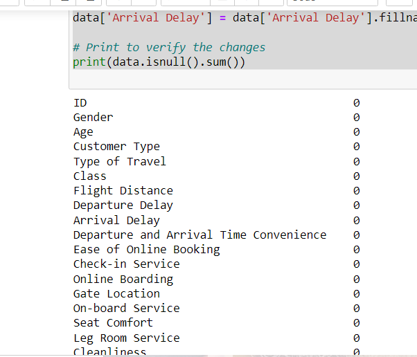
# Assuming 'data' is your DataFrame
data['Arrival Delay'] = data['Arrival Delay'].fillna(0)

# Print to verify the changes
print(data.isnull().sum())
Fill 0 in missing value in dataframe.
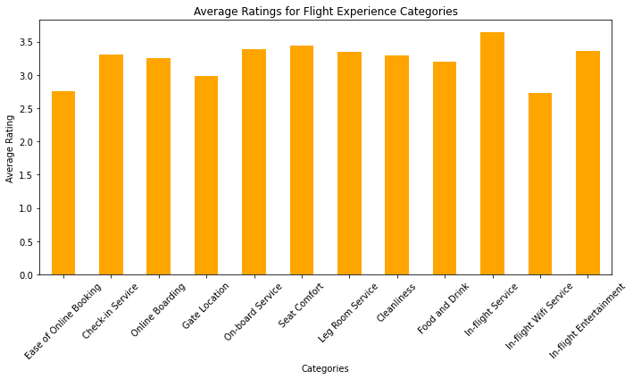
# Define the categories of columns
categories = ['Ease of Online Booking', 'Check-in Service', 'Online Boarding',
              'Gate Location', 'On-board Service', 'Seat Comfort',
              'Leg Room Service', 'Cleanliness', 'Food and Drink',
              'In-flight Service', 'In-flight Wifi Service', 'In-flight Entertainment']

# Calculate the averages for each category
category_averages = data[categories].mean()

# Create a bar chart
plt.figure(figsize=(10, 6))
category_averages.plot(kind='bar', color='orange')
plt.title('Average Ratings for Flight Experience Categories')
plt.xlabel('Categories')
plt.ylabel('Average Rating')
plt.xticks(rotation=45)
plt.tight_layout()

# Show the chart
plt.show()
A list called categories is defined, containing the names of different categories that are likely related to the evaluation of a flight experience. These categories might include things like ease of online booking, check-in service, seat comfort, in-flight entertainment, etc.
The code assumes the existence of a DataFrame named data, which presumably contains ratings or scores for each of the specified categories. The mean() function is used to calculate the average value for each category based on the ratings provided in the DataFrame.
The code uses the matplotlib library to create a bar chart. It sets the figure size to 10×6 inches with plt.figure(figsize=(10, 6)). Then, it plots the average ratings using the category_averages Series as data, and sets the bars to be colored orange (color=’orange’). The kind parameter is set to ‘bar’ to indicate that a bar chart should be created.
Various attributes are set to customize the appearance of the chart. The plt.title() function sets the chart title to ‘Average Ratings for Flight Experience Categories’. The plt.xlabel() and plt.ylabel() functions set the labels for the x-axis and y-axis respectively. The plt.xticks(rotation=45) function rotates the x-axis labels by 45 degrees for better readability.
The plt.tight_layout() function is called to ensure that the plot elements do not overlap. Finally, plt.show() is called to display the generated bar chart.
In summary, this code takes ratings or scores for different flight experience categories from a DataFrame, calculates the average ratings for each category, and then creates and displays a bar chart to visually represent these average ratings. The chart provides insights into which categories of the flight experience are rated more favorably or less favorably on average.
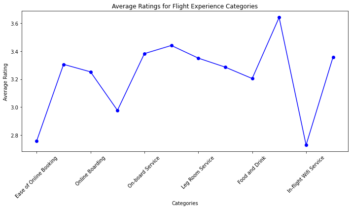
 #Create a line plot
plt.figure(figsize=(10, 6))
category_averages.plot(kind='line', marker='o', color='blue')
plt.title('Average Ratings for Flight Experience Categories')
plt.xlabel('Categories')
plt.ylabel('Average Rating')
plt.xticks(rotation=45)
plt.tight_layout()

# Show the chart
plt.show() In summary, the code creates a line plot that displays average ratings for different flight experience categories. The categories are labeled on the x-axis, the average ratings are on the y-axis, and each data point is marked with a blue circular marker. The plot has a title and axis labels, and the x-axis labels are rotated for better readability. Finally, the plot is displayed using plt.show().
#Create a histogram for the "Age" column
plt.figure(figsize=(10, 6))
plt.hist(data['Age'], bins=20, color='skyblue', edgecolor='black')
plt.title('Age Distribution')
plt.xlabel('Age')
plt.ylabel('Frequency')
plt.tight_layout()

# Show the histogram
plt.show() 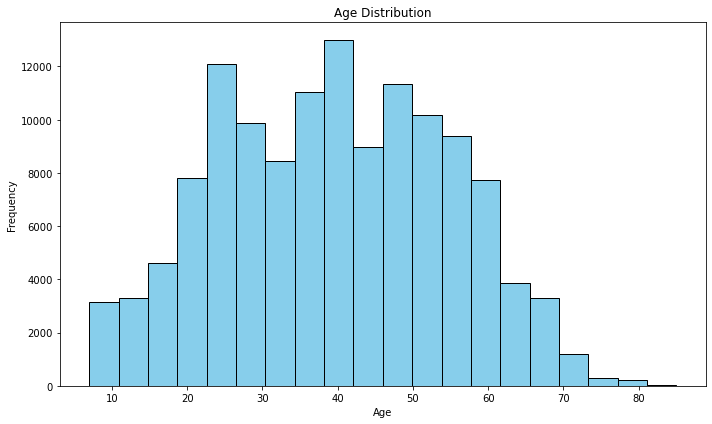
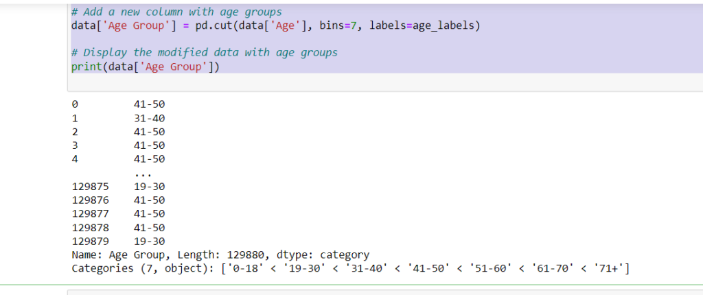
# Define labels for the age bins
age_labels = ['0-18', '19-30', '31-40', '41-50', '51-60', '61-70', '71+']

# Add a new column with age groups
data['Age Group'] = pd.cut(data['Age'], bins=7, labels=age_labels)

# Display the modified data with age groups
print(data['Age Group'])
In summary, the code takes an existing DataFrame with an ‘Age’ column, divides the age values into 7 different age groups, assigns corresponding labels to these groups, and then adds a new ‘Age Group’ column to the DataFrame to store these group labels. This can be useful for segmenting and analyzing data based on different age ranges.
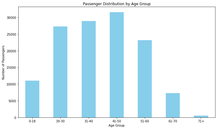
age_group_counts = data['Age Group'].value_counts().sort_index()
#Create a bar chart
plt.figure(figsize=(10, 6))
age_group_counts.plot(kind='bar', color='skyblue')
plt.title('Passenger Distribution by Age Group')
plt.xlabel('Age Group')
plt.ylabel('Number of Passengers')
plt.xticks(rotation=0)
plt.tight_layout()

# Show the chart
plt.show()
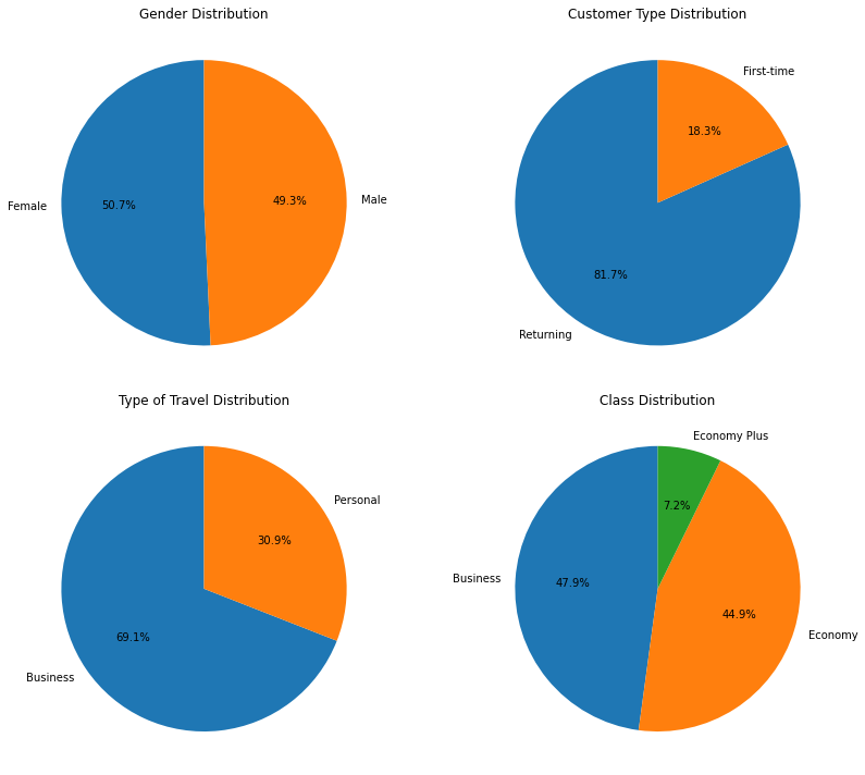
gender_counts = data['Gender'].value_counts() customer_type_counts = data['Customer Type'].value_counts() travel_type_counts = data['Type of Travel'].value_counts() class_counts = data['Class'].value_counts()Here, you’re calculating the count of unique values in the ‘Gender’, ‘Customer Type’, ‘Type of Travel’, and ‘Class’ columns of the DataFrame data and storing them in separate variables.
fig, axes = plt.subplots(2, 2, figsize=(12, 10))You’re creating a 2×2 grid of subplots (four subplots in total) using the subplots function from the matplotlib.pyplot library. The figsize parameter determines the size of the entire figure.
axes[0, 0].pie(gender_counts, labels=gender_counts.index, autopct='%1.1f%%', startangle=90)
axes[0, 1].pie(customer_type_counts, labels=customer_type_counts.index, autopct='%1.1f%%', startangle=90)
axes[1, 0].pie(travel_type_counts, labels=travel_type_counts.index, autopct='%1.1f%%', startangle=90)
axes[1, 1].pie(class_counts, labels=class_counts.index, autopct='%1.1f%%', startangle=90)
You’re creating individual pie charts for each categorical variable. For each subplot, you’re using the pie function to create the pie chart. The labels parameter specifies the labels for each slice of the pie chart, the autopct parameter formats the percentage labels on the chart, and startangle determines the angle at which the first slice starts.
axes[0, 0].set_title('Gender Distribution')
axes[0, 1].set_title('Customer Type Distribution')
axes[1, 0].set_title('Type of Travel Distribution')
axes[1, 1].set_title('Class Distribution')
plt.tight_layout()
plt.show()
plt.tight_layout() adjusts the spacing between subplots for better visualization. Finally, plt.show() displays the entire figure with the pie charts.
satisfaction_mapping = {
    'Neutral or Dissatisfied': 0,
    'Satisfied': 1
}
In this step, a dictionary named satisfaction_mapping is created. It maps categorical satisfaction values (‘Neutral or Dissatisfied’ and ‘Satisfied’) to numerical values (0 and 1, respectively).
data['Satisfaction'] = data['Satisfaction'].map(satisfaction_mapping)the ‘Satisfaction’ column in the DataFrame named data by applying the mapping defined earlier. This maps the categorical values to their corresponding numerical values in the DataFrame.
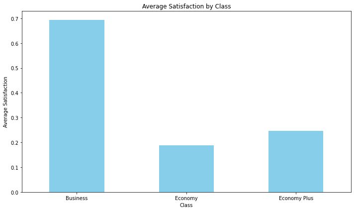
class_satisfaction = data.groupby('Class')['Satisfaction'].mean()
This line groups the data in the DataFrame by the ‘Class’ column and calculates the mean (average) of the ‘Satisfaction’ values for each class. The result is stored in the class_satisfaction Series.
plt.figure(figsize=(10, 6))
class_satisfaction.plot(kind='bar', color='skyblue')
In this step, a bar chart is created using the matplotlib library. The plt.figure(figsize=(10, 6)) sets the size of the figure, and class_satisfaction.plot(kind=’bar’, color=’skyblue’) plots the average satisfaction values for each class as bars, using the color ‘skyblue’.
plt.title('Average Satisfaction by Class')
plt.xlabel('Class')
plt.ylabel('Average Satisfaction')
plt.xticks(rotation=0)
plt.tight_layout()
These lines add various details to the chart:
plt.show()
# Calculate the average satisfaction for each type of travel
travel_satisfaction = data.groupby('Type of Travel')['Satisfaction'].mean()

# Create a bar chart
plt.figure(figsize=(10, 6))
travel_satisfaction.plot(kind='bar', color='skyblue')
plt.title('Average Satisfaction by Type of Travel')
plt.xlabel('Type of Travel')
plt.ylabel('Average Satisfaction')
plt.xticks(rotation=0)
plt.tight_layout()

# Show the chart
plt.show() 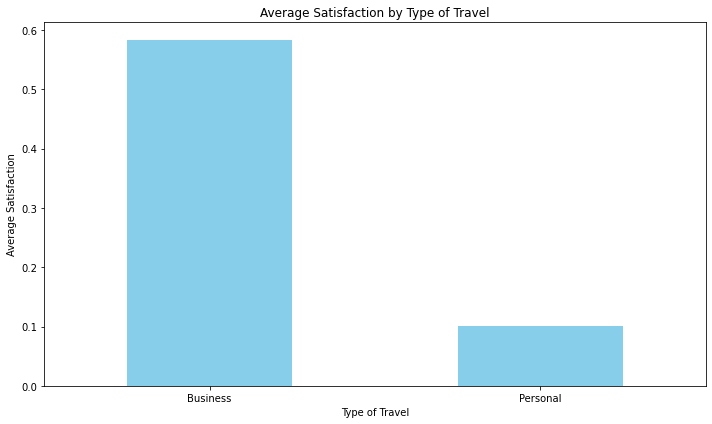
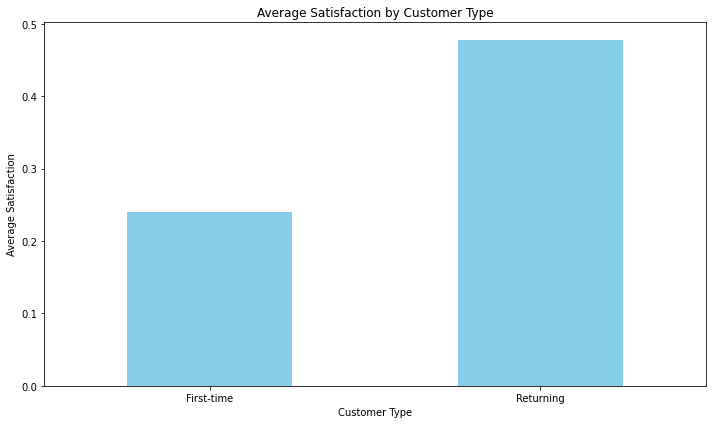
# Calculate the average satisfaction for each customer type
customer_type_satisfaction = data.groupby('Customer Type')['Satisfaction'].mean()

# Create a bar chart
plt.figure(figsize=(10, 6))
customer_type_satisfaction.plot(kind='bar', color='skyblue')
plt.title('Average Satisfaction by Customer Type')
plt.xlabel('Customer Type')
plt.ylabel('Average Satisfaction')
plt.xticks(rotation=0)
plt.tight_layout()

# Show the chart
plt.show()