

Data visualization plays a crucial role in understanding and interpreting complex datasets. Python, with its powerful libraries, provides an excellent environment for data analytics and visualization. One such library, Matplotlib, is a go-to tool for creating a wide variety of charts and plots. In this tutorial, we will explore the fundamentals of Matplotlib and learn how to create and customize different types of charts for effective data analysis.
Table of Contents
ToggleMatplotlib is a versatile and widely-used plotting library in the Python ecosystem. Whether you’re a data scientist, analyst, or enthusiast, mastering Matplotlib empowers you to communicate insights visually. From simple line plots to sophisticated 3D visualizations, Matplotlib has you covered.
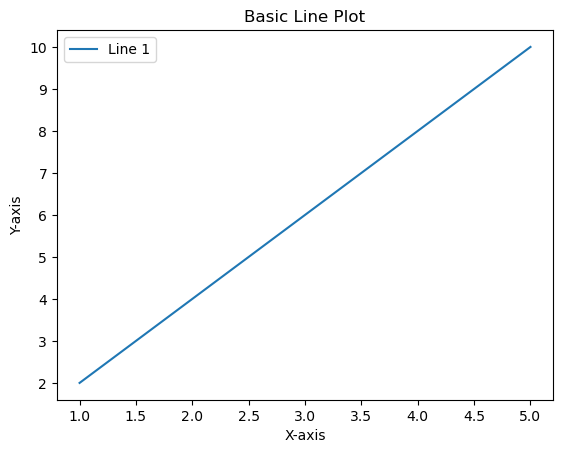
import matplotlib.pyplot as plt

# Sample data
x = [1, 2, 3, 4, 5]
y = [2, 4, 6, 8, 10]

# Basic Line Plot
plt.plot(x, y, label='Line 1')

# Customize the plot
plt.title('Basic Line Plot')
plt.xlabel('X-axis')
plt.ylabel('Y-axis')
plt.legend()

# Show the plot
plt.show()
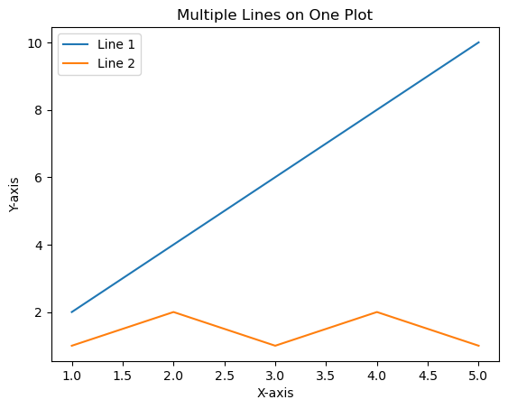
import matplotlib.pyplot as plt

# Sample data
x = [1, 2, 3, 4, 5]
y1 = [2, 4, 6, 8, 10]
y2 = [1, 2, 1, 2, 1]

# Multiple Lines on One Plot
plt.plot(x, y1, label='Line 1')
plt.plot(x, y2, label='Line 2')

# Customize the plot
plt.title('Multiple Lines on One Plot')
plt.xlabel('X-axis')
plt.ylabel('Y-axis')
plt.legend()

# Show the plot
plt.show()
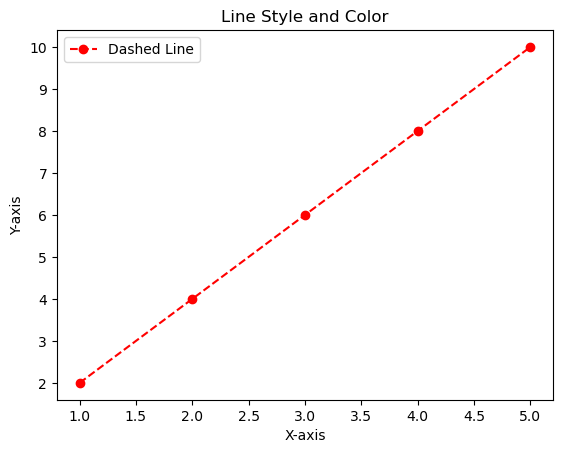
import matplotlib.pyplot as plt

# Sample data
x = [1, 2, 3, 4, 5]
y = [2, 4, 6, 8, 10]

# Line Style and Color
plt.plot(x, y, linestyle='--', color='red', marker='o', label='Dashed Line')

# Customize the plot
plt.title('Line Style and Color')
plt.xlabel('X-axis')
plt.ylabel('Y-axis')
plt.legend()

# Show the plot
plt.show()
plt.plot(x, y, linestyle='-', label='Solid Line')Dashed Line:
plt.plot(x, y, linestyle='--', label='Dashed Line')Dotted Line:
plt.plot(x, y, linestyle=':', label='Dotted Line')Dash-Dot Line:
plt.plot(x, y, linestyle='-.', label='Dash-Dot Line')Line Colors:
plt.plot(x, y, color='red', label='Red Line')Markers Markers indicate specific data points on the line. You can use various markers:
plt.plot(x, y, marker='o', label='Circle Marker')
plt.plot(x, y, marker='s', label='Square Marker')
plt.plot(x, y, marker='^', label='Triangle Up Marker')
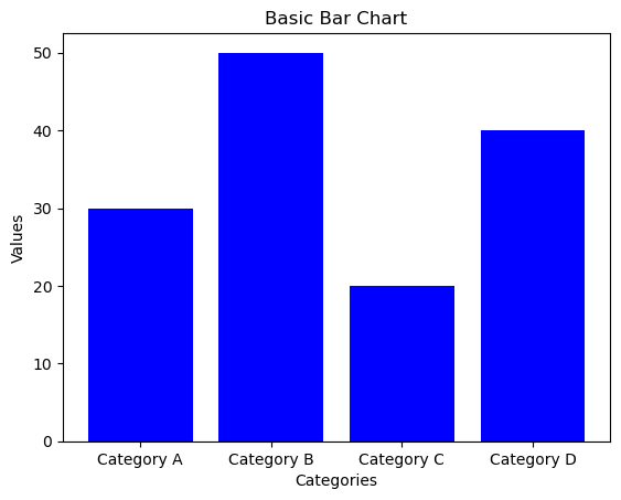
import matplotlib.pyplot as plt

# Sample data
categories = ['Category A', 'Category B', 'Category C', 'Category D']
values = [30, 50, 20, 40]

# Basic Bar Chart
plt.bar(categories, values, color='blue')

# Customize the plot
plt.title('Basic Bar Chart')
plt.xlabel('Categories')
plt.ylabel('Values')

# Show the plot
plt.show()
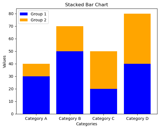
import matplotlib.pyplot as plt

# Sample data
categories = ['Category A', 'Category B', 'Category C', 'Category D']
values1 = [30, 50, 20, 40]
values2 = [10, 20, 30, 40]

# Stacked Bar Chart
plt.bar(categories, values1, color='blue', label='Group 1')
plt.bar(categories, values2, bottom=values1, color='orange', label='Group 2')

# Customize the plot
plt.title('Stacked Bar Chart')
plt.xlabel('Categories')
plt.ylabel('Values')
plt.legend()

# Show the plot
plt.show()
import numpy as np
import matplotlib.pyplot as plt

# Sample data
categories = ['Category A', 'Category B', 'Category C', 'Category D']
values1 = [30, 50, 20, 40]
values2 = [10, 20, 30, 40]

# Grouped Bar Chart
bar_width = 0.35  # Width of each bar
index = np.arange(len(categories))  # Generating an array of evenly spaced values representing the categories

# Creating the first set of bars (Group 1)
plt.bar(index, values1, width=bar_width, color='blue', label='Group 1')

# Creating the second set of bars (Group 2), shifted to the right by bar_width
plt.bar(index + bar_width, values2, width=bar_width, color='orange', label='Group 2')

# Customize the plot
plt.title('Grouped Bar Chart')
plt.xlabel('Categories')
plt.ylabel('Values')
plt.xticks(index + bar_width / 2, categories)  # Setting the x-axis ticks at the center of each group
plt.legend()  # Displaying the legend

# Show the plot
plt.show()
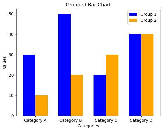
plt.bar(index, values1, width=bar_width, color=’blue’, label=’Group 1′): Creates the first set of bars (Group 1).
plt.bar(index + bar_width, values2, width=bar_width, color=’orange’, label=’Group 2′): Creates the second set of bars (Group 2), shifted to the right by bar_width
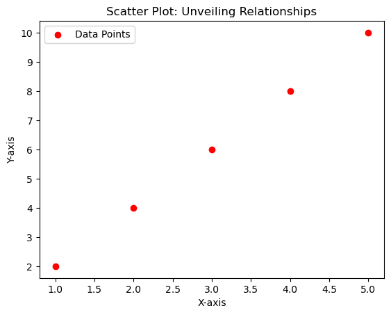
import matplotlib.pyplot as plt

# Sample data
x = [1, 2, 3, 4, 5]
y = [2, 4, 6, 8, 10]

# Scatter Plot
plt.scatter(x, y, color='red', marker='o', label='Data Points')

# Customize the plot
plt.title('Scatter Plot: Unveiling Relationships')
plt.xlabel('X-axis')
plt.ylabel('Y-axis')
plt.legend()

# Show the plot
plt.show()
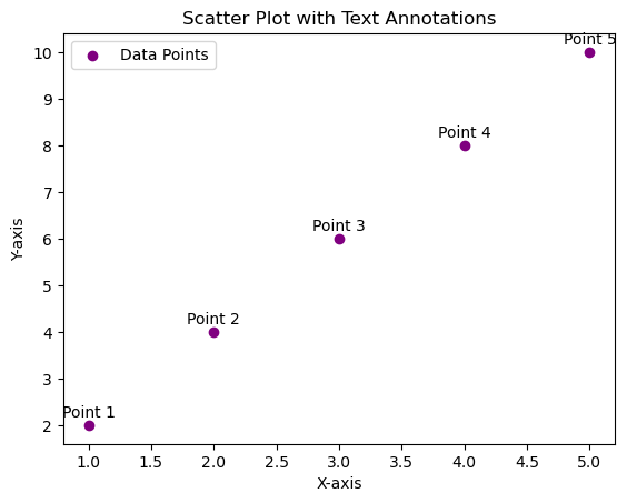
import matplotlib.pyplot as plt

# Sample data
x = [1, 2, 3, 4, 5]
y = [2, 4, 6, 8, 10]
data_labels = ['Point 1', 'Point 2', 'Point 3', 'Point 4', 'Point 5']

# Scatter Plot with Text Annotations
plt.scatter(x, y, color='purple', marker='o', label='Data Points')

# Adding text annotations
for i, label in enumerate(data_labels):
    plt.annotate(label, (x[i], y[i]), textcoords="offset points", xytext=(0,5), ha='center')

# Customize the plot
plt.title('Scatter Plot with Text Annotations')
plt.xlabel('X-axis')
plt.ylabel('Y-axis')
plt.legend()

# Show the plot
plt.show()
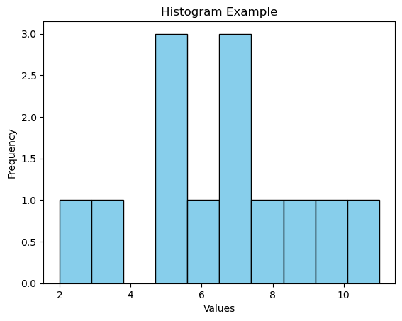
import matplotlib.pyplot as plt
import numpy as np

# Sample data
data = [2, 5, 7, 10, 5, 8, 3, 7, 6, 9, 11, 5, 7]

# Create histogram
plt.hist(data, bins=10, edgecolor='black', color='skyblue')

# Customize the plot
plt.title('Histogram Example')
plt.xlabel('Values')
plt.ylabel('Frequency')

# Show the plot
plt.show()
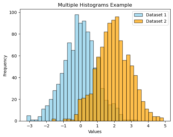
import matplotlib.pyplot as plt
import numpy as np

# Sample data
data1 = np.random.randn(1000)
data2 = np.random.randn(1000) + 2  # Shift the second dataset

# Create multiple histograms
plt.hist(data1, bins=30, edgecolor='black', color='skyblue', alpha=0.7, label='Dataset 1')
plt.hist(data2, bins=30, edgecolor='black', color='orange', alpha=0.7, label='Dataset 2')

# Customize the plot
plt.title('Multiple Histograms Example')
plt.xlabel('Values')
plt.ylabel('Frequency')
plt.legend()

# Show the plot
plt.show()
import matplotlib.pyplot as plt

# Sample data
labels = ['Category A', 'Category B', 'Category C', 'Category D']
sizes = [30, 20, 15, 35]

# Create a pie chart
plt.pie(sizes, labels=labels, autopct='%1.1f%%', startangle=90, colors=['skyblue', 'orange', 'lightgreen', 'lightcoral'])

# Customize the plot
plt.title('Pie Chart Example')

# Show the plot
plt.show() 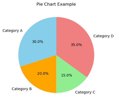
import matplotlib.pyplot as plt

# Dataset
scores = [78, 82, 85, 90, 91, 93, 95, 97, 100, 102, 105, 108]

# Creating the box plot
plt.boxplot(scores)

plt.title(‘Test Scores Box Plot’)
plt.ylabel(‘Scores’)

# Display the plot
plt.show()