
Introduction to Charts and Graphs in Data Analytics
Table of Contents
ToggleUnderstanding data visualization for better insights
Charts and graphs in data analytics are essential for transforming raw data into meaningful insights through effective data visualization. Instead of analyzing large tables with thousands of rows, analysts rely on visual representations to quickly identify trends, patterns, comparisons, and outliers. Whether analyzing sales performance, customer behavior, financial growth, or operational efficiency, choosing the right chart or graph provides clarity and context. These visuals help data analysts communicate findings clearly and enable data-driven decision making across business and strategy.
Bar Chart in Data Analytics
Definition, uses & best practices
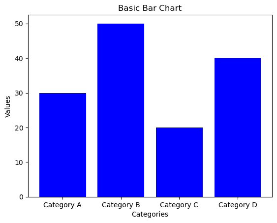
A bar chart is one of the most commonly used charts in data analytics for visualizing categorical data. It represents data using rectangular bars, where the length or height of each bar corresponds to its value. Bar charts can be displayed vertically (column charts) or horizontally (bar charts), making them ideal for quick and clear category-wise comparison.
Use Case 1: Comparing Categories
Bar charts are widely used to compare different categories such as product-wise sales, city populations, or department-wise performance within an organization.
Use Case 2: Changes Over Time (Discrete)
When data is recorded at discrete time intervals like years, months, or quarters, bar charts effectively show changes over time, such as annual revenue or quarterly growth.
Best Practice: Consistent Colors
Use consistent colors for the same categories across different charts to avoid confusion and improve visual recognition.
Best Practice: Start Y-Axis at Zero
Always begin the Y-axis at zero to maintain proportional accuracy. Starting from a higher value can exaggerate differences and mislead interpretation.
Line Chart

Line Chart in Data Analytics
Description, uses & best practices
A line chart in data analytics is a widely used data visualization technique where information is displayed as a sequence of data points, known as markers, connected by straight line segments. Line charts are especially effective for showing how values change over time. Each point on the line represents a data value at a specific time interval, while the connecting lines clearly highlight overall trends and movement.
Use Case 1: Visualizing Trends Over Time
Line charts are ideal for identifying trends such as growth, decline, or seasonal patterns over time. For example, they are commonly used to track stock prices, website traffic, or company revenue across months or years.
Use Case 2: Comparing Multiple Data Sets
When multiple data sets share the same time period, line charts allow easy comparison by plotting multiple lines on a single graph. This helps analysts compare performance, such as monthly sales of different products or regions.
Best Practice: Use Distinct Line Styles
To clearly differentiate multiple data series, use different colors or line styles such as solid, dashed, or dotted lines. This improves readability and prevents confusion.
Best Practice: Keep Time Intervals Consistent
Ensure that time intervals on the X-axis are evenly spaced. Inconsistent or irregular intervals can misrepresent trends and confuse viewers, especially when analyzing monthly or yearly data.
Pie Chart

Pie Chart in Data Analytics
Description, uses & best practices
A pie chart in data analytics is a circular data visualization technique divided into slices, where each slice represents a category’s contribution to the whole. The size of each slice is proportional to its value, making pie charts useful for understanding relative proportions and composition within a dataset.
Use Case 1: Showing Composition of a Whole
Pie charts are commonly used to illustrate how a whole is divided into different parts. Typical examples include market share of companies, budget allocation, or demographic distribution within a population.
Use Case 2: Comparing Categories at One Point in Time
When comparing multiple categories at a single moment, pie charts provide a clear snapshot of relative sizes, helping identify the largest and smallest contributors easily.
Best Practice: Limit Number of Slices
To maintain clarity, limit the number of slices in a pie chart. As a best practice, keep slices under eight and combine smaller categories into an “Other” group when necessary.
Best Practice: Use Contrasting Colors
Use clearly contrasting colors for different slices to improve readability. Avoid using similar shades, as they can make it difficult to distinguish between categories.
Histogram

Histogram in Data Analytics
Description, uses & best practices
A histogram in data analytics is a bar-based data visualization used to represent the distribution of numerical data. Unlike a bar chart, which displays categorical values, a histogram groups continuous data into ranges known as bins. Each bar represents the frequency of data points within a specific range, making histograms ideal for understanding the shape and spread of data.
Use Case 1: Understanding Data Distribution
Histograms help analysts visualize how data is distributed across different ranges. They can reveal patterns such as normal distribution, uniform distribution, or skewed distribution within a dataset.
Use Case 2: Identifying Central Tendency & Spread
A histogram makes it easier to observe central tendency (mean, median, mode), dispersion (range, variance, standard deviation), and skewness. Unimodal and multimodal peaks highlight data concentration and clustering.
Best Practice: Choose Appropriate Bin Size
Selecting the right bin size is crucial. Very large bins can hide important patterns, while very small bins may add noise. Adjust bin sizes to accurately reflect the underlying data distribution.
Best Practice: Avoid Gaps Between Bars
Histogram bars should be placed next to each other without gaps to indicate continuous data. Gaps can mislead viewers into thinking the data is categorical rather than continuous.
Scatter Plot

Scatter Plot in Data Analytics
Description, uses & best practices
A scatter plot in data analytics is a powerful data visualization technique used to display the relationship between two numerical variables. Each dot on the chart represents a single data point, with its position determined by values on the horizontal (X-axis) and vertical (Y-axis). Scatter plots are widely used to identify relationships, patterns, and trends between variables.
Use Case 1: Identifying Correlation Between Variables
Scatter plots help analysts visually examine whether two variables have a positive, negative, or no correlation. For example, they are often used to analyze the relationship between advertising spend and sales revenue.
Use Case 2: Detecting Outliers and Trends
By observing the distribution of data points, scatter plots make it easy to detect outliers and identify trends such as linear or non-linear relationships. Outliers may indicate anomalies or exceptional cases in the data set.
Best Practice: Clearly Label Axes
Always label the X-axis and Y-axis to clearly represent the variables being compared. Proper axis labeling helps viewers correctly interpret the data, such as comparing age on the X-axis with income on the Y-axis.
Best Practice: Use Trend Lines
Adding trend lines, such as linear regression lines, helps highlight the direction and strength of relationships between variables. Trend lines make patterns easier to interpret and support data-driven conclusions.
Bubble Chart

Bubble Chart in Data Analytics
Description, uses & best practices
A bubble chart in data analytics is an advanced form of scatter plot that introduces a third dimension through the size of the bubbles. The position of each bubble along the horizontal (X-axis) and vertical (Y-axis) represents two numerical variables, while the bubble size reflects the value of a third variable. Bubble charts are especially useful for visualizing complex relationships between three variables in a single view.
Use Case 1: Comparing Three Numerical Variables
Bubble charts allow analysts to examine how two variables interact while simultaneously accounting for a third variable. For example, they can be used to compare sales and marketing spend, with bubble size representing market share.
Use Case 2: Visualizing the Weight of Factors
By varying bubble sizes, bubble charts highlight the relative importance or weight of different data points. This is particularly useful in scenarios like risk assessment, where multiple influencing factors must be analyzed together.
Best Practice: Use Proportional Bubble Sizes
Ensure that bubble sizes accurately and proportionally represent the third variable. Using a consistent scale and including a size legend improves clarity and prevents misinterpretation.
Best Practice: Avoid Overlapping Bubbles
Overlapping bubbles can hide important information. To maintain clarity, reduce overlap by adjusting bubble positions, using transparency, or applying techniques such as jittering to separate overlapping data points.
Area Chart

Area Chart in Data Analytics
Description, uses & best practices
An area chart in data analytics is similar to a line chart, with the area below the line filled to emphasize the magnitude of values. This filled region makes area charts especially effective for showing cumulative totals and understanding how quantities change over time. They are commonly used to analyze trends across continuous intervals or time periods.
Use Case 1: Tracking Changes Over Time
Area charts are ideal for visualizing how a quantity evolves over time. They clearly show growth or decline and help viewers understand the overall volume of change, such as revenue growth or website traffic trends.
Use Case 2: Showing Part-to-Whole Relationships
When multiple data series are stacked, area charts can illustrate how each category contributes to the total. This is useful for analyzing market share, product contribution, or resource usage over time.
Best Practice: Use Transparency
Apply transparency when working with overlapping areas to prevent clutter and ensure that all data sets remain visible. This creates a clear layered visual effect.
Best Practice: Label Data Sets Clearly
Use clear labels, legends, and distinct colors to differentiate between multiple data sets. Proper labeling helps viewers quickly understand what each area represents and how it contributes to the total.
Box Plot

Box Plot in Data Analytics
Description, uses & best practices
A box plot in data analytics, also known as a whisker plot, is a standardized visualization used to represent the distribution of a data set using the five-number summary: minimum, first quartile (Q1), median (Q2), third quartile (Q3), and maximum. Box plots clearly show central tendency, data spread, skewness, and the presence of outliers.
Use Case 1: Comparing Distributions Across Groups
Box plots are ideal for comparing distributions between multiple groups. Displaying several box plots side by side makes it easy to compare median values, variability, and spread across different categories or treatments.
Use Case 2: Identifying Outliers and Variability
Box plots help identify outliers—data points that fall outside the typical range—and provide a clear view of variability using the interquartile range (IQR), overall spread, and whiskers.
Best Practice: Use for Small to Medium Data Sets
Box plots are most effective for small to moderate-sized data sets. For very large data sets, histograms or density plots may provide clearer insights.
Best Practice: Clearly Label Quartiles and Outliers
Clearly label quartiles, median, and outliers to improve interpretability. Adding legends or annotations helps users quickly understand key statistical measures shown in the box plot.
Heatmap

Heatmap in Data Analytics
Description, uses & best practices
A heatmap in data analytics represents data in a matrix format, where color intensity indicates the magnitude of values. By using colors instead of numbers alone, heatmaps provide a quick visual summary that makes it easy to identify patterns, correlations, concentrations, and anomalies in large data sets.
Use Case 1: Visualizing Data Density
Heatmaps are highly effective for showing data density, helping analysts spot areas of high and low concentration. Common applications include geographic population density maps and gene expression analysis in bioinformatics.
Use Case 2: Showing Correlation Between Variables
Heatmaps are widely used in correlation matrices to visualize relationships between variables. Each cell represents the correlation value, making it easy to observe how changes in one variable influence others.
Best Practice: Use a Clear Color Gradient
Apply a continuous and intuitive color gradient to represent data values. Choose palettes with smooth transitions and strong contrast, such as blue-to-red or green-to-red, to help users interpret values quickly.
Best Practice: Limit the Number of Colors
Avoid using too many colors, as this can reduce readability. Stick to a limited and perceptually uniform color scale so equal changes in data appear as equal changes in color.
Gantt Chart

Gantt Chart in Data Analytics
Description, uses & best practices
A Gantt chart in data analytics is a specialized bar chart used to visualize project schedules and timelines. It displays tasks along a time axis, where each task is represented by a horizontal bar whose length indicates its duration. Gantt charts are widely used in project management to plan tasks, track progress, and manage dependencies between activities.
Use Case 1: Project Management
Gantt charts are essential tools for project planning and execution. They help project managers coordinate tasks, allocate resources, and monitor progress by providing a clear visual overview of the entire project timeline.
Use Case 2: Tracking Timelines and Dependencies
Gantt charts clearly show task dependencies, highlighting which activities must be completed before others can begin. This makes it easier to identify bottlenecks, manage delays, and keep projects on schedule.
Best Practice: Use for Clearly Defined Projects
Gantt charts work best for projects with well-defined tasks and timelines. Break projects into manageable activities, each with realistic start and end dates, to ensure accurate planning and tracking.
Best Practice: Clearly Mark Durations and Dependencies
Clearly label task durations and show dependencies using arrows or connectors. This helps teams understand task sequencing and identify the project’s critical path for efficient execution.
Waterfall Chart

Waterfall Chart in Data Analytics
Description, uses & best practices
A waterfall chart in data analytics is a type of column chart that illustrates the cumulative effect of sequential positive and negative values. It shows how an initial value changes through a series of intermediate increases or decreases, eventually leading to a final result. Waterfall charts are widely used to explain step-by-step changes in financial and business metrics.
Use Case 1: Visualizing Incremental Impact
Waterfall charts clearly display how each individual data point contributes to an overall change. They are especially useful in financial analysis to explain revenue, profit, or cost variations over time.
Use Case 2: Explaining Changes from Start to End
By breaking down the total change into intermediate steps, waterfall charts make it easy to understand how a starting value is affected by multiple positive or negative factors.
Best Practice: Maintain Logical Order
Waterfall charts work best when data points follow a clear and logical sequence. Present values in a sensible order so viewers can easily track the progression from the initial value to the final outcome.
Best Practice: Clearly Label Each Step
Label each step in the chart to explain how and why changes occur. Adding annotations or tooltips improves clarity and helps viewers interpret the cumulative impact correctly.
Treemap

Treemap in Data Analytics
Description, uses & best practices
A treemap in data analytics is a visualization technique used to represent hierarchical data using nested rectangles. Each rectangle corresponds to a category in the hierarchy, and its size reflects a specific metric such as value, volume, or importance. Treemaps make it easy to analyze part-to-whole relationships within complex hierarchical structures.
Use Case 1: Displaying Hierarchical Data
Treemaps are ideal for visualizing hierarchical data where categories are divided into subcategories. They help users quickly understand relationships between parent and child groups and their contribution to the overall data.
Use Case 2: Comparing Proportions Across Categories
By representing values through rectangle size, treemaps allow easy comparison of proportions between categories. Larger rectangles indicate higher values, making it simple to identify dominant or less significant groups.
Best Practice: Use Distinct Colors
Apply clear and distinct colors to differentiate categories or hierarchy levels. A well-chosen color scheme prevents adjacent rectangles from blending together and improves overall readability.
Best Practice: Keep Hierarchy Simple
Avoid overcrowding treemaps with too many levels or categories. Focus on the most important parts of the data to maintain clarity and ensure the treemap remains easy to interpret.
Violin Plot

Violin Plot in Data Analytics
Description, uses & best practices
A violin plot in data analytics is an advanced visualization that combines features of a box plot with a kernel density plot. By displaying the distribution shape on both sides, violin plots provide a richer and more detailed view of data distribution compared to traditional box plots.
Use Case 1: Comparing Distributions Across Categories
Violin plots are especially useful for comparing how data is distributed across multiple categories or groups. They reveal differences in shape, spread, and central tendency, making it easy to spot variations between groups.
Use Case 2: Visualizing Data Density
The width of a violin plot at any point represents data density at that value. This makes violin plots ideal for understanding where data points are concentrated and how they are dispersed across the range.
Best Practice: Use for Medium to Large Data Sets
Violin plots work best with medium to large data sets where understanding the full distribution is important. They provide more insight into distribution shape than simple box plots.
Best Practice: Combine with Box Plots
Combining violin plots with box plots enhances interpretation by showing both summary statistics (quartiles, median, outliers) and the full data distribution. This hybrid approach delivers deeper analytical insights.
Funnel Chart

Funnel Chart in Data Analytics
Description, uses & best practices
A funnel chart in data analytics is used to visualize the stages of a process and the quantity of data at each step. It typically starts with a wide top and gradually narrows toward the bottom, representing the decrease in volume as data or users move through successive stages of a process.
Use Case 1: Visualizing Process Stages
Funnel charts are commonly used to represent multi-step processes such as sales funnels, marketing pipelines, or customer journeys. Each segment shows how many users or data points remain at each stage.
Use Case 2: Identifying Bottlenecks
By comparing the width of funnel stages, analysts can quickly identify significant drop-offs or inefficiencies. This helps teams pinpoint where improvements are needed to optimize performance.
Best Practice: Clearly Label Each Stage
Ensure that every stage of the funnel is clearly labeled with descriptive names. Proper labeling helps viewers easily understand the flow and meaning of each step in the process.
Best Practice: Use for Linear Processes
Funnel charts work best for processes with a clear, sequential flow. Avoid using them for complex or non-linear processes, as this may lead to confusion or misinterpretation.
Bullet Chart

Bullet Chart in Data Analytics
Description, uses & best practices
A bullet chart in data analytics is a variation of a bar chart designed to compare a single performance metric against a target value and predefined performance ranges. It provides a compact and clear visual summary that shows how well a metric is performing relative to its goal.
Use Case 1: Displaying Performance Data
Bullet charts are widely used to visualize performance metrics such as KPIs, sales figures, and operational indicators. They help stakeholders quickly assess performance levels and identify areas that require improvement.
Use Case 2: Tracking Progress Toward Goals
By showing the actual value alongside a target and performance ranges (poor, satisfactory, good), bullet charts make it easy to understand how close a metric is to achieving its objective.
Best Practice: Use Clear Color Coding
Apply distinct colors for target markers, actual values, and performance ranges. Effective color coding improves readability and allows viewers to interpret results at a glance.
Best Practice: Keep the Design Simple
Maintain a clean and minimal design to emphasize key metrics. Avoid unnecessary visual elements that could distract from the core message of comparing performance against goals.
Frequently Asked Questions (FAQs)
Charts and graphs in data analytics explained
What are charts and graphs in data analytics?
Charts and graphs in data analytics are visual tools used to represent data graphically. They help analysts identify patterns, trends, relationships, and insights quickly, making complex data easier to understand.
Why are charts important in data analytics?
Charts simplify large datasets, improve data storytelling, support data-driven decision making, and help stakeholders understand insights without deep technical knowledge.
Which chart is best for comparing categories?
Bar charts are best for comparing different categories such as product sales, department performance, or population across cities.
Which chart should be used to show trends over time?
Line charts and area charts are ideal for showing trends over time. Line charts highlight changes, while area charts emphasize cumulative growth or decline.
What is the difference between a bar chart and a histogram?
A bar chart displays categorical data with gaps between bars, while a histogram represents continuous numerical data grouped into bins with no gaps between bars.
When should you use a pie chart?
Pie charts are used to show part-to-whole relationships at a single point in time, such as market share or budget distribution, and work best with limited categories.
How do I choose the right chart for my data?
Choose charts based on purpose: bar charts for comparison, line or area charts for trends, pie charts for proportions, scatter plots for relationships, and heatmaps for density or correlation analysis.
Visual Summary: Charts & Graphs Used in Data Analytics
One-glance guide to choose the right chart
Bar Chart
Compare categories like product sales, departments, or regions.
Line Chart
Track trends and changes over time such as growth or decline.
Pie Chart
Show part-to-whole relationships at a single point in time.
Histogram
Understand data distribution, spread, and skewness.
Scatter Plot
Analyze relationships and correlation between two variables.
Bubble Chart
Compare three variables using position and bubble size.
Area Chart
Visualize cumulative totals and trends over time.
Box Plot
Compare distributions, medians, and identify outliers.
Heatmap
Spot patterns, density, and correlations using color intensity.
Gantt Chart
Plan and track project timelines and task dependencies.
Waterfall Chart
Explain step-by-step changes from start to final value.
Treemap
Analyze hierarchical data and part-to-whole structure.
Violin Plot
Explore data distribution and density across categories.
Funnel Chart
Track process stages and identify drop-offs.
Bullet Chart
Measure performance against targets and KPIs.
Continue Your Learning Journey
Explore related topics to strengthen your data analytics foundation
Data Science & Data Scientist
Learn the fundamentals of data science and understand the real-world role, responsibilities, and skills of a data scientist.
Become a Data Analyst (Hindi)
Discover what data analytics is and learn the step-by-step process to become a data analyst in simple Hindi.
SQL Commands for Data Analysis
Explore essential SQL command categories every data analyst must know for querying and analyzing data efficiently.
Data Science in Hindi
Understand the meaning of data science and detailed roles of a data scientist explained clearly in Hindi.
Real-World Data Analytics Case Studies
See how data analytics is applied in real businesses through practical case studies and actionable insights.
Want to Build a Career in Data Analytics?
Explore structured learning paths, real projects, and career guidance at Vista Academy.