
Creating an end-to-end Power BI project that focuses on listing the top 20 countries by external debt involves several key steps, from data acquisition to visualization. In this blog post, we will walk through each of these steps to demonstrate how to build a comprehensive Power BI project. By the end of this project, you will have an interactive report that showcases the top 20 countries with the highest external debt levels.
The first step in any Power BI project is to collect and prepare your data. In this case, we need data on external debt levels for various countries. You can obtain this data from reliable sources like the World Bank, IMF, or other governmental agencies. Ensure that your data is in a structured format, such as a CSV or Excel file. I have taken from wikipedia
Once your data is loaded, you may need to perform some data transformation steps:
Now it’s time to create visualizations that will showcase the top 20 countries by external debt:
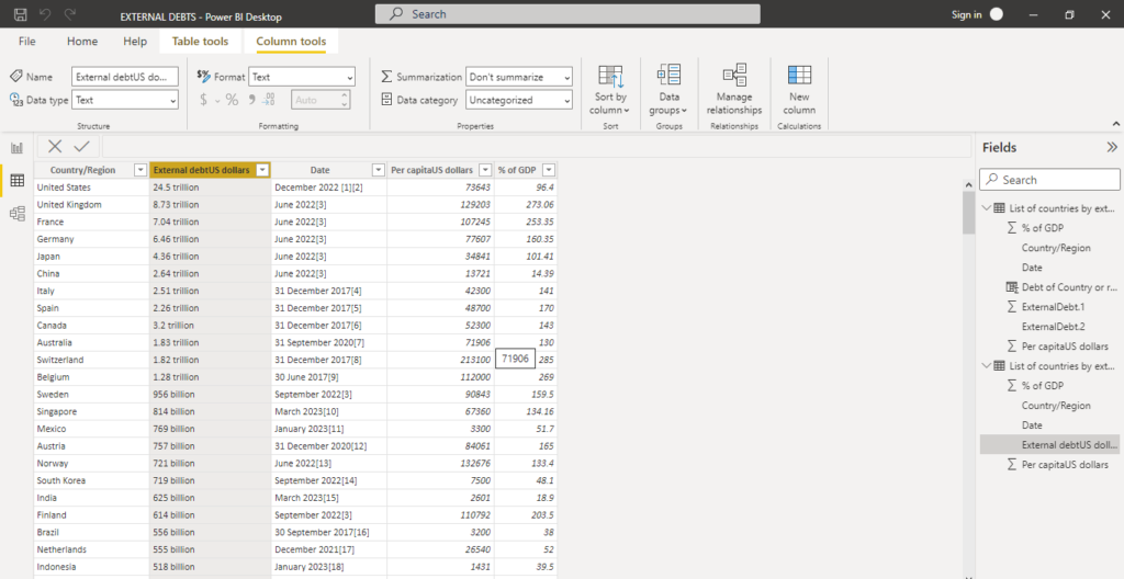
Drag the “Country/Region” and “External Debt” columns into a table visualization.
Sort the table by “External Debt” in descending order.
You can create additional visualizations like a map or a treemap to provide more insights into the data.
Add slicers and filters to allow users to interact with the data. Users can filter the data by specific criteria, such as debt percentage of GDP or per capita debt.
o split the data into two columns in Power BI using a delimiter, you can follow these steps: colum name external debt
Debt of Country or region =
VAR ValueText = CONCATENATE([debt amount], [units])
VAR NumericPart = VALUE(ValueText)
RETURN
    SWITCH(
        TRUE(),
        [units] = "trillion", [debt amount] * 1E+12,
        [units] = "billion", [debt amount] * 1E+9,
        [units] = "million", [debt amount] * 1E+6,
        NumericPart
    )
this will give you value of debts and new column with units of measurement