Mastering Chart Types for Effective Visualization in Data Analytics
Table of Contents
ToggleWhat is data visualization?
Data visualizations are graphical representations of data that help in understanding patterns and trends, identifying correlations between variables, and identifying outliers. This is true even for complex datasets. Visual components like charts, graphs, and maps are utilized to make information more accessible and understood.
Different types of charts and graphs
With so many different types of data visualizations to choose from, it’s important to understand the differences between them. This will help you identify which visualization is ideal for your dataset, allowing you to increase engagement when sharing your data story. Let’s dive in.
Line charts
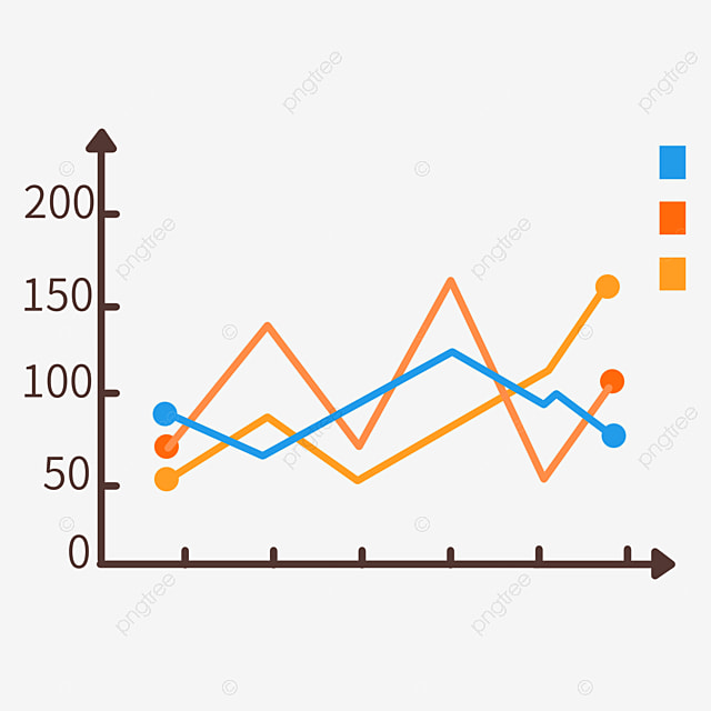
A line chart connects discrete data points using straight lines. Its best application is to highlight trends, patterns, and variable changes.
When to use line charts?
This type of chart is useful for determining how different groups relate to one another. This style of chart is also useful for illustrating progress, making it appropriate for scenarios such as project timeframes, manufacturing cycles, and population expansion.
Best practices for line charts:
- Ensure that the data you’re representing is in a logical order.
- Add context with annotations and labels.
- To improve visibility in a large dataset, utilize transparency or spacing.
Bar charts
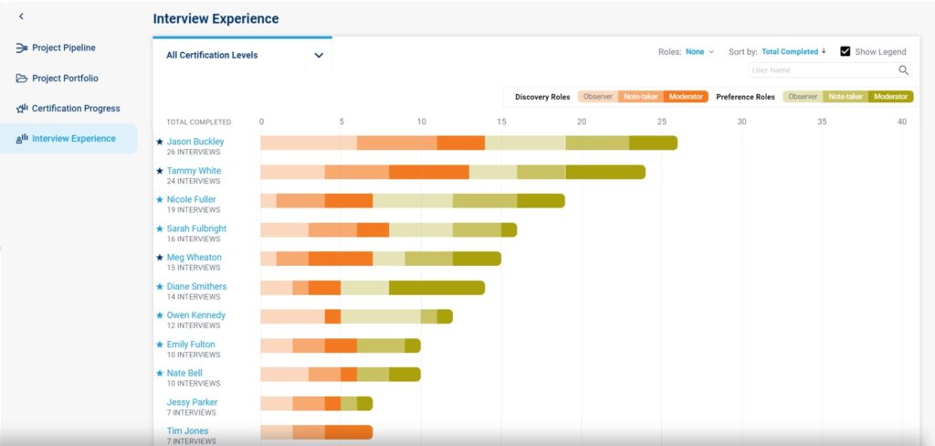
A bar chart visualizes data by utilizing rectangular bars or columns. Here, the length of each bar is according to its value. You can arrange these bars horizontally or vertically. When the text on the x-axis of a vertical bar chart is too long to fit within the display, use a horizontal bar chart instead.
When to use bar charts?
Bar charts are ideal for comparing values across categories or groupings. Aside from that, these sorts of charts are useful for displaying the distribution of data across several categories.
Best practices for bar charts:
- Label each bar and axis with quick labels.
- Limit the number of bars and categories to avoid cognitive overload.
- Use colors to emphasize essential points and express message.
Scatter plots
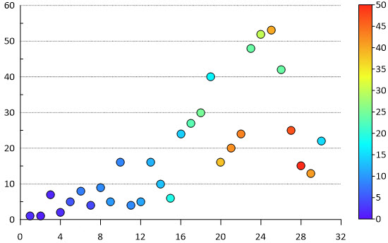
Scatter plots are visualizations that display a set of data points’scattered’ around a graph. The data points may be uniformly or wildly distributed.
When to use scatter plots?
Scatter plots are useful for examining the relationships and patterns between two continuous variables. They can assist you in identifying patterns, correlations, and potential clusters in the data.
Best practices for scatter plots:
- Highlight outliers in the graph in order to show data distribution.
- Use a trendline to show the link between variables.
- Use different colors or marker sizes for overlapping spots.
Pie charts
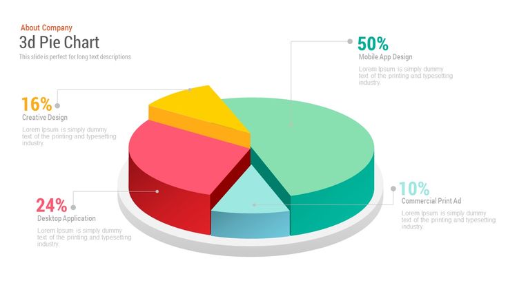
Pie charts are a frequent yet limited style of display. It’s a circular statistical graph that separates data into slices. Each slice indicates a percentage or proportion of the whole.
When to use pie charts?
This standard chart works well when you want to show the proportion of each category in the dataset. However, avoid using these types of visualizations for huge datasets because too many slices might cause confusion. The chart works best with a small number of categories, ideally less than six or seven.
Best practices for pie chart:
- Limit the number of cuts to retain clarity.
- Label each piece with clear text.
- Ensure consistency, so that viewers identify colors with specific categories.
Column charts
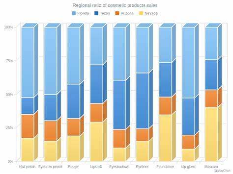
Column charts are the most basic and versatile style of visualization in data analytics. The horizontal chart shows your data as bars proportional to the values they represent.
When to use column charts?
Column charts frequently compare data across categories. They are also useful for displaying rankings and order in a dataset, which allows users to rapidly discover trends.
Best practices for column charts:
- Reduce distracting graphic features, such as 3D effects and excessive gridlines.
- Concentrate on providing crucial data points for improved understanding.
- Use contrasting colors to emphasize key columns.
- Maintain constant axis scaling for accurate interpretation.
Treemap charts
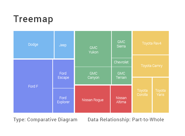
Treemaps are hierarchical visualizations that let you see data as nested rectangles. Treemaps are effective for illustrating categorical and hierarchical relationships since they represent data structure and distribution through rectangles or branches.
When to use treemap charts?
Aside from showing hierarchical data, this type of visualization is useful for illustrating part-to-whole linkages within a dataset, showing how each category contributes to the entire composition.
Best practices for treemap charts:
- Ensure that the rectangle’s size is proportional to that of the category.
- Clearly mark each rectangle with succinct labels.
- To demonstrate changes in data, use a single color in changing tones.
Heatmap charts
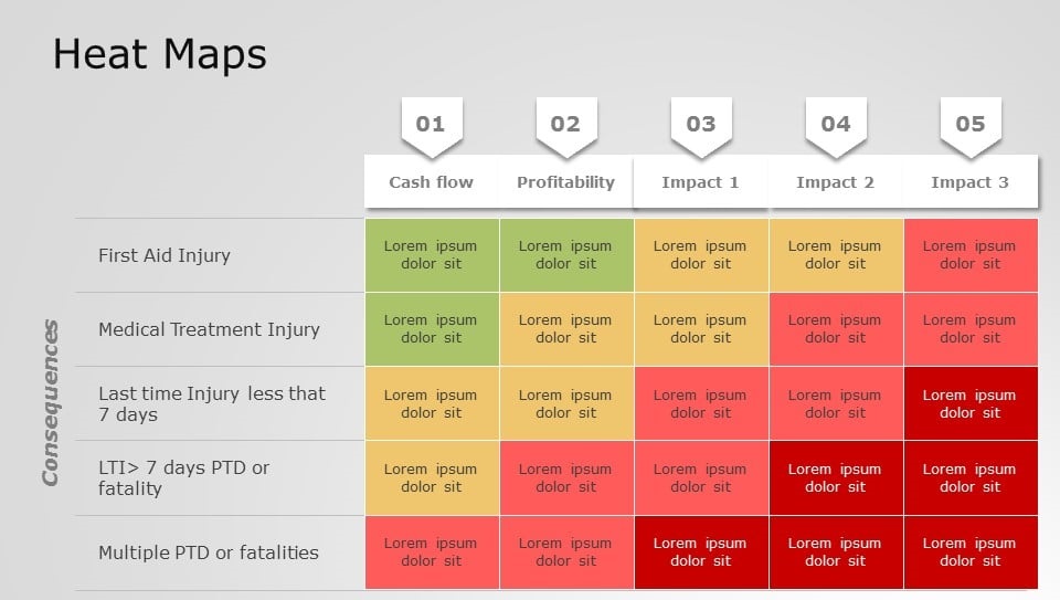
Heatmap charts are a sort of map data visualization that represents value through a color-coding method. Each cell in the matrix is assigned a color depending on the value it contains.
When to use heatmap charts?
A heatmap is widely used to show the correlations between two variables on a grid. In the example above, the intensity of the colors in the map clearly shows the variables, making it simple to recognize trends and patterns.
Best practices for heatmap charts:
- Select an intuitive color palette that effectively communicates the magnitude of values.
- Use visual cues to emphasize noteworthy values on the heatmap.
- Use the design notion of white space to avoid overpopulation.
Pareto charts
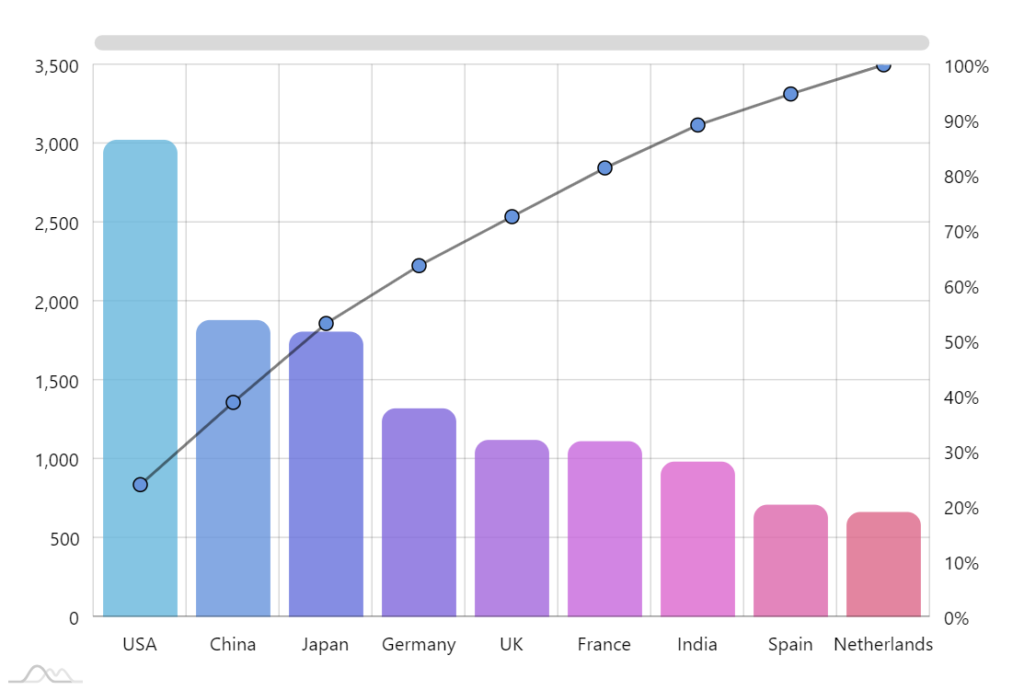
A Pareto chart is a combination of a bar chart and a line graph. The rectangular bars represent individual values in descending order, while the line graph shows the percentage of the overall total. This style of chart follows the well-known Pareto concept, which states that 20% of causes result in 80% of problems.
When to use Pareto charts?
A Pareto chart effectively identifies the primary contributing elements to a specific outcome. A Pareto chart is also useful for highlighting problems based on their impact.
Best practices for Pareto charts:
- Sort the categories in descending order based on frequency, effect, or contribution.
- Use colors strategically to improve clarity.
- Add context by labeling each group clearly and concisely.
Geo charts
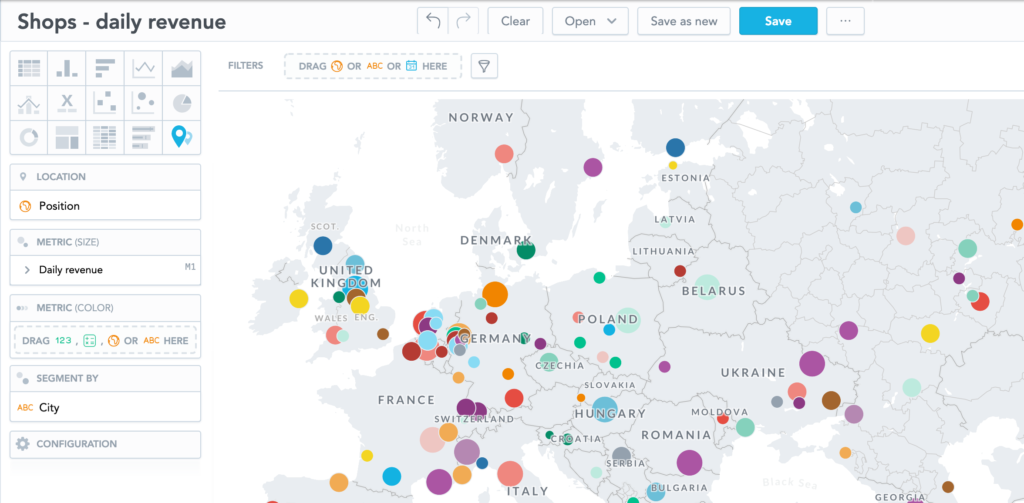
Geo charts are a sort of visualization that shows data on a map. They display spatial data, such as the distribution of values among regions, countries, and states.
When to use geo charts?
As you want to analyze geographic details within your data, these charts can help you find hidden patterns and trends. Each region, such as a country, state, or district, is highlighted or colored according to the magnitude of the variable displayed.
Best practices for geo charts:
- Choose a suitable map projection that matches your region.
- Use color shading to emphasize specific sections.
- Label the projections that represent data points on the map.
Waterfall charts
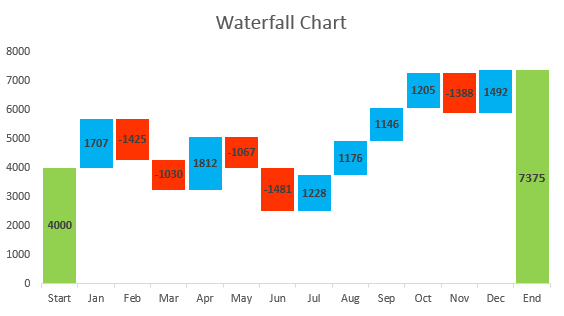
A waterfall chart is a visual story that shows how several elements contribute to a final result. It describes how a series of intermediate positive and negative values influence a beginning value. The waterfall chart is named by its shape, which expresses the effects of cascading.
When to use waterfall chart?
This type of picture aids in communicating the sequential impact of various factors on a total value. The graphic aids in visualizing data changes and understanding value flow.
Best practices for waterfall chart:
- Use labels and color coding to tell the difference between positive and negative changes.
- Maintain uniform scaling along the axis.
- Begin with the original value and then continue by adding contributing factors.
How do you choose the right charts for data visualization?
Choosing the correct charts for data visualization requires a grasp of the data you want to exhibit and the message you want to express. Begin by considering the type of data you have, whether category, numerical, or time-series data. Match the data type to the appropriate chart format, such as bar charts for comparing categories, line charts for trend analysis, and pie charts for displaying proportions. Additionally, consider the audience and the level of detail required; simpler charts may be appropriate for general audiences, but complicated data may necessitate more advanced visualizations such as heatmaps or scatter plots. Experiment with various chart types to determine which one best presents your findings simply and effectively.here are some tips you can follow.
Understand the data: Proceed by analyzing your data’s type (e.g., numerical, categorical), structure, and relationship between variables.
Define Objectives: Clearly state the goals of your visualization. Are you looking to demonstrate trends over time, compare categories, or emphasize correlations between variables?
Know Your Audience: Consider who will be seeing the visualizations. Customize the charts to reflect the audience’s level of experience, preferences, and the insights they require from the data.
Choose Appropriate Chart Types: Choose chart types that best portray your data and are consistent with your aims. The most common chart types are:
=> Bar charts are useful for comparing categories and illustrating changes over time.
=> Line charts are ideal for depicting trends and patterns over time.
=> Pie charts are useful for representing sections of a total or percentages.
=> Scatter plots are useful for demonstrating links and correlations between variables.
=> Heatmaps are useful for visualizing complex data sets or identifying patterns in vast datasets.
Focus on Clarity: Prioritize clarity and simplicity in your visualizations. Avoid cluttered charts, unnecessary embellishments, and confusing labeling that could obscure the message.
