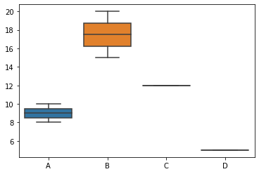
Seaborn is a powerful Python data visualization package based on Matplotlib. It is created specifically for data analytics and is especially beneficial for making attractive and instructive statistical visuals. Seaborn has a high-level interface for constructing several types of plots, making it simple to build visualizations for studying and analyzing your data.
Table of Contents
ToggleSeaborn provides a concise and expressive API to create complex visualizations with just a few lines of code. It simplifies the process of creating common statistical plots, such as scatter plots, bar plots, histograms, box plots, violin plots, etc.
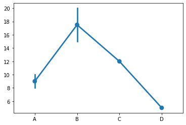
Seaborn comes with built-in functions for visualizing statistical relationships and distributions in your data. It allows you to create informative plots like regression plots, distribution plots, joint plots, pair plots, and more.
Seaborn enhances the visual appeal of plots by providing attractive default styles and color palettes. This saves you time and effort in fine-tuning the appearance of your visualizations.
Seaborn integrates seamlessly with Pandas DataFrames, allowing you to plot data directly from your datasets without extensive data manipulation.
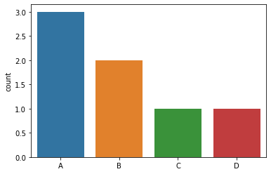
Seaborn handles categorical data well and can automatically adjust the plot aesthetics based on the data’s nature.
import seaborn as sns import matplotlib.pyplot as plt # Sample data x = [1, 2, 3, 4, 5] y = [5, 4, 3, 2, 1] # Create a scatter plot sns.scatterplot(x=x, y=y) # Show the plot plt.show()
import seaborn as sns import matplotlib.pyplot as plt # Sample data x = [1, 2, 3, 4, 5] y = [5, 4, 3, 2, 1] # Create a line plot sns.lineplot(x=x, y=y) # Show the plot plt.show()
import seaborn as sns import matplotlib.pyplot as plt # Sample data x = [1, 2, 3, 4, 5] y = [5, 4, 3, 2, 1] # Create a scatter plot using relplot sns.relplot(x=x, y=y, kind='scatter') # Show the plot plt.show()
Categorical plots in Seaborn are used to visualize the distribution and relationships between categorical variables. They are particularly useful for comparing data across different categories and identifying patterns or trends. Seaborn provides several functions to create categorical plots. Here are some of the key functions for categorical plots:
import seaborn as sns import matplotlib.pyplot as plt # Sample data categories = ['A', 'B', 'C', 'D'] values = [10, 15, 8, 12] # Create a bar plot sns.barplot(x=categories, y=values) # Show the plot plt.show()
import seaborn as sns import matplotlib.pyplot as plt # Sample data categories = ['A', 'B', 'A', 'C', 'A', 'B', 'D'] # Create a count plot sns.countplot(x=categories) # Show the plot plt.show()
import seaborn as sns import matplotlib.pyplot as plt # Sample data categories = ['A', 'B', 'A', 'C', 'B', 'D'] values = [10, 15, 8, 12, 20, 5] # Create a box plot sns.boxplot(x=categories, y=values) # Show the plot plt.show()
import seaborn as sns import matplotlib.pyplot as plt # Sample categories = ['A', 'B', 'A', 'C', 'B', 'D'] values = [10, 15, 8, 12, 20, 5] # Create a point plot sns.pointplot(x=categories, y=values) # Show the plot plt.show()

Time’s up
