Seaborn is a powerful data visualization library built on top of Matplotlib, a widely used Python library for creating plots and graphs. It provides a high-level interface for creating beautiful and informative statistical graphics, making data visualization more accessible and intuitive for Python users.
Here are some of the key advantages of using Seaborn for data visualization:
In summary, Seaborn’s versatility, ease of use, and ability to produce aesthetically pleasing and informative statistical graphics make it an invaluable tool for data scientists, analysts, and anyone who wants to effectively communicate data insights through compelling visualizations.
Table of Contents
Toggle# Load data data = ... # Create a histogram sns.histplot(data['column_name'])
import seaborn as sns
import matplotlib.pyplot as plt
import numpy as np

# Generate some sample data
data = np.random.randn(100)

# Create a list of plot types
plot_types = ['histogram', 'kernel_density', 'violin']

# Iterate through the list of plot types and create the corresponding plots
for plot_type in plot_types:
    if plot_type == 'histogram':
        sns.histplot(data)
        plt.title('Histogram')
        plt.show()
    elif plot_type == 'kernel_density':
        sns.kdeplot(data)
        plt.title('Kernel Density Plot')
        plt.show()
    elif plot_type == 'violin':
        sns.violinplot(x=data)
        plt.title('Violin Plot')
        plt.show()
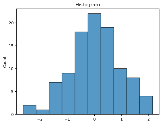
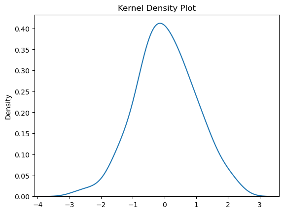
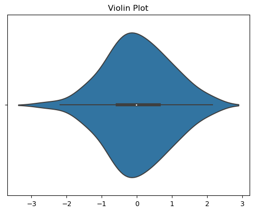
Purpose: To visualize the distribution of a numerical variable by dividing it into bins and counting the number of observations in each bin.
Representation: A bar chart where the x-axis represents the bins and the y-axis represents the frequency or density of observations.
Seaborn Function:
sns.histplot()
Purpose: To estimate the probability density function of a continuous variable by smoothing the histogram.
Representation: A smooth curve that represents the probability density of the data.
Seaborn Function:
sns.kdeplot()
Purpose: To visualize the distribution of a numerical variable across different categories by combining a kernel density plot and a box plot.
Representation: A violin-shaped plot where the width represents the density of observations and the body of the violin shows the distribution.
Seaborn Function:
sns.violinplot()
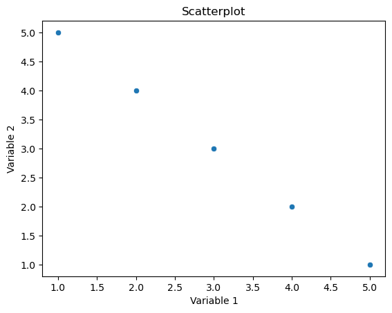
A scatterplot is used to visualize the relationship between two continuous variables. It displays individual data points on a two-dimensional graph, where each point represents a pair of values for the two variables.
Points are scattered on the graph, and the position of each point corresponds to the values of the two variables. The pattern of points can provide insights into the nature and strength of the relationship between the variables (e.g., positive correlation, negative correlation, or no correlation).
In Seaborn, the scatterplot function is commonly used for creating scatterplots.
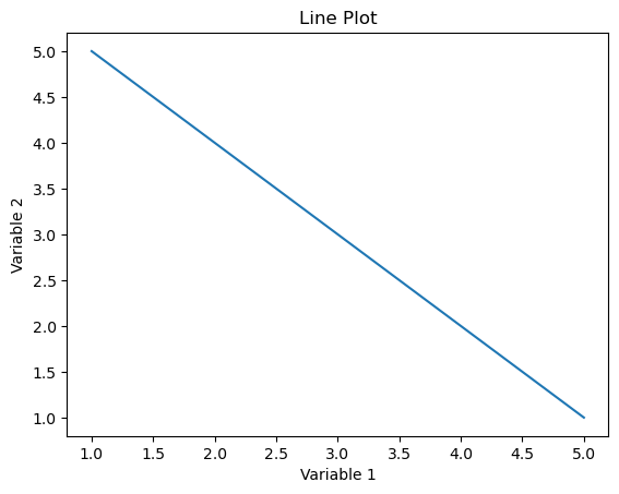
Line plots (or line charts) are used to visualize the trend or pattern of a variable over a continuous interval or time. They are especially useful for displaying changes in a variable’s value over a sequential range.
Representation: A line is drawn connecting points corresponding to the variable’s values. This helps in identifying trends, patterns, or fluctuations in the data.
In Seaborn, the lineplot function is commonly used for creating line plots.
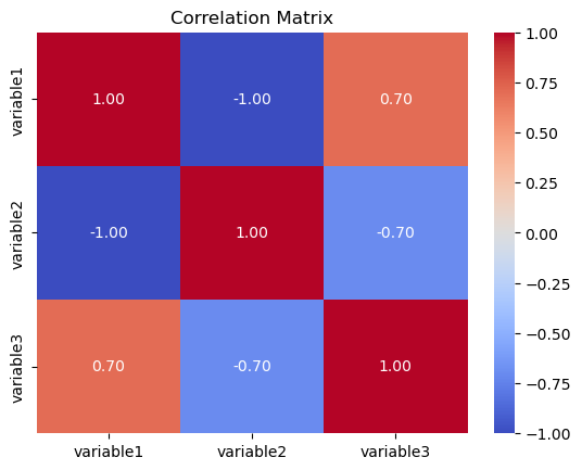
A correlation matrix is used to examine the strength and direction of the linear relationship between multiple variables. It shows pairwise correlations between variables, providing insights into how changes in one variable relate to changes in another.
The matrix is a square grid where each cell represents the correlation coefficient between two variables. Values close to 1 indicate a strong positive correlation, values close to -1 indicate a strong negative correlation, and values close to 0 indicate a weak or no correlation.
In Seaborn, the heatmap function is often used to create a visually appealing representation of the correlation matrix.
import seaborn as sns
import matplotlib.pyplot as plt
import pandas as pd
# Example data
data = {‘variable1’: [1, 2, 3, 4, 5],
        ‘variable2’: [5, 4, 3, 2, 1],
        ‘variable3′: [2, 3, 1, 4, 5]}

df = pd.DataFrame(data)
# Scatterplot
sns.scatterplot(x=’variable1′, y=’variable2’, data=df)
plt.title(‘Scatterplot’)
plt.xlabel(‘Variable 1’)
plt.ylabel(‘Variable 2′)
plt.show()
# Line Plot
sns.lineplot(x=’variable1′, y=’variable2’, data=df)
plt.title(‘Line Plot’)
plt.xlabel(‘Variable 1’)
plt.ylabel(‘Variable 2′)
plt.show()
# Correlation Matrix
correlation_matrix = df.corr()
sns.heatmap(correlation_matrix, annot=True, cmap=’coolwarm’, fmt=”.2f”)
plt.title(‘Correlation Matrix’)
plt.show()
Purpose: To visualize the relationship between two numerical variables.
Representation: A plot where each data point is represented by a dot, with its position determined by its values on the x and y axes.
Seaborn Function:
sns.scatterplot()
Purpose: To visualize the relationship between two numerical variables where one variable is continuous (often time) and the other is continuous.
Seaborn Function:
sns.lineplot()
Purpose: To visualize the correlation between multiple numerical variables.
Representation: A heatmap where the color intensity of each cell represents the correlation coefficient between two variables.
Seaborn Function:
sns.heatmap()
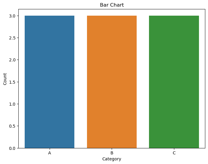
Bar charts are used to display the distribution of a categorical variable by representing the frequencies or proportions of each category.
Categories are shown on one axis (usually the x-axis for vertical bars) and their corresponding frequencies or proportions on the other axis.
The countplot function is commonly used for creating bar charts.
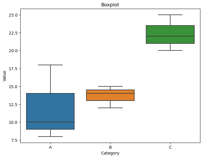
Boxplots (or box-and-whisker plots) are useful for visualizing the distribution of a continuous variable within different categories. They show the median, quartiles, and potential outliers of the data.
A box is drawn representing the interquartile range (IQR), with a line inside indicating the median. Whiskers extend to the minimum and maximum values within a certain range.
The boxplot function can be used for creating boxplots.
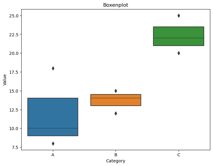
Boxenplots (or letter-value plots) are similar to boxplots but are more detailed, especially for larger datasets. They show additional information about the tails of the distribution.
Similar to boxplots, but with more notches and detailed information about the tails of the distribution.
The boxenplot function is used for creating boxenplots.
import seaborn as sns
import matplotlib.pyplot as plt
import pandas as pd

# Example data
data = {'category': ['A', 'B', 'A', 'C', 'B', 'A', 'C', 'B', 'C'],
        'value': [10, 15, 8, 20, 12, 18, 22, 14, 25]}

df = pd.DataFrame(data)

# Bar Chart
plt.figure(figsize=(8, 6))
sns.countplot(x='category', data=df)
plt.title('Bar Chart')
plt.xlabel('Category')
plt.ylabel('Count')
plt.show()

# Boxplot
plt.figure(figsize=(8, 6))
sns.boxplot(x='category', y='value', data=df)
plt.title('Boxplot')
plt.xlabel('Category')
plt.ylabel('Value')
plt.show()

# Boxenplot
plt.figure(figsize=(8, 6))
sns.boxenplot(x='category', y='value', data=df)
plt.title('Boxenplot')
plt.xlabel('Category')
plt.ylabel('Value')
plt.show()
Purpose: To compare the distribution of a categorical variable across different groups.
Representation: A chart where the height of each bar represents the frequency or count of observations for each category.
Seaborn Function:
sns.countplot() or sns.barplot()
Purpose: To visualize the distribution of a numerical variable across different categories, showing the median, quartiles, and outliers.
Representation: A box with whiskers representing the quartiles and outliers, with a line indicating the median.
Seaborn Function:
sns.boxplot()
Purpose: Similar to boxplots, but better at visualizing distributions with many outliers.
Representation: A boxplot-like visualization with more details about the distribution.
Seaborn Function:
sns.boxenplot()
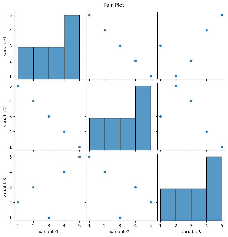
Pair plots are used to visualize pairwise relationships between multiple variables in a dataset. It shows scatterplots for each pair of variables along the diagonal and histograms on the off-diagonal to represent the distribution of each variable.
The diagonal shows the univariate distribution of each variable, and the scatterplots on the lower and upper triangles show bivariate relationships.
Seaborn Function: The pairplot function is commonly used for creating pair plots.
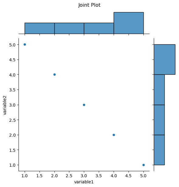
Joint plots are used to visualize the relationship between two variables, including the distribution of each variable and a scatterplot of the two variables.
It combines a scatterplot with histograms along the axes, providing a comprehensive view of the relationship and marginal distributions.
Seaborn Function: The jointplot function is used for creating joint plots.
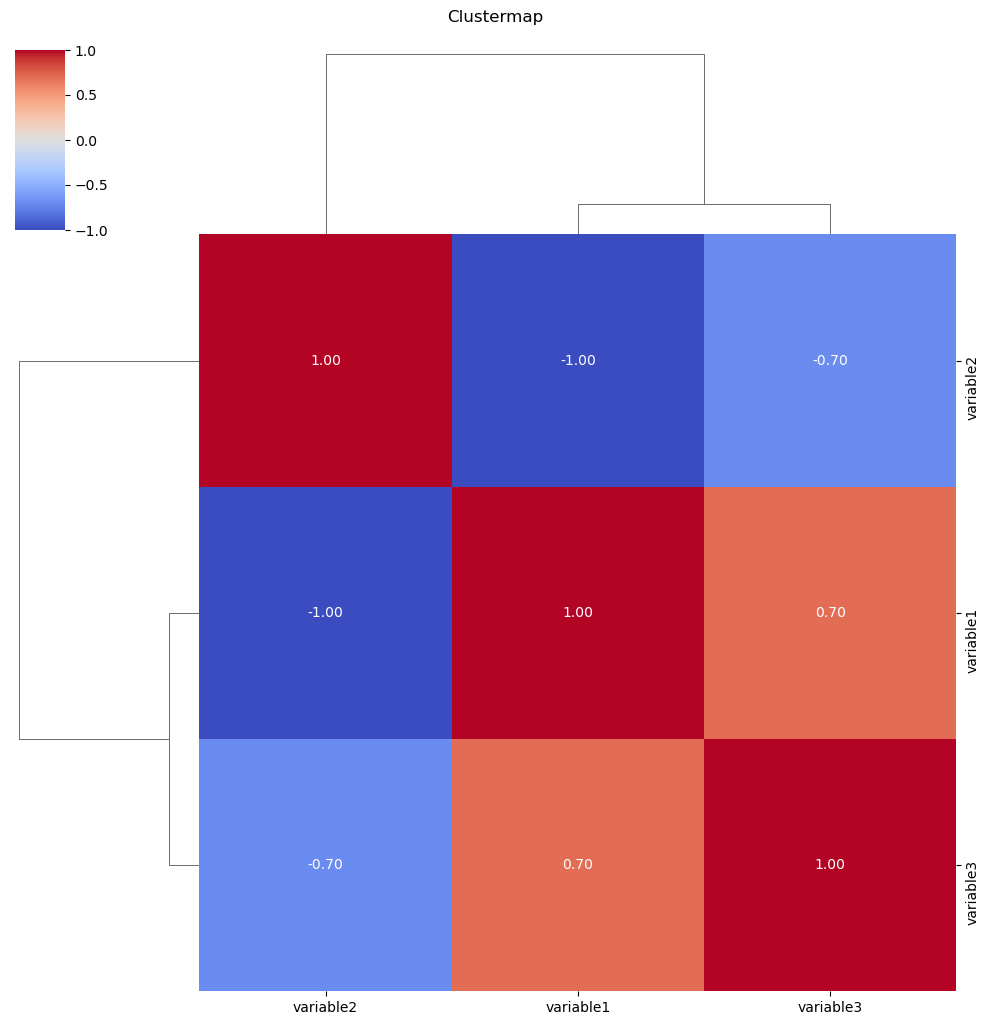
Clustermaps are used to visualize the relationships between variables and cluster them based on similarity. It’s particularly useful for exploring patterns in large datasets
The clustermap arranges variables in rows and columns and colors cells based on the similarity of values. Hierarchical clustering is often applied to group similar variables together.
The clustermap function is used for creating clustermaps.
import seaborn as sns
import matplotlib.pyplot as plt
import pandas as pd

# Example data
data = {‘variable1’: [1, 2, 3, 4, 5],
        ‘variable2’: [5, 4, 3, 2, 1],
        ‘variable3’: [2, 3, 1, 4, 5]}

df = pd.DataFrame(data)

# Pair Plot
plt.figure(figsize=(10, 8))
sns.pairplot(df)
plt.suptitle(‘Pair Plot’, y=1.02)
plt.show()

# Joint Plot
plt.figure(figsize=(8, 6))
sns.jointplot(x=’variable1′, y=’variable2′, data=df, kind=’scatter’)
plt.suptitle(‘Joint Plot’, y=1.02)
plt.show()

# Clustermap
plt.figure(figsize=(8, 6))
sns.clustermap(df.corr(), annot=True, cmap=’coolwarm’, fmt=”.2f”)
plt.suptitle(‘Clustermap’, y=1.02)
plt.show()
Relationship Plots
Purpose: To visualize pairwise relationships between multiple numerical variables.
Representation: A matrix of scatterplots, with histograms or KDE plots on the diagonal.
Seaborn Function: sns.pairplot()
Purpose: To visualize the relationship between two numerical variables, along with their distributions.
Representation: A scatterplot with histograms or KDE plots on the margins.
Seaborn Function:
sns.jointplot()
Purpose: To visualize the hierarchical clustering of observations or variables based on their similarity.
Representation: A heatmap with a dendrogram on top and side.
Seaborn Function:
sns.clustermap()
Seaborn is a Python data visualization library built on top of Matplotlib. It provides a high-level interface for creating attractive and informative statistical graphics.
Seaborn can handle various data types, including numerical, categorical, and time-series data. It excels at visualizing relationships between variables and exploring data distributions.
A histogram is a bar chart representation of the distribution of a numerical variable, while a kernel density plot is a smooth curve that estimates the probability density function of the data.
Violin plots are useful when you want to visualize the distribution of data across multiple categories, and they can reveal more details about the distribution than box plots, especially when there are outliers or multimodal distributions.
You can use the sns.regplot() function to add a linear regression line to a scatterplot.
To create a time series plot, ensure your data has a datetime index and use the sns.lineplot() function with the x parameter set to the datetime column.
the color intensity in a correlation matrix represents the strength of the correlation between two variables. Red indicates a positive correlation, blue indicates a negative correlation, and white indicates no correlation.
use a bar chart when you want to visualize the mean or sum of a numerical variable across different categories. Use a countplot to visualize the frequency of occurrences of each category.
Boxenplots are similar to box plots but provide more details about the distribution, especially when there are many outliers or the distribution is complex.
You can customize the appearance of a pair plot by using the diag_kind and kind parameters to specify the type of plot for the diagonal and off-diagonal elements, respectively.
A clustermap is used to visualize the hierarchical clustering of observations or variables based on their similarity. It helps identify groups or patterns in the data.
