Unlocking the Hidden Mysteries of Data with Seaborn’s Visual Storytelling
Seaborn is a powerful data visualization library built on top of Matplotlib, a widely used Python library for creating plots and graphs. It provides a high-level interface for creating beautiful and informative statistical graphics, making data visualization more accessible and intuitive for Python users.
Here are some of the key advantages of using Seaborn for data visualization:
- Simplified Plot Creation: Seaborn offers a concise and user-friendly interface for generating common statistical plots, reducing the amount of code required compared to Matplotlib.
- Seamless Matplotlib Integration: Seaborn seamlessly integrates with Matplotlib, allowing you to leverage Matplotlib’s extensive customization options while benefiting from Seaborn’s higher-level abstractions.
- Aesthetically Appealing Plots: Seaborn produces visually appealing plots with default styling guidelines that enhance data comprehension and readability.
- Statistical Functions and Tools: Seaborn incorporates statistical functions and tools, such as correlation analysis and linear regression, within the visualization context, facilitating data exploration and understanding.
- Thematic Styling and Consistency: Seaborn provides a variety of themes for consistent styling across plots, ensuring visual coherence and enhancing the overall presentation of your data.
- Faceting and Subplotting: Seaborn supports faceting and subplotting, enabling you to visualize data by subgroups or multiple plots within a single figure, providing a more comprehensive view of your data.
- Statistical Analysis Integration: Seaborn seamlessly integrates statistical analysis with visualization, allowing you to explore and understand data patterns simultaneously, facilitating a deeper understanding of your data.
In summary, Seaborn’s versatility, ease of use, and ability to produce aesthetically pleasing and informative statistical graphics make it an invaluable tool for data scientists, analysts, and anyone who wants to effectively communicate data insights through compelling visualizations.
Getting Started with Seaborn:
- Installation: Install Seaborn using pip: pip install seaborn
- Import Seaborn: Import Seaborn in your Python script: import seaborn as sns
- Explore Data and Create Plots: Use Seaborn functions to explore your data and generate plots:
# Load data
data = ...

# Create a histogram
sns.histplot(data['column_name'])
Univariate Distribution Plots: Histograms, kernel density plots, violin plots
Histograms:
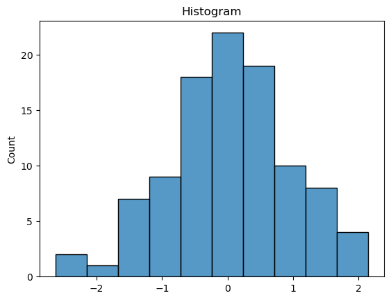
Histograms are bar charts that represent the frequency distribution of a quantitative variable. They divide the data into bins or intervals and count the number of data points that fall within each bin. Histograms provide a visual representation of the data’s distribution, revealing its shape, central tendency, and spread.Kernel Density Plots:
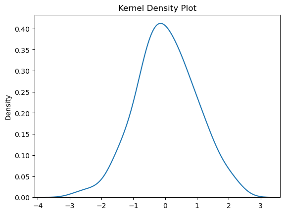
Kernel density plots, also known as density curves, provide a more continuous representation of the data’s distribution compared to histograms. They estimate the probability density function (PDF) of the data using a kernel function, which is a smooth bell-shaped curve. Kernel density plots effectively capture the underlying shape of the data, including its modes, skewness, and kurtosis.Violin Plots:
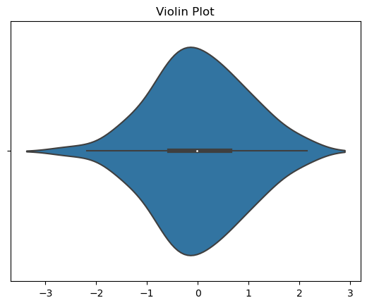
Violin plots combine box plots with kernel density estimates to provide a comprehensive overview of the distribution of a quantitative variable. They display the median, quartiles, and extreme values using a boxplot-like structure, while the kernel density estimate around the boxplot represents the distribution of the data within each quartile. Violin plots are particularly useful for comparing the distributions of a variable across different groups or categories. Choosing the Right Univariate Distribution Plot: The choice of univariate distribution plot depends on the specific characteristics of the data and the desired level of detail.- Histograms: Histograms are suitable for exploring the frequency distribution and identifying potential outliers.
- Kernel Density Plots: Kernel density plots are effective for capturing the overall shape and density of the data, revealing its underlying structure.
- Violin Plots: Violin plots are useful for comparing distributions across groups, providing a combined view of central tendency, spread, and density.
import seaborn as sns
import matplotlib.pyplot as plt
import numpy as np

# Generate some sample data
data = np.random.randn(100)

# Create a list of plot types
plot_types = ['histogram', 'kernel_density', 'violin']

# Iterate through the list of plot types and create the corresponding plots
for plot_type in plot_types:
    if plot_type == 'histogram':
        sns.histplot(data)
        plt.title('Histogram')
        plt.show()
    elif plot_type == 'kernel_density':
        sns.kdeplot(data)
        plt.title('Kernel Density Plot')
        plt.show()
    elif plot_type == 'violin':
        sns.violinplot(x=data)
        plt.title('Violin Plot')
        plt.show()



Bivariate Relationship Plots: Scatterplots, line plots, correlation matrices
Scatterplots:
Purpose:
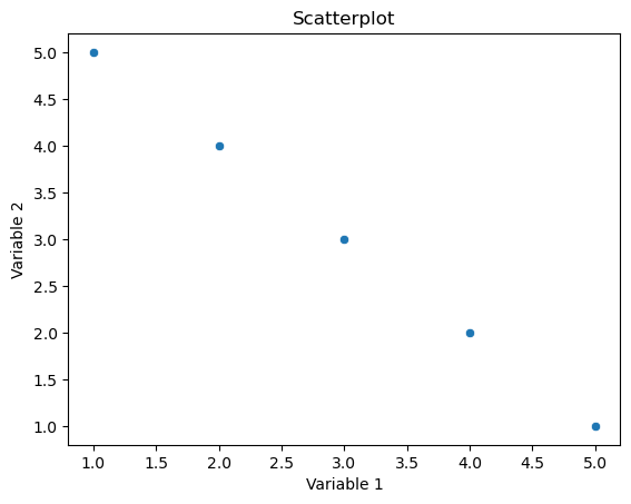
A scatterplot is used to visualize the relationship between two continuous variables. It displays individual data points on a two-dimensional graph, where each point represents a pair of values for the two variables.
Representation:
Points are scattered on the graph, and the position of each point corresponds to the values of the two variables. The pattern of points can provide insights into the nature and strength of the relationship between the variables (e.g., positive correlation, negative correlation, or no correlation).
Seaborn Function:
In Seaborn, the scatterplot function is commonly used for creating scatterplots.
Line Plots:
Purpose:
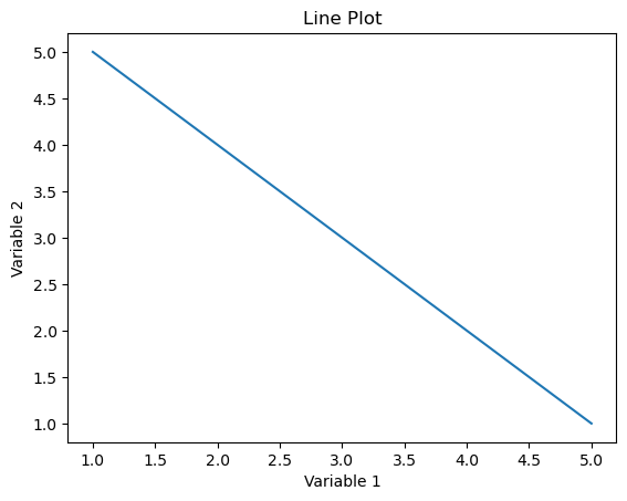
Line plots (or line charts) are used to visualize the trend or pattern of a variable over a continuous interval or time. They are especially useful for displaying changes in a variable’s value over a sequential range.
Representation: A line is drawn connecting points corresponding to the variable’s values. This helps in identifying trends, patterns, or fluctuations in the data.
Seaborn Function:
In Seaborn, the lineplot function is commonly used for creating line plots.
Correlation Matrices:
Purpose:
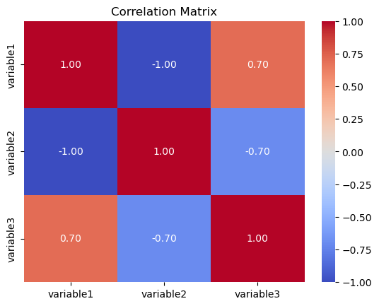
A correlation matrix is used to examine the strength and direction of the linear relationship between multiple variables. It shows pairwise correlations between variables, providing insights into how changes in one variable relate to changes in another.
Representation:
The matrix is a square grid where each cell represents the correlation coefficient between two variables. Values close to 1 indicate a strong positive correlation, values close to -1 indicate a strong negative correlation, and values close to 0 indicate a weak or no correlation.
Seaborn Function:
In Seaborn, the heatmap function is often used to create a visually appealing representation of the correlation matrix.
import seaborn as sns
import matplotlib.pyplot as plt
import pandas as pd
# Example data
data = {‘variable1’: [1, 2, 3, 4, 5],
        ‘variable2’: [5, 4, 3, 2, 1],
        ‘variable3′: [2, 3, 1, 4, 5]}

df = pd.DataFrame(data)
# Scatterplot
sns.scatterplot(x=’variable1′, y=’variable2’, data=df)
plt.title(‘Scatterplot’)
plt.xlabel(‘Variable 1’)
plt.ylabel(‘Variable 2′)
plt.show()
# Line Plot
sns.lineplot(x=’variable1′, y=’variable2’, data=df)
plt.title(‘Line Plot’)
plt.xlabel(‘Variable 1’)
plt.ylabel(‘Variable 2′)
plt.show()
# Correlation Matrix
correlation_matrix = df.corr()
sns.heatmap(correlation_matrix, annot=True, cmap=’coolwarm’, fmt=”.2f”)
plt.title(‘Correlation Matrix’)
plt.show()



Categorical Data Plots: Bar charts, boxplots, boxenplots
Bar Charts:
Purpose:
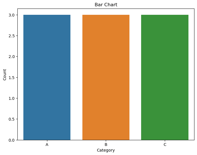
Bar charts are used to display the distribution of a categorical variable by representing the frequencies or proportions of each category.
Representation:
Categories are shown on one axis (usually the x-axis for vertical bars) and their corresponding frequencies or proportions on the other axis.
Seaborn Function:
The countplot function is commonly used for creating bar charts.
Boxplots:
Purpose:
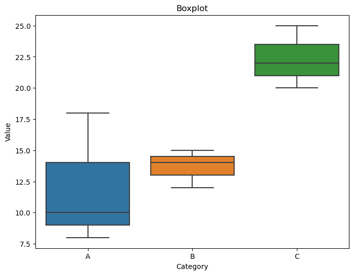
Boxplots (or box-and-whisker plots) are useful for visualizing the distribution of a continuous variable within different categories. They show the median, quartiles, and potential outliers of the data.
Representation:
A box is drawn representing the interquartile range (IQR), with a line inside indicating the median. Whiskers extend to the minimum and maximum values within a certain range.
Seaborn Function:
The boxplot function can be used for creating boxplots.
Boxenplots:
Purpose:
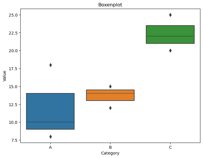
Boxenplots (or letter-value plots) are similar to boxplots but are more detailed, especially for larger datasets. They show additional information about the tails of the distribution.
Representation:
Similar to boxplots, but with more notches and detailed information about the tails of the distribution.
Seaborn Function:
The boxenplot function is used for creating boxenplots.
import seaborn as sns
import matplotlib.pyplot as plt
import pandas as pd

# Example data
data = {'category': ['A', 'B', 'A', 'C', 'B', 'A', 'C', 'B', 'C'],
        'value': [10, 15, 8, 20, 12, 18, 22, 14, 25]}

df = pd.DataFrame(data)

# Bar Chart
plt.figure(figsize=(8, 6))
sns.countplot(x='category', data=df)
plt.title('Bar Chart')
plt.xlabel('Category')
plt.ylabel('Count')
plt.show()

# Boxplot
plt.figure(figsize=(8, 6))
sns.boxplot(x='category', y='value', data=df)
plt.title('Boxplot')
plt.xlabel('Category')
plt.ylabel('Value')
plt.show()

# Boxenplot
plt.figure(figsize=(8, 6))
sns.boxenplot(x='category', y='value', data=df)
plt.title('Boxenplot')
plt.xlabel('Category')
plt.ylabel('Value')
plt.show()



Pair plots, joint plots, clustermaps
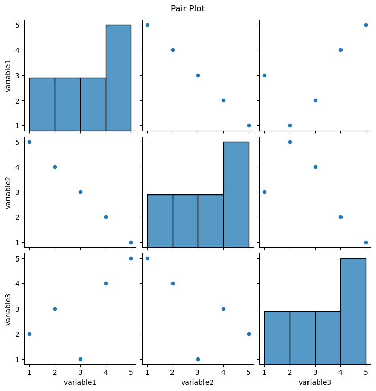
Pair Plots:
Purpose:
Pair plots are used to visualize pairwise relationships between multiple variables in a dataset. It shows scatterplots for each pair of variables along the diagonal and histograms on the off-diagonal to represent the distribution of each variable.
Representation:
The diagonal shows the univariate distribution of each variable, and the scatterplots on the lower and upper triangles show bivariate relationships.
Seaborn Function: The pairplot function is commonly used for creating pair plots.
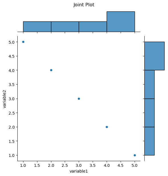
Joint Plots:
Purpose:
Joint plots are used to visualize the relationship between two variables, including the distribution of each variable and a scatterplot of the two variables.
Representation:
It combines a scatterplot with histograms along the axes, providing a comprehensive view of the relationship and marginal distributions.
Seaborn Function: The jointplot function is used for creating joint plots.
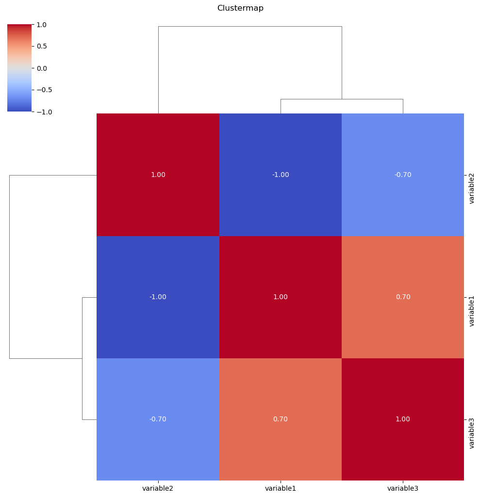
Clustermaps:
Purpose:
Clustermaps are used to visualize the relationships between variables and cluster them based on similarity. It’s particularly useful for exploring patterns in large datasets
.
Representation:
The clustermap arranges variables in rows and columns and colors cells based on the similarity of values. Hierarchical clustering is often applied to group similar variables together.
Seaborn Function:
The clustermap function is used for creating clustermaps.
import seaborn as sns
import matplotlib.pyplot as plt
import pandas as pd

# Example data
data = {‘variable1’: [1, 2, 3, 4, 5],
        ‘variable2’: [5, 4, 3, 2, 1],
        ‘variable3’: [2, 3, 1, 4, 5]}

df = pd.DataFrame(data)

# Pair Plot
plt.figure(figsize=(10, 8))
sns.pairplot(df)
plt.suptitle(‘Pair Plot’, y=1.02)
plt.show()

# Joint Plot
plt.figure(figsize=(8, 6))
sns.jointplot(x=’variable1′, y=’variable2′, data=df, kind=’scatter’)
plt.suptitle(‘Joint Plot’, y=1.02)
plt.show()

# Clustermap
plt.figure(figsize=(8, 6))
sns.clustermap(df.corr(), annot=True, cmap=’coolwarm’, fmt=”.2f”)
plt.suptitle(‘Clustermap’, y=1.02)
plt.show()



The Big Data Revolution with Data Analytics
Big data refers to extremely large and diverse collections of structured, unstructured, and semi-structured data that continue to grow exponentially over time. It is characterized by the three Vs: volume, velocity, and variety. Volume refers to the amount of data, velocity refers to the speed at which data is generated and processed, and variety refers to the different types of data, including structured, semi-structured, and unstructured data. Big data can be analyzed for insights that improve decisions and give confidence for making strategic business moves. Big data can help organizations to identify patterns, trends, and insights that can be used to improve business operations, customer experiences, and decision-making processes. It can also help organizations to identify new opportunities for growth and innovation.
The world is awash in data, and businesses are increasingly recognizing the value of this vast resource. Big data, which refers to the massive and complex datasets that are too large to be processed by traditional methods, holds the key to unlocking new insights and opportunities. Data analytics, the process of extracting meaningful information from big data, is the engine that drives this revolution.
Imagine the world as a vast library, filled with books on every imaginable topic. Each book represents a piece of data, and the library as a whole represents the vast sea of data that exists in our world today. This is what we call “big data.”
But just as a library without librarians would be useless, big data without data analytics would be nothing more than a pile of information. Data analytics is like the librarian, the expert who can sift through the mountains of data, organize it, and extract meaningful insights.
Data Analytics: The Unsung Hero of Our Time
the Supermarket Detective
Imagine you’re a supermarket manager, your store is bustling with activity, and shelves are lined with products. But behind the scenes, you’re facing a challenge: understanding which products are selling well and which ones are just taking up space. That’s where data analytics comes in, acting as your very own supermarket detective.
Data analysts can sift through your sales data, customer behavior, and market trends like a seasoned detective examining clues at a crime scene. They’ll uncover hidden patterns, identify popular items, and predict future demand. With these insights, you can:
- Stock up on the right products, ensuring your customers always have what they’re looking for.
- Avoid overstocking slow-moving items, saving valuable shelf space and reducing inventory costs.
- Make informed pricing decisions, optimizing profits and customer satisfaction.
The Netflix Recommendation Guru
Ever wondered how Netflix knows that romantic comedy you watched last night is exactly the kind of movie you’re in the mood for today? It’s not magic, it’s data analytics, your very own Netflix recommendation guru.
Netflix collects a massive amount of data about your viewing habits, analyzing every pause, rewind, and skip. Data analysts use this information to create a personalized profile of your viewing preferences, like a detective building a psychological profile of a criminal.
- With this profile in hand, they can:
- Recommend movies and shows that align with your tastes and interests.
- Suggest new genres and hidden gems you might not have discovered on your own.
- Keep you engaged and entertained, increasing your satisfaction and loyalty to Netflix.
The Fraud-Fighting Bank
In the world of finance, fraudsters are like cunning spies, constantly trying to infiltrate and steal money. But data analytics is the ultimate counterintelligence weapon, your very own fraud-fighting bank.
Data analysts can analyze vast amounts of financial transactions, scrutinizing every purchase, transfer, and withdrawal like a detective examining fingerprints at a crime scene. They’ll identify unusual patterns or anomalies that might indicate fraudulent activity.
With these insights, they can:
- Detect fraudulent transactions in real-time, preventing financial losses and protecting customer accounts.
- Identify potential fraudsters and take proactive measures to prevent future attacks.
- Safeguard the integrity of the financial system and build trust among customers.
The Traffic-Taming City Planner
Ever felt trapped in a sea of cars, navigating through a city choked with traffic congestion? Data analytics is the key to untangling this mess, your very own traffic-taming city planner.
Data analysts can analyze traffic patterns, sensor readings, and travel behavior like a detective investigating a complex traffic accident. They’ll identify bottlenecks, optimize traffic signals, and suggest alternative routes.
With these insights, they can:
- Reduce traffic congestion, saving commuters time and fuel.
- Improve travel times, making cities more livable and businesses more accessible.
- Plan for future infrastructure needs, ensuring smooth traffic flow as cities grow.
The Disease-Detecting Doctor
In the fight against disease, data analytics is the ultimate diagnostic tool, your very own disease-detecting doctor.
Doctors can analyze medical records, patient data, and genetic information like a detective examining a patient’s medical history. They’ll identify patterns and correlations that might indicate underlying diseases or potential health risks.
With these insights, they can:
- Diagnose diseases more accurately and efficiently, providing timely and effective treatment.
- Develop personalized treatment plans tailored to each patient’s unique genetic makeup and medical history.
- Predict and prevent potential health risks, promoting preventive care and improving overall health outcomes.
These examples illustrate how data analytics is transforming our lives in countless ways. It’s not just about numbers and spreadsheets; it’s about using data to make a difference, solve problems, and improve the world around us. Data analytics is the detective, the guru, the fraud-fighter, the traffic-tamer, and the disease-detector, working tirelessly behind the scenes to make our lives better.

Data Analytics: A Journey of Discovery
Imagine you’re an archaeologist, uncovering hidden treasures buried beneath layers of dust and time. Data analytics is like your very own archaeological tool, unearthing valuable insights from the vast troves of data that surround us.
In recent years, data analytics has made remarkable strides, opening up new frontiers in understanding and utilizing data. Let’s delve into some of these exciting discoveries and advancements, presented in a way that even the most data-savvy layman can appreciate:
1. XAI: Unlocking the Mysteries of AI Decisions
Have you ever wondered how AI makes its decisions? Sometimes, even the creators of AI models struggle to explain their inner workings. That’s where Explainable AI (XAI) comes in, like a translator bridging the gap between AI and human understanding.
XAI techniques are like having a magnifying glass for AI models, allowing us to see how they arrive at their conclusions. This newfound transparency is crucial for ensuring that AI decisions are fair, unbiased, and accountable.
2. Federated Learning: Keeping Data Privacy in the Spotlight
In today’s data-driven world, privacy concerns are paramount. Federated learning is like a privacy-preserving cloak for data analytics, enabling researchers and organizations to collaborate on training machine learning models without sharing sensitive data.
Imagine multiple hospitals working together to improve disease detection algorithms without sharing their patient records directly. Federated learning makes this possible, allowing researchers to harness the power of collective data while safeguarding individual privacy.
3. Real-Time Analytics: Capturing the Pulse of Data
Data is like a river, constantly flowing and evolving. Real-time analytics is like a dam that captures this dynamic flow, providing insights into data as it happens.
Imagine fraud detection systems that can identify and flag suspicious transactions in real time, saving banks millions of dollars. Or traffic management systems that can adjust traffic signals based on real-time traffic patterns, reducing congestion and improving commute times.
4. Edge Computing: Data Analytics at the Forefront
Edge computing is like bringing the power of data analytics closer to the action, where data is generated. It’s like having a mini data center embedded in devices and sensors, crunching numbers right at the source.
Imagine sensors in industrial machinery analyzing data in real time, predicting equipment failures before they occur. Or smart home devices optimizing energy consumption based on real-time usage patterns.
5. Graph Analytics: Navigating the Complexities of Relationships
Data isn’t always a straightforward list of numbers; it can be a network of interconnected entities, like a tangled web of relationships. Graph analytics is like a powerful microscope for these complex data structures, allowing us to identify patterns and connections that would otherwise remain hidden.
Imagine social media platforms using graph analytics to understand how information spreads and how communities form. Or supply chain managers using graph analytics to optimize logistics and identify potential disruptions.
6. DataOps: Bridging the Divide Between Data and Operations
DataOps is like a bridge connecting data teams, development teams, and operations teams, ensuring that data is seamlessly flowing and being used effectively throughout the organization.
Imagine a company where data is not siloed in isolated departments but is readily accessible and integrated into decision-making processes at all levels. DataOps makes this possible, fostering a culture of collaboration and data-driven decision-making.
7. AutoML: Democratizing Machine Learning
Machine learning has revolutionized many industries, but building and training machine learning models can be complex and time-consuming. AutoML is like a helping hand, making machine learning more accessible to a wider range of users.
Imagine non-experts being able to build and train machine learning models with just a few clicks. AutoML is making this a reality, empowering individuals to harness the power of machine learning without extensive technical expertise.
8. NLP: Decoding the Language of Humans
Data isn’t always numbers and figures; it can be the rich tapestry of human language. Natural Language Processing (NLP) is like a universal translator, enabling computers to understand and process the nuances of human language.
Imagine customer service chatbots that can provide personalized support, understanding the sentiment and intent behind customer queries. Or social media analysis tools that can extract valuable insights from public conversations, revealing trends and opinions.
These new discoveries and advancements in data analytics are just the beginning of an exciting journey. As data continues to grow and evolve, data analytics will play an increasingly crucial role in shaping our world, providing insights that will transform businesses, industries, and society as a whole


the future of data analytics in India from reports:
The Indian Data Analytics Market is Expected to Reach $36.6 Billion by 2027:
According to a report by Market Research Future, the Indian data analytics market is expected to reach $36.6 billion by 2027, growing at a CAGR of 18.7% from 2022 to 2027. This growth is being driven by factors such as the increasing adoption of data-driven decision-making in Indian businesses, the government’s focus on promoting data analytics, and the growing demand for skilled data analytics professionals.
2. The Demand for Data Analytics Professionals in India is Expected to Grow by 35% by 2025:
A report by NASSCOM and SkillsCircle found that the demand for data analytics professionals in India is expected to grow by 35% by 2025. This means that there will be a significant need for data analytics professionals in the coming years.
3. The Indian Government is Actively Promoting Data Analytics:
The Indian government is actively promoting data analytics through initiatives such as the National Data Policy and the National Artificial Intelligence Strategy. These initiatives are aimed at creating a data-driven economy and fostering innovation in the field of data analytics.
4. India’s IT Industry is a Major Driver of Data Analytics Growth:
India’s IT industry is a major driver of data analytics growth. The country has a large pool of skilled IT professionals who are able to develop and implement data analytics solutions.
5. India is Emerging as a Global Data Analytics Hub:
India is emerging as a global data analytics hub, with several data analytics startups emerging in recent years. These startups are developing innovative solutions for various industries, such as healthcare, finance, and retail.
6. India is Focusing on Data Privacy and Security:
The Indian government is taking steps to ensure data privacy and security in the country. The Personal Data Protection Bill (PDP Bill), which is currently under consideration, aims to regulate the collection, use, and storage of personal data.
7. India is Participating in Global Data Analytics Initiatives:
India is actively participating in global data analytics initiatives, such as the Global Partnership on Artificial Intelligence (GPAI) and the Open Data Institute (ODI). This collaboration is helping India to stay up-to-date with the latest advancements in data analytics and share best practices with other countries.
8. Data Analytics is Playing a Crucial Role in India’s COVID-19 Response:
Data analytics is playing a crucial role in India’s COVID-19 response. Data is being used to track the spread of the virus, identify hotspots, and develop targeted interventions.
Overall, India is well-positioned to play a leading role in the future of data analytics. The country’s strong IT industry, growing demand for data analytics professionals, and government initiatives are all creating a favorable environment for the development and adoption of data analytics solutions.
AUTOMATION IN JOBS AND DATA ANALYTICS
Yes, it is true that automation is likely to play an increasing role in data science and analytics in the future. Many data science and analytics tasks, such as data cleaning, data preparation, and feature engineering, can be automated using machine learning and artificial intelligence. This will free up data scientists and analysts to focus on more creative and strategic tasks, such as developing predictive models and generating insights from data.
However, automation is not likely to replace the need for human data scientists and analysts. Data scientists and analysts will still be needed to:
- Understand the business context and objectives of data analytics projects.
- Collect and curate the right data for the project.
- Interpret the results of data analysis and communicate them to stakeholders.
- Develop and implement data governance and privacy policies.
- In addition, data scientists and analysts will need to stay up-to-date on the latest advancements in machine learning and artificial intelligence in order to effectively use these technologies to automate tasks.
Overall, the automation of data science and analytics tasks is likely to have a positive impact on the field. It will free up data scientists and analysts to focus on more strategic tasks, and it will make data analytics more accessible to a wider range of users. However, it is important to remember that automation is not a replacement for human expertise. Data scientists and analysts will still be needed to provide the context, interpretation, and leadership that is essential for successful data analytics projects.
Here are some specific examples of how automation is being used in data science and analytics:
- Data cleaning and preparation: Machine learning algorithms can be used to automatically identify and correct errors in data, such as missing values and outliers.
- Feature engineering: Machine learning algorithms can be used to automatically generate new features from existing data. This can be helpful for improving the performance of predictive models.
- Model development and selection: Machine learning algorithms can be used to automatically develop and select predictive models. This can save time and effort for data scientists and analysts.
- Model deployment and monitoring: Machine learning models can be automatically deployed to production and monitored for performance. This can help to ensure that models are performing as expected and are not generating biased or unfair results.
Overall, automation is a powerful tool that can be used to improve the efficiency and effectiveness of data science and analytics. However, it is important to use automation responsibly and to ensure that it is not used to replace human judgment and expertise.
“Mastering Charts with Matplotlib in Python Data Analytics
Data visualization plays a crucial role in understanding and interpreting complex datasets. Python, with its powerful libraries, provides an excellent environment for data analytics and visualization. One such library, Matplotlib, is a go-to tool for creating a wide variety of charts and plots. In this tutorial, we will explore the fundamentals of Matplotlib and learn how to create and customize different types of charts for effective data analysis.
Why Matplotlib?
Matplotlib is a versatile and widely-used plotting library in the Python ecosystem. Whether you’re a data scientist, analyst, or enthusiast, mastering Matplotlib empowers you to communicate insights visually. From simple line plots to sophisticated 3D visualizations, Matplotlib has you covered.
Exploring Line Plots with Matplotlib
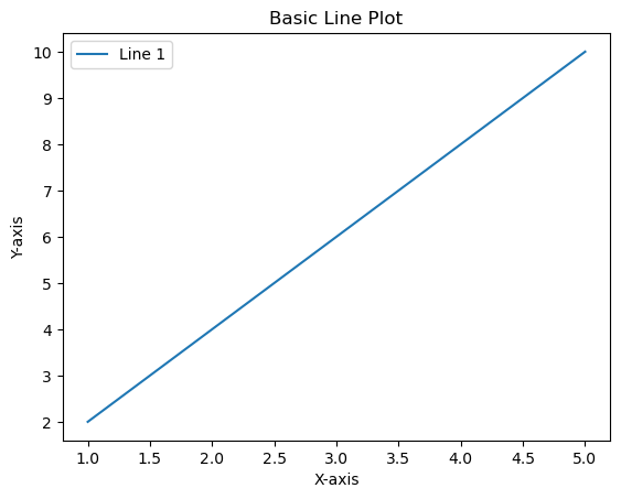
Basic Line Plot:
import matplotlib.pyplot as plt

# Sample data
x = [1, 2, 3, 4, 5]
y = [2, 4, 6, 8, 10]

# Basic Line Plot
plt.plot(x, y, label='Line 1')

# Customize the plot
plt.title('Basic Line Plot')
plt.xlabel('X-axis')
plt.ylabel('Y-axis')
plt.legend()

# Show the plot
plt.show()
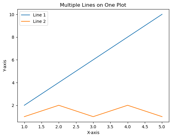
Multiple Lines on One Plot:
import matplotlib.pyplot as plt

# Sample data
x = [1, 2, 3, 4, 5]
y1 = [2, 4, 6, 8, 10]
y2 = [1, 2, 1, 2, 1]

# Multiple Lines on One Plot
plt.plot(x, y1, label='Line 1')
plt.plot(x, y2, label='Line 2')

# Customize the plot
plt.title('Multiple Lines on One Plot')
plt.xlabel('X-axis')
plt.ylabel('Y-axis')
plt.legend()

# Show the plot
plt.show()
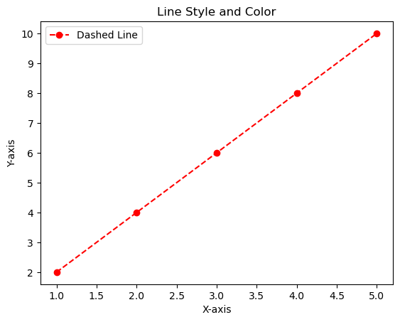
3. Line Style and Color:
import matplotlib.pyplot as plt

# Sample data
x = [1, 2, 3, 4, 5]
y = [2, 4, 6, 8, 10]

# Line Style and Color
plt.plot(x, y, linestyle='--', color='red', marker='o', label='Dashed Line')

# Customize the plot
plt.title('Line Style and Color')
plt.xlabel('X-axis')
plt.ylabel('Y-axis')
plt.legend()

# Show the plot
plt.show()
types of label and marker in line chart
Line Styles:
SOLID LINEplt.plot(x, y, linestyle='-', label='Solid Line')Dashed Line:
plt.plot(x, y, linestyle='--', label='Dashed Line')Dotted Line:
plt.plot(x, y, linestyle=':', label='Dotted Line')Dash-Dot Line:
plt.plot(x, y, linestyle='-.', label='Dash-Dot Line')Line Colors:
plt.plot(x, y, color='red', label='Red Line')Markers Markers indicate specific data points on the line. You can use various markers:
Circle:
plt.plot(x, y, marker='o', label='Circle Marker')
Square:
plt.plot(x, y, marker='s', label='Square Marker')
Triangle Up
plt.plot(x, y, marker='^', label='Triangle Up Marker')



Bar Charts
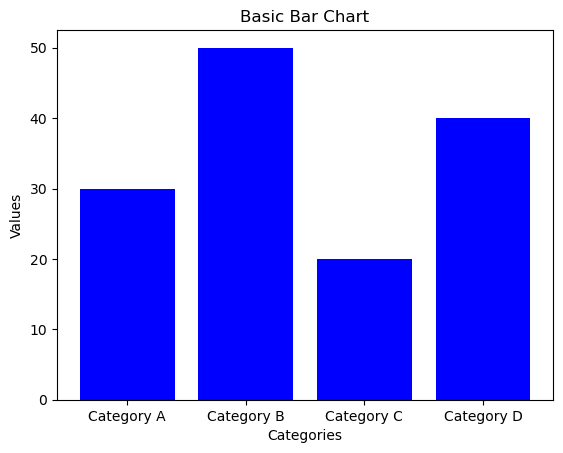
Basic Bar Chart:
import matplotlib.pyplot as plt

# Sample data
categories = ['Category A', 'Category B', 'Category C', 'Category D']
values = [30, 50, 20, 40]

# Basic Bar Chart
plt.bar(categories, values, color='blue')

# Customize the plot
plt.title('Basic Bar Chart')
plt.xlabel('Categories')
plt.ylabel('Values')

# Show the plot
plt.show()
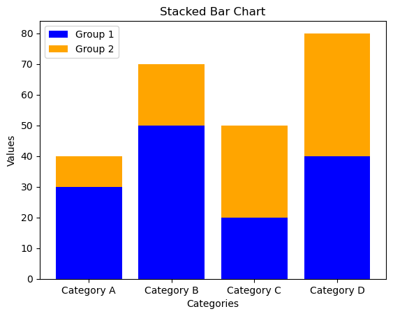
Stacked Bar Chart:
import matplotlib.pyplot as plt

# Sample data
categories = ['Category A', 'Category B', 'Category C', 'Category D']
values1 = [30, 50, 20, 40]
values2 = [10, 20, 30, 40]

# Stacked Bar Chart
plt.bar(categories, values1, color='blue', label='Group 1')
plt.bar(categories, values2, bottom=values1, color='orange', label='Group 2')

# Customize the plot
plt.title('Stacked Bar Chart')
plt.xlabel('Categories')
plt.ylabel('Values')
plt.legend()

# Show the plot
plt.show()
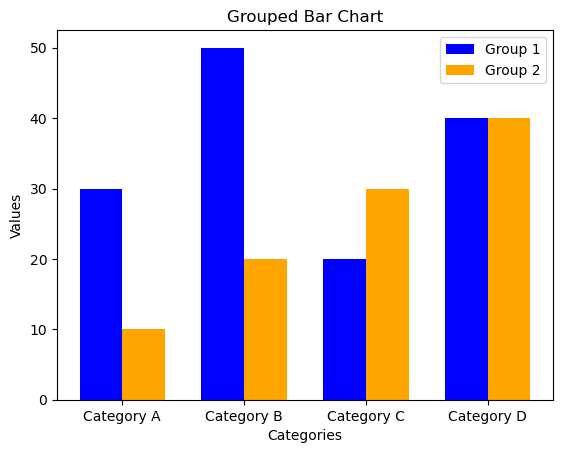
Group bar chart
import numpy as np
import matplotlib.pyplot as plt

# Sample data
categories = ['Category A', 'Category B', 'Category C', 'Category D']
values1 = [30, 50, 20, 40]
values2 = [10, 20, 30, 40]

# Grouped Bar Chart
bar_width = 0.35  # Width of each bar
index = np.arange(len(categories))  # Generating an array of evenly spaced values representing the categories

# Creating the first set of bars (Group 1)
plt.bar(index, values1, width=bar_width, color='blue', label='Group 1')

# Creating the second set of bars (Group 2), shifted to the right by bar_width
plt.bar(index + bar_width, values2, width=bar_width, color='orange', label='Group 2')

# Customize the plot
plt.title('Grouped Bar Chart')
plt.xlabel('Categories')
plt.ylabel('Values')
plt.xticks(index + bar_width / 2, categories)  # Setting the x-axis ticks at the center of each group
plt.legend()  # Displaying the legend

# Show the plot
plt.show()



Creating Grouped Bar Chart:
plt.bar(index, values1, width=bar_width, color=’blue’, label=’Group 1′): Creates the first set of bars (Group 1).
plt.bar(index + bar_width, values2, width=bar_width, color=’orange’, label=’Group 2′): Creates the second set of bars (Group 2), shifted to the right by bar_width
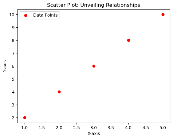
Scatter Plots: Unveiling Relationships
import matplotlib.pyplot as plt

# Sample data
x = [1, 2, 3, 4, 5]
y = [2, 4, 6, 8, 10]

# Scatter Plot
plt.scatter(x, y, color='red', marker='o', label='Data Points')

# Customize the plot
plt.title('Scatter Plot: Unveiling Relationships')
plt.xlabel('X-axis')
plt.ylabel('Y-axis')
plt.legend()

# Show the plot
plt.show()

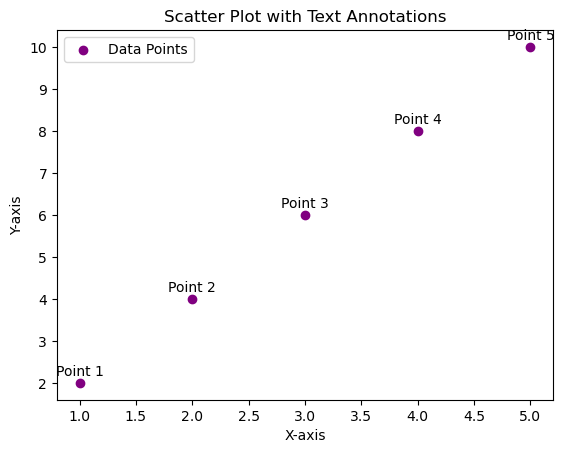
Adding Text Annotations Scatter Plotter
import matplotlib.pyplot as plt

# Sample data
x = [1, 2, 3, 4, 5]
y = [2, 4, 6, 8, 10]
data_labels = ['Point 1', 'Point 2', 'Point 3', 'Point 4', 'Point 5']

# Scatter Plot with Text Annotations
plt.scatter(x, y, color='purple', marker='o', label='Data Points')

# Adding text annotations
for i, label in enumerate(data_labels):
    plt.annotate(label, (x[i], y[i]), textcoords="offset points", xytext=(0,5), ha='center')

# Customize the plot
plt.title('Scatter Plot with Text Annotations')
plt.xlabel('X-axis')
plt.ylabel('Y-axis')
plt.legend()

# Show the plot
plt.show()

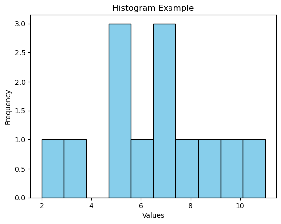
Histrogram
import matplotlib.pyplot as plt
import numpy as np

# Sample data
data = [2, 5, 7, 10, 5, 8, 3, 7, 6, 9, 11, 5, 7]

# Create histogram
plt.hist(data, bins=10, edgecolor='black', color='skyblue')

# Customize the plot
plt.title('Histogram Example')
plt.xlabel('Values')
plt.ylabel('Frequency')

# Show the plot
plt.show()

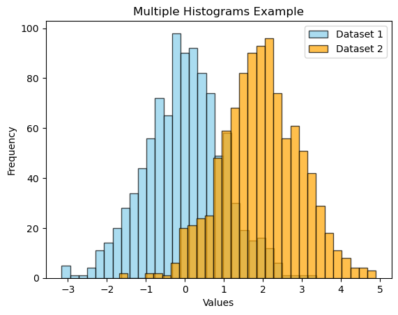
import matplotlib.pyplot as plt
import numpy as np

# Sample data
data1 = np.random.randn(1000)
data2 = np.random.randn(1000) + 2  # Shift the second dataset

# Create multiple histograms
plt.hist(data1, bins=30, edgecolor='black', color='skyblue', alpha=0.7, label='Dataset 1')
plt.hist(data2, bins=30, edgecolor='black', color='orange', alpha=0.7, label='Dataset 2')

# Customize the plot
plt.title('Multiple Histograms Example')
plt.xlabel('Values')
plt.ylabel('Frequency')
plt.legend()

# Show the plot
plt.show()

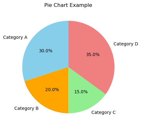
Pie Chart
import matplotlib.pyplot as plt

# Sample data
labels = ['Category A', 'Category B', 'Category C', 'Category D']
sizes = [30, 20, 15, 35]

# Create a pie chart
plt.pie(sizes, labels=labels, autopct='%1.1f%%', startangle=90, colors=['skyblue', 'orange', 'lightgreen', 'lightcoral'])

# Customize the plot
plt.title('Pie Chart Example')

# Show the plot
plt.show() - plt.pie(sizes, labels=labels, autopct=’%1.1f%%’, startangle=90, colors=[‘skyblue’, ‘orange’, ‘lightgreen’, ‘lightcoral’]): This line creates a pie chart. sizes is a list of data values, labels is a list of category labels, autopct adds percentage labels, startangle rotates the pie chart, and colors specifies the color for each category.
- plt.title(‘Pie Chart Example’): Adds a title to the plot.
- plt.show(): Displays the pie chart.

Blox plot
import matplotlib.pyplot as plt

# Dataset
scores = [78, 82, 85, 90, 91, 93, 95, 97, 100, 102, 105, 108]

# Creating the box plot
plt.boxplot(scores)

plt.title(‘Test Scores Box Plot’)
plt.ylabel(‘Scores’)

# Display the plot
plt.show()
8 STEPS TO BECOME DATA ANALYTICS IN DEHRADUN
Embarking on a journey to become a data analytics professional in Dehradun involves a strategic roadmap. Begin by exploring education options, considering reputable institutions or online courses that offer comprehensive data analytics programs. Next, focus on acquiring core skills such as statistical analysis, programming languages like Python or R, and mastering Structured Query Language (SQL) for effective database management. Develop expertise in data visualization tools like Tableau or Power BI to convey insights effectively. Crafting a strong resume that highlights your skills and any relevant experience is crucial. Engage in real-world projects to apply your knowledge practically, and practice interview scenarios to hone your communication skills. Stay updated on industry trends, technologies, and actively network with professionals in Dehradun. This holistic approach ensures a well-rounded preparation for a successful career in data analytics in the vibrant city of Dehradun
Enroll at Vista Academy in Dehradun
“Ready to level up your skills and dive into the world of data? Enroll at Vista, where learning meets excitement! Join a community of learners passionate about turning data into insights. With Vista, it’s not just about classes; it’s about unlocking your potential in a way that makes learning engaging and impactful. Say goodbye to the mundane, and hello to a journey that transforms data into your superpower. Enroll today, and let’s embark on this exciting adventure together!”
Core Skill Mastery
Mastering the core skills for data analytics is like unlocking the superpowers of the digital world. Imagine it as the key to understanding the language of numbers and making them dance to your tune. It’s not about complicated algorithms; it’s about gaining superhero abilities in analyzing patterns, using programming magic like a wizard, and creating visual stories that even a five-year-old could follow. It’s about turning raw data into a captivating narrative that speaks to everyone. So, when we say “core skill mastery,” think of it as your superhero training ground, where you become the data hero the world needs!
Master SQL
Think of mastering SQL like becoming the maestro of a secret data language. It’s not about complicated codes; it’s about having the power to effortlessly talk to databases and make them spill their secrets. Imagine you’re the detective of the digital world, and SQL is your magnifying glass. You learn how to ask questions in a way that databases can’t resist answering. It’s like becoming the Sherlock Holmes of data, solving mysteries with each well-crafted query. So, when we say “Master SQL,” think of it as obtaining the key to unlock the treasure chest of information hidden in databases, making you the ultimate data detective!
Focus on Visualization:
Picture this: becoming a visualization wizard is like transforming dull data into a vibrant, eye-catching story. It’s not about drowning in a sea of numbers; it’s about painting a vivid picture that even your grandma would understand. Imagine turning a spreadsheet into a captivating infographic or a mesmerizing chart that speaks louder than words. Visualization is your artistic palette, and tools like Tableau or Power BI are your brushes. It’s about making data dance, creating visual symphonies that anyone can enjoy. So, when we talk about “Focus on Visualization,” envision yourself as the Picasso of data, turning the ordinary into extraordinary visual tales!
Craft a Strong Resume:
Crafting a strong resume is like creating your own superhero origin story on paper. It’s not about listing every detail; it’s about showcasing your superpowers in a way that leaves a lasting impression. Imagine your resume as the movie trailer for your career, highlighting your achievements and skills with flair. It’s about being the author of your professional narrative, emphasizing your strengths, and captivating the reader from the first glance. So, when we say “Craft a Strong Resume,” think of it as assembling the pieces of your superhero suit – each section a vital element that contributes to your epic career story!
Engage in Projects:
Engaging in projects is like stepping onto the stage of your own data adventure. It’s not about just learning; it’s about putting your skills to the test in the real world. Imagine it as joining a data expedition, where you roll up your sleeves and dive into practical challenges. It’s about applying what you’ve learned in a hands-on, immersive experience. Projects are your journey’s milestones, turning theoretical knowledge into practical expertise. So, when we talk about “Engage in Projects,” picture yourself as the hero of your data story, conquering challenges and gaining valuable experience along the way!
Practice Interviews:
Practicing interviews is like rehearsing for the grand performance of your professional story. It’s not about memorizing answers; it’s about refining your narrative and delivering it with confidence. Imagine it as a friendly sparring match where you polish your communication skills and showcase your data superpowers. It’s about being ready to impress, turning potential challenges into opportunities to shine. So, when we say “Practice Interviews,” envision yourself as the star of your own career show, ensuring that you’re poised, prepared, and ready to dazzle in any interview spotlight!
Continuous Learning and Networking:
Think of continuous learning and networking as the ongoing chapters of your data adventure novel. It’s not about reaching a final destination; it’s about evolving and staying ahead in the ever-changing world of data. Imagine it like having a passport to an endless exploration, where you absorb new knowledge, embrace emerging trends, and connect with fellow data enthusiasts. Networking becomes your treasure map, leading to valuable insights and opportunities. So, when we talk about “Continuous Learning and Networking,” see yourself as the protagonist of an exciting, ever-expanding data saga, always ready for the next thrilling chapter!
Vista Academy stands as a beacon for aspiring data analysts, providing not just education but a transformative journey that nurtures careers. The curriculum is meticulously crafted to develop a well-rounded skill set, encompassing the technical intricacies of statistical analysis and programming, alongside essential soft skills crucial for thriving in professional environments. The hands-on approach distinguishes Vista, where theoretical knowledge is immediately applied to real-world projects, ensuring that graduates are not just adept in theory but possess practical expertise.
What sets Vista apart is its commitment to career preparation. Mock interviews and resume building workshops are integral components, aimed at instilling confidence and refining communication skills. This meticulous attention to interview readiness prepares individuals for the competitive job market. Vista’s culture of continuous learning is more than a mantra; it’s a commitment to staying abreast of industry trends and fostering adaptability. This emphasis on lifelong learning is vital in a rapidly evolving field like data analytics.
Networking is woven into the fabric of Vista Academy. Whether through collaborative projects or industry events, learners have the opportunity to connect with instructors, peers, and professionals, creating a valuable web of support and mentorship. Additionally, Vista’s career support services extend beyond the classroom, providing guidance and assistance in job placement. In essence, Vista Academy is not merely an educational institution; it is a career catalyst, propelling individuals into the dynamic realm of data analytics with confidence, skill, and a robust professional network.
A Deep Dive into Data Enrichment and Cleaning Techniques Python
Pandas Power Hour: A Deep Dive into Data Enrichment and Cleaning Techniques” sounds like an engaging and informative session for anyone working with data using the Pandas library in Python. In this power hour, you could cover various advanced techniques for enhancing and cleaning datasets using Pandas. Here’s a potential outline for your session
Overview of the importance of Data Enrichment
Data enrichment is a crucial step in the data processing pipeline that involves enhancing and expanding the information in a dataset to improve its quality, depth, and usability. This process is especially important in various industries and applications, and here are some key reasons why data enrichment is essential:
Enhanced Data Quality:
Data enrichment helps in filling gaps and correcting errors in datasets, improving overall data accuracy and reliability.
It allows for the validation and verification of existing data, ensuring that it is up-to-date and consistent.
Improved Decision-Making:
Enriched data provides a more comprehensive view of the entities represented in the dataset, enabling better-informed decision-making.
Decision-makers can have more confidence in their analyses when working with enriched data, as it is likely to be more complete and accurate.
Increased Relevance and Context:
Enrichment adds context to the data by incorporating additional information such as demographics, geospatial data, or external sources.
This additional context is valuable for gaining a deeper understanding of the data and its implications.
Better Customer Understanding:
In customer-centric industries, data enrichment helps in creating detailed customer profiles by incorporating information such as social media activity, purchasing behavior, and preferences.
This deeper understanding of customers enables businesses to tailor their products, services, and marketing strategies more effectively.
Enhanced Data Relationships:
Enrichment allows for the linking of disparate datasets through common attributes, facilitating the creation of relationships between different pieces of information.
These enhanced relationships enable more complex analyses and a more holistic understanding of the data ecosystem.
Support for Machine Learning and Analytics:
Enriched data serves as a solid foundation for machine learning algorithms and advanced analytics.
The quality and richness of the data directly impact the accuracy and effectiveness of predictive models and analytical insights.
Compliance and Regulatory Requirements:
In certain industries, compliance with regulations and standards necessitates the enrichment of data to meet specific requirements.
Enrichment helps in ensuring that data meets the necessary criteria for legal and regulatory compliance.
Organizations that effectively leverage data enrichment gain a competitive edge by making more informed decisions, understanding their customers better, and adapting to market changes more quickly.
In summary, data enrichment is a critical process that transforms raw data into a valuable asset. By improving data quality, relevance, and context, organizations can derive deeper insights, make more accurate predictions, and ultimately gain a competitive advantage in their respective fields.
Example in Pandas
import pandas as pd


from geopy.geocoders import Nominatim
import random

# Sample dataset for Indian addresses and names
data = {
    'CustomerID': [1, 2, 3, 4],
    'Name': ['Aarav', 'Isha', 'Vikram', 'Priya'],
    'Address': [
        '123 MG Road, Bangalore, Karnataka, India',
        '456 Jubilee Hills, Hyderabad, Telangana, India',
        '789 Connaught Place, New Delhi, Delhi, India',
        '101 Park Street, Kolkata, West Bengal, India'
    ]
}

df = pd.DataFrame(data)

# Function to get geolocation (latitude, longitude) based on address
def get_geolocation(address):
    geolocator = Nominatim(user_agent="enrichment_example")
    location = geolocator.geocode(address)
    if location:
        return location.latitude, location.longitude
    else:
        return None, None

# Enrich the dataset with geolocation data
df['Latitude'], df['Longitude'] = zip(*df['Address'].apply(get_geolocation))

# Display the enriched dataset
print(df)
Importing Necessary Libraries:
import pandas as pd: Imports the Pandas library and gives it the alias ‘pd’ for easier reference. from geopy.geocoders import Nominatim: Imports the Nominatim geocoder from the ‘geopy’ library. This geocoder is used for obtaining geographical information based on addresses. import random: Imports the random module, though it’s not used in this specific script.Creating a Sample Dataset:
data: Defines a dictionary containing sample data for a DataFrame. The data includes customer IDs, names, and addresses.Creating a Pandas DataFrame:
df = pd.DataFrame(data): Creates a Pandas DataFrame using the provided data dictionary.Defining a Function to Get Geolocation:
get_geolocation: Defines a function that takes an address as input and uses the Nominatim geocoder to obtain latitude and longitude information. If the geocoding is successful, the function returns the latitude and longitude; otherwise, it returns None, None.Enriching the Dataset with Geolocation Data:
df[‘Latitude’], df[‘Longitude’] = zip(*df[‘Address’].apply(get_geolocation)): Applies the get_geolocation function to each address in the ‘Address’ column of the DataFrame. The resulting latitude and longitude values are added as new columns (‘Latitude’ and ‘Longitude’) to the DataFrame.Displaying the Enriched Dataset:
print(df): Prints the final DataFrame with the original columns (‘CustomerID’, ‘Name’, ‘Address’) and the newly added columns (‘Latitude’ and ‘Longitude’). In summary, this script demonstrates a simple example of data enrichment, where geolocation information (latitude and longitude) is added to a dataset containing customer names and addresses using the ‘geopy’ library and Pandas. The final DataFrame includes the enriched data, which can be useful for various spatial analyses or visualizations. CustomerID Name Address \
0 1 Aarav 123 MG Road, Bangalore, Karnataka, India
1 2 Isha 456 Jubilee Hills, Hyderabad, Telangana, India
2 3 Vikram 789 Connaught Place, New Delhi, Delhi, India
3 4 Priya 101 Park Street, Kolkata, West Bengal, India
Latitude Longitude
0 12.976609 77.599509
1 17.430836 78.410288
2 28.631402 77.219379
3 22.548881 88.358485 Merging, Concatenating, and Reshaping Data for Data Enrichment
A. Merging and Joining:
Demonstration of Different Types of Joins:
- Inner Join: Combines only the common rows between two datasets.
Outer Join (Full Outer Join): Combines all rows from both datasets, filling in missing values where there are no matches. - Left Join (Left Outer Join): Includes all rows from the left dataset and matching rows from the right dataset.
- Right Join (Right Outer Join): Includes all rows from the right dataset and matching rows from the left dataset.
Handling Common Merging Challenges:
- Duplicate Key Values: Addressing situations where key values are duplicated in one or both datasets.
- Suffixes and Prefixes: Dealing with column name conflicts during merging.
Multiple Key Columns: Merging based on multiple columns.
B. Concatenation:
- Combining Datasets Along Rows and Columns
- Concatenating Along Rows (axis=0): Stacking datasets vertically.
- Concatenating Along Columns (axis=1): Joining datasets side by side.
- Using pd.concat() Function: Exploring the parameters and options of the pd.concat() function.
Use Cases for Concatenation:
- Combining Data from Multiple Sources: Concatenating datasets with similar structures.
- Time Series Data: Concatenating datasets with time-related information.
Adding New Columns: Concatenating datasets to add new features.
C. Reshaping Data:
Pivoting and Melting for Reshaping Data:
- Pivoting: Changing the shape of the DataFrame by rotating it.
- Melting: Unpivoting a DataFrame, converting it from wide to long format.
Practical Examples of Reshaping for Analysis:
- Pivoting for Summary Statistics: Creating summary tables for analysis.
- Melting for Long-Form Analysis: Transforming data for specific analytical tools or visualization libraries.
- Dealing with Multi-level Indexes: Handling hierarchical index structures resulting from reshaping operations.
By exploring these techniques and examples, participants can gain a solid understanding of how to manipulate and enrich their datasets using Pandas, making their data more suitable for various analytical tasks. Hands-on exercises and real-world examples can enhance the learning experience and help participants apply these techniques in their own projects
import pandas as pd

# Sample data for merging and joining
data1 = {'ID': [1, 2, 3], 'Name': ['Alice', 'Bob', 'Charlie']}
data2 = {'ID': [2, 3, 4], 'Age': [25, 30, 22]}

df1 = pd.DataFrame(data1)
df2 = pd.DataFrame(data2)

# A. Merging and Joining
# 1. Different types of joins
inner_join = pd.merge(df1, df2, on='ID', how='inner')
outer_join = pd.merge(df1, df2, on='ID', how='outer')
left_join = pd.merge(df1, df2, on='ID', how='left')
right_join = pd.merge(df1, df2, on='ID', how='right')

# 2. Handling common merging challenges
data3 = {'ID': [1, 2, 2], 'Salary': [50000, 60000, 55000]}
df3 = pd.DataFrame(data3)

merged_with_duplicates = pd.merge(df1, df3, on='ID')  # Handles duplicate key values

# B. Concatenation
# 1. Combining datasets along rows and columns
concatenated_rows = pd.concat([df1, df2], axis=0)
concatenated_columns = pd.concat([df1, df2], axis=1)

# 2. Use cases for concatenation
data4 = {'ID': [5, 6], 'Name': ['Eve', 'Frank']}
df4 = pd.DataFrame(data4)

concatenated_multiple_sources = pd.concat([df1, df2, df4], axis=0)  # Combining data from multiple sources

# C. Reshaping Data
# 1. Pivoting and Melting
wide_data = {'ID': [1, 2, 3], 'Subject1': [90, 85, 92], 'Subject2': [78, 88, 95]}
df_wide = pd.DataFrame(wide_data)

pivoted_data = df_wide.pivot(index='ID', columns='Subject1', values='Subject2')  # Pivoting

df_wide_melted = pd.melt(df_wide, id_vars='ID', var_name='Subject', value_name='Score')  # Melting

# Displaying the results
print("Inner Join:\n", inner_join)
print("\nOuter Join:\n", outer_join)
print("\nLeft Join:\n", left_join)
print("\nRight Join:\n", right_join)
print("\nMerged with Duplicates:\n", merged_with_duplicates)

print("\nConcatenated Rows:\n", concatenated_rows)
print("\nConcatenated Columns:\n", concatenated_columns)
print("\nConcatenated Multiple Sources:\n", concatenated_multiple_sources)

print("\nPivoted Data:\n", pivoted_data)
print("\nMelted Data:\n", df_wide_melted)
Inner Join:
ID Name Age
0 2 Bob 25
1 3 Charlie 30
Outer Join:
ID Name Age
0 1 Alice NaN
1 2 Bob 25.0
2 3 Charlie 30.0
3 4 NaN 22.0
Left Join:
ID Name Age
0 1 Alice NaN
1 2 Bob 25.0
2 3 Charlie 30.0
Right Join:
ID Name Age
0 2 Bob 25
1 3 Charlie 30
2 4 NaN 22
Merged with Duplicates:
ID Name Salary
0 1 Alice 50000
1 2 Bob 60000
2 2 Bob 55000
Concatenated Rows:
ID Name Age
0 1 Alice NaN
1 2 Bob NaN
2 3 Charlie NaN
0 2 NaN 25.0
1 3 NaN 30.0
2 4 NaN 22.0
Concatenated Columns:
ID Name ID Age
0 1 Alice 2 25
1 2 Bob 3 30
2 3 Charlie 4 22
Concatenated Multiple Sources:
ID Name Age
0 1 Alice NaN
1 2 Bob NaN
2 3 Charlie NaN
0 2 NaN 25.0
1 3 NaN 30.0
2 4 NaN 22.0
0 5 Eve NaN
1 6 Frank NaN
Pivoted Data:
Subject1 85 90 92
ID
1 NaN 78.0 NaN
2 88.0 NaN NaN
3 NaN NaN 95.0
Melted Data:
ID Subject Score
0 1 Subject1 90
1 2 Subject1 85
2 3 Subject1 92
3 1 Subject2 78
4 2 Subject2 88
5 3 Subject2 95
Data Cleaning Techniques
Handling Missing Data:
Techniques for Identifying and Handling Missing Values:
import pandas as pd

# Sample DataFrame with missing values
data = {'Name': ['Alice', 'Bob', 'Charlie', None, 'Eve'],
        'Age': [25, None, 30, 22, 35],
        'Salary': [50000, 60000, None, 55000, 70000]}

df = pd.DataFrame(data)

# Identify missing values
missing_values = df.isnull()

# Handling missing values using fillna
df_filled = df.fillna({'Age': df['Age'].mean(), 'Salary': df['Salary'].median()})

# Display the results
print("Original DataFrame:\n", df)
print("\nMissing Values:\n", missing_values)
print("\nDataFrame with Missing Values Handled:\n", df_filled)
Output
Original DataFrame:
       Name   Age   Salary
0    Alice  25.0  50000.0
1      Bob   NaN  60000.0
2  Charlie  30.0      NaN
3     None  22.0  55000.0
4      Eve  35.0  70000.0

Missing Values:
     Name    Age  Salary
0  False  False   False
1  False   True   False
2  False  False    True
3   True  False   False
4  False  False   False

DataFrame with Missing Values Handled:
       Name   Age   Salary
0    Alice  25.0  50000.0
1      Bob  28.0  60000.0
2  Charlie  30.0  57500.0
3     None  22.0  55000.0
4      Eve  35.0  70000.0
Imputation Methods and Their Pros and Cons:
# Imputation methods: Mean, Median, and Forward Fill
mean_imputation = df.fillna(df.mean())
median_imputation = df.fillna(df.median())
forward_fill = df.ffill()

# Display the results
print("\nMean Imputation:\n", mean_imputation)
print("\nMedian Imputation:\n", median_imputation)
print("\nForward Fill:\n", forward_fill)
output
Mean Imputation:
       Name   Age   Salary
0    Alice  25.0  50000.0
1      Bob  28.0  60000.0
2  Charlie  30.0  58750.0
3     None  22.0  55000.0
4      Eve  35.0  70000.0

Median Imputation:
       Name   Age   Salary
0    Alice  25.0  50000.0
1      Bob  27.5  60000.0
2  Charlie  30.0  57500.0
3     None  22.0  55000.0
4      Eve  35.0  70000.0

Forward Fill:
       Name   Age   Salary
0    Alice  25.0  50000.0
1      Bob  25.0  60000.0
2  Charlie  30.0  60000.0
3  Charlie  22.0  55000.0
4      Eve  35.0  70000.0
Outlier Detection and Treatment:
# Sample DataFrame with outliers
data_outliers = {'Value': [100, 150, 200, 250, 300, 1000]}
df_outliers = pd.DataFrame(data_outliers)

# Identify outliers using z-score
z_scores = (df_outliers - df_outliers.mean()) / df_outliers.std()
outliers = (z_scores > 3) | (z_scores < -3)

# Display the results
print("\nDataFrame with Outliers:\n", df_outliers)
print("\nZ-Scores:\n", z_scores)
print("\nIdentified Outliers:\n", outliers)
Output
DataFrame with Outliers:
    Value
0    100
1    150
2    200
3    250
4    300
5   1000
Data Validation and Quality Checks:
# Sample DataFrames for checking integrity and consistency
df1 = pd.DataFrame({'ID': [1, 2, 3], 'Name': ['Alice', 'Bob', 'Charlie']})
df2 = pd.DataFrame({'ID': [1, 2, 4], 'Age': [25, 30, 22]})

# Check for common values between DataFrames
common_values = pd.merge(df1, df2, on='ID', how='inner')

# Display the results
print("\nDataFrame 1:\n", df1)
print("\nDataFrame 2:\n", df2)
print("\nCommon Values (Data Integrity Check):\n", common_values)
OUTPUT
DataFrame 1:
    ID     Name
0   1    Alice
1   2      Bob
2   3  Charlie

DataFrame 2:
    ID  Age
0   1   25
1   2   30
2   4   22

Common Values (Data Integrity Check):
    ID   Name  Age
0   1  Alice   25
1   2    Bob   30
A Guide to Insert, Update, and Delete Rows in Python Pandas Data Analytics
In the ever-evolving realm of data science, the ability to manipulate and mold data is a fundamental skill. Whether you’re an aspiring data scientist or a seasoned analyst, proficiency in tools like Pandas can make all the difference. Among its many capabilities, Pandas excels at handling tabular data, providing a robust foundation for data manipulation in Python.
This blog aims to delve into the intricacies of efficient data manipulation in Pandas, with a specific focus on inserting, updating, and deleting rows. These operations are the building blocks of data transformation, and mastering them opens the door to a world of possibilities in data analysis and exploration.
So, fasten your seatbelts as we embark on a journey to unravel the secrets of Pandas, exploring techniques that will empower you to wield this powerful tool with finesse. Whether you’re looking to add new insights to your data, update existing records, or clean up unnecessary information, this guide has you covered. Let’s dive into the heart of Pandas and unlock the potential of data manipulation in Python.
import and read in Pandas
import pandas as pd
df=pd.read_excel('E:\JOINS\CUSTOMERDATA.xlsx')
print(df)- import pandas as pd
This line imports the Pandas library and aliases it as pd for brevity. The alias is a common convention in the data science community. - Reading Excel File:
df = pd.read_excel(‘E:\JOINS\CUSTOMERDATA.xlsx’)
Here, you use the pd.read_excel() function to read the contents of an Excel file into a Pandas DataFrame (df). The file path ‘E:\JOINS\CUSTOMERDATA.xlsx’ points to the location of your Excel file. - If your Excel file has multiple sheets, you can specify the sheet name using the sheet_name parameter (e.g., pd.read_excel(‘file.xlsx’, sheet_name=’Sheet1′)).
- Displaying the DataFrame:
- print(df)
This line prints the entire DataFrame to the console. This is useful for quickly inspecting the structure and contents of your data.
Note: If your DataFrame is too large, printing it in its entirety may not be practical. In such cases, you can use df.head() to display the first few rows or specify the number of rows to display.
In summary, your code reads an Excel file into a Pandas DataFrame and then prints the DataFrame to the console, allowing you to inspect the data. If you have any specific questions about the DataFrame or if you’d like to perform certain operations on it, feel free to let me know!
Basic Operator in Pandas
# Displaying the current DataFrame
print(df)

# Selecting Columns
names = df['customer_name']
print("\nSelected 'customer_name' column:\n", names)

# Filtering Data
young_customers = df[df['customer_id'] < 104]
print("\nCustomers with 'customer_id' less than 104:\n", young_customers)

# Sorting Data
sorted_df = df.sort_values(by='customer_name', ascending=False)
print("\nDataFrame sorted by 'customer_name' in descending order:\n", sorted_df)
1.Displaying the DataFrame:
print(df) This prints the entire DataFrame, showing all the rows and columns.2.Selecting Columns:
names = df[‘customer_name’] print(“\nSelected ‘customer_name’ column:\n”, names) It extracts the ‘customer_name’ column from the DataFrame and prints it. names is now a Series containing only the ‘customer_name’ column.3.Filtering Data:
young_customers = df[df[‘customer_id’] < 104] print(“\nCustomers with ‘customer_id’ less than 104:\n”, young_customers) It filters the DataFrame to include only the rows where the ‘customer_id’ is less than 104.4. Sorting Data:
sorted_df = df.sort_values(by=’customer_name’, ascending=False) print(“\nDataFrame sorted by ‘customer_name’ in descending order:\n”, sorted_df) It sorts the DataFrame based on the ‘customer_name’ column in descending order and then prints the sorted DataFrame. Seems like you’re manipulating and exploring your data. Anything specific you’re trying to achieve with this DataFrame? OUTPUT customer_id customer_name customer_email
0 101 Alice alice@example.com
1 102 Bob bob@example.com
2 103 Charlie charlie@example.com
3 104 David david@example.com
4 105 Eve eve@example.com
5 106 Friday Fri@fmail.com
Selected 'customer_name' column:
0 Alice
1 Bob
2 Charlie
3 David
4 Eve
5 Friday
Name: customer_name, dtype: object
Customers with 'customer_id' less than 104:
customer_id customer_name customer_email
0 101 Alice alice@example.com
1 102 Bob bob@example.com
2 103 Charlie charlie@example.com
DataFrame sorted by 'customer_name' in descending order:
customer_id customer_name customer_email
5 106 Friday Fri@fmail.com
4 105 Eve eve@example.com
3 104 David david@example.com
2 103 Charlie charlie@example.com
1 102 Bob bob@example.com
0 101 Alice alice@example.com Adding a new row using loc with label-based indexing
new_data_loc = {'customer_id': 110.0, 'customer_name': 'Grace', 'customer_email': 'grace@example.com'}
df.loc[len(df)] = new_data_loc
new_data_loc
is a dictionary that contains information about a new customer. It has keys such as ‘customer_id’, ‘customer_name’, and ‘customer_email’, along with their respective values.
df.loc[len(df)]
is selecting a specific location within the DataFrame df. len(df) returns the length of the DataFrame, which corresponds to the index where the new row will be added.
df.loc[len(df)] =
new_data_loc assigns the values in the new_data_loc dictionary to the row in the DataFrame at the index position obtained by len(df). This effectively appends a new row to the DataFrame df with the information provided in the new_data_loc dictionary.
So, the code snippet is taking the dictionary new_data_loc and using it to add a new row to the DataFrame df with the information of a customer named Grace.
Adding a new row using iloc with integer-based indexing
new_data_iloc = {'customer_id': 111.0, 'customer_name': 'Harry', 'customer_email': 'harry@example.com'}
df.loc[df.index.max() + 1] = new_data_iloc

# Displaying the updated DataFrame
print(df)
This code is similar to the previous one but uses df.index.max() + 1 to find the next available index for the new row. Here’s a breakdown:
new_data_iloc
is a dictionary containing details about a new customer with keys ‘customer_id’, ‘customer_name’, and ‘customer_email’, each with their respective values.
df.loc[df.index.max() + 1]
locates the row in the DataFrame df at the next available index. df.index.max() returns the maximum index value in the DataFrame, and adding 1 ensures that the new row is added to the next index.
df.loc[df.index.max() + 1]
= new_data_iloc assigns the values from the new_data_iloc dictionary to the row in the DataFrame df at the index position determined by df.index.max() + 1. This effectively appends a new row to the DataFrame df with the information provided in the new_data_iloc dictionary.
The print(df) statement displays the updated DataFrame with the new row added, showing the customer named Harry with the given details.
This code is adding a new row to the DataFrame df with the information of a customer named Harry. The printed output will show the updated DataFrame with this new addition.
Delete row in data frame
df=df[df['customer_id']!=106]
print(df)
This line of code performs a filtering operation on the DataFrame df using a condition to remove rows where the ‘customer_id’ column is equal to 106. Let’s break it down:
df[‘customer_id’] != 106
creates a boolean Series where each row is evaluated to True or False based on whether the ‘customer_id’ for that row is not equal to 106.
df[df[‘customer_id’] != 106]
filters the DataFrame df by selecting only those rows where the condition df[‘customer_id’] != 106 is True. This effectively removes the rows where the ‘customer_id’ is equal to 106 from the DataFrame.
The updated DataFrame is reassigned to the variable df. Now, df contains all the rows where the ‘customer_id’ is not equal to 106.
The result displayed by print(df) will show the DataFrame after removing all rows where the ‘customer_id’ is equal to 106. It filters out those specific rows, leaving only the rows where the ‘customer_id’ is different from 106.
Update row in data frame
df.loc[df['customer_id']==104,'customer_name']='Ramesh'
print(df)
This line of code modifies the ‘customer_name’ in the DataFrame df for the rows where the ‘customer_id’
is equal to 104, setting their ‘customer_name’ to ‘Ramesh’. Let’s break it down:
df[‘customer_id’] == 104
creates a boolean Series that checks each row in the DataFrame to identify where the ‘customer_id’ column is equal to 104.
df.loc[df[‘customer_id’] == 104, ‘customer_name’] = ‘Ramesh’ uses the .loc function to locate rows meeting the condition df[‘customer_id’] == 104. It specifically targets the ‘customer_name’ column and sets the value to ‘Ramesh’ for those rows.
So, this code line updates the ‘customer_name’ to ‘Ramesh’ for all rows in the DataFrame df where the ‘customer_id’ is equal to 104. This operation effectively changes the ‘customer_name’ selectively for rows that meet the specified condition. The printed output via print(df) will display the DataFrame after this modification.
Inserting a New Column
ages = [25, 30, 28, 33, 27,22,21]

# Inserting 'age' column into the DataFrame
df['age'] = ages
To insert a new column ‘age’ in the DataFrame:
Assuming ‘age’ data for each customer
ages = [25, 30, 28, 33, 27]
Inserting ‘age’ column into the DataFrame
df[‘age’] = ages
The code uses this line to add the ‘age’ column to the DataFrame
dfand populates it with the values from theageslist.This operation aligns the ages in the list with the rows of the DataFrame based on their indices. The length of the list should match the number of rows in the DataFrame.
Each age value in the list corresponds to a row in the DataFrame, with the first age (25) being assigned to the first row, the second age (30) to the second row, and so on.
By executing this code, the ‘age’ column will be added to your DataFrame, providing age information aligned with the existing rows of your data.
Deleting a Column:
Deleting columns in a DataFrame is a common operation when you’re working with data in pandas, a popular data manipulation library in Python. You can delete one or more columns using various methods. Here’s how you can do it:
1. Using drop Method
The drop method is versatile and can be used to delete both rows and columns by specifying the axis parameter.
Delete a single column:
import pandas as pd
# Sample DataFrame
df = pd.DataFrame({
‘A’: [1, 2, 3],
‘B’: [4, 5, 6],
‘C’: [7, 8, 9]
})
# Delete column ‘B’
df = df.drop(‘B’, axis=1)
print(df)
2. Using del Keyword
The del keyword is a Python statement that removes an item by its name. It’s straightforward for removing a single column but cannot directly handle multiple columns without a loop or additional logic.
# Delete column 'B'
del df['B']
print(df)
Using pop Method
The pop method removes a column and returns it as a series. This can be useful if you want to use the removed column for something else.
# Remove and return column 'B'
removed_column = df.pop('B')
print(df)
print(removed_column)
Selecting Columns to Keep
Instead of deleting unwanted columns, you can select the columns you want to keep. This is not a direct deletion method but effectively achieves the same result.
# Keep only columns 'A' and 'C'
df = df[['A', 'C']]
print(df)
Mastering Data Analytics with pandas: A Comprehensive Guide to DataFrame Joins
Data analytics is an integral part of any data-driven organization. To extract valuable insights and make data-driven decisions, you often need to combine and analyze data from different sources. One of the essential skills in this domain is mastering the art of DataFrame joins using pandas, a popular Python library for data manipulation and analysis.
In this comprehensive guide, we will dive into the world of DataFrame joins, exploring different types of joins and demonstrating how to perform them with pandas. By the end of this blog, you’ll have a solid understanding of how to leverage pandas to combine, merge, and analyze data effectively.
Introduction to DataFrame Joins
Data analysis frequently involves working with multiple datasets that need to be combined to gain meaningful insights or perform advanced analysis. DataFrame joins are a fundamental technique in data manipulation, especially when using pandas in Python. This introductory section will provide an overview of DataFrame joins, highlighting their importance and the types of joins available.
The Need for DataFrame Joins
In the real world, data often resides in multiple datasets. For example, you may have one dataset containing customer information and another containing their purchase history. To analyze customer behavior or preferences, you need to combine these datasets. This is where DataFrame joins come into play.
DataFrame joins enable you to bring together data from different sources, linking them based on a common attribute, such as a unique identifier, key, or column. The result is a merged dataset that provides a comprehensive view of the information you require for analysis.
Types of DataFrame Joins
There are several types of DataFrame joins, each serving a specific purpose:
Inner Join: This type of join returns only the rows where there is a match in both DataFrames based on the specified key. It filters the data to show only the common elements between the two datasets.
Left Join: A left join includes all rows from the left DataFrame and only the matching rows from the right DataFrame. If there’s no match in the right DataFrame, it still includes the data from the left DataFrame.
Right Join: The right join is the opposite of the left join. It includes all rows from the right DataFrame and the matching rows from the left DataFrame. Non-matching rows from the left DataFrame are excluded.
Outer Join: An outer join combines all rows from both DataFrames. It includes matching rows from both DataFrames and fills in missing values with NaN for columns that don’t have a match.
Practical Use Cases
DataFrame joins are a versatile tool for data analysts and scientists in various industries. Here are some common use cases:
Combining Sales Data: Merge sales transactions with customer information to analyze customer demographics and purchasing behavior.
Matching Employee Records: Join employee data with department data to assign department information to employees for organizational analysis.
Merging Time Series Data: Combine time series data with weather data to analyze the impact of weather on certain events or activities.
Data Enrichment: Augmenting existing data with additional information, such as adding geographical data to customer addresses for mapping and geospatial analysis.
DataFrame joins are an essential skill for data analysts and data scientists, and mastering them allows you to unlock the full potential of your data for informed decision-making. In the following sections of this guide, we will explore each type of join in detail and provide practical examples to help you become proficient in using pandas for data analysis.
sales_data:
- order_id: The order ID for each sale.
- product_id: The ID of the product sold.
- quantity: The quantity of the product sold.
- total_price: The total price for the sale.
customer_data:
- customer_id: The customer’s unique identifier.
- customer_name: The customer’s name.
- customer_email: The customer’s email address.
import pandas as pd

# Read the customer data from the first Excel file


# Read customer data from Excel
customer_data = pd.read_excel(r"E:\JOINS\CUSTOMERDATA.xlsx")
sales_data = pd.read_excel(r"E:\JOINS\SALESDATA.xlsx")

print(customer_data)
print(sales_data)
OUTPUT
   customer_id customer_name       customer_email
0          101         Alice    alice@example.com
1          102           Bob      bob@example.com
2          103       Charlie  charlie@example.com
3          104         David    david@example.com
4          105           Eve      eve@example.com
   order_id  customer_id  quantity  total_price
0         1          101         3          150
1         2          101         2          120
2         3          103         5          250
3         4          103         1           50
4         5          105         4          200
The code you provided will perform a left join on the ‘customer_id’ column in the “customer_data” and “sales_data” DataFrames. Here’s what the code will do:
- It will merge the two DataFrames based on the ‘customer_id’ column.
- Since you specified how=’left’, the result will include all rows from the “customer_data” DataFrame and only the matching rows from the “sales_data” DataFrame. Any unmatched rows from the “customer_data” DataFrame will still be included in the result.
The result will be a new DataFrame containing all the columns from both the “customer_data” and “sales_data” DataFrames, with additional rows where “customer_id” matches between the two DataFrames. If there is no match for a specific ‘customer_id’ in the “sales_data” DataFrame, the corresponding columns for that row in the “sales_data” DataFrame will contain NaN (missing values) in the result.
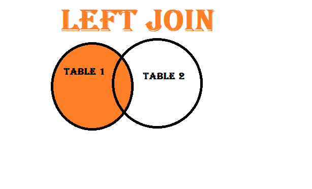

LEFT Join
# Perform a left join on 'customer_id' in customer_data and 'customer_id' in sales_data
result_df = pd.merge(customer_data, sales_data, left_on='customer_id', right_on='customer_id', how='left')

# Display the result
print(result_df)
outcome
   customer_id customer_name       customer_email  order_id  quantity  \
0          101         Alice    alice@example.com       1.0       3.0
1          101         Alice    alice@example.com       2.0       2.0
2          102           Bob      bob@example.com       NaN       NaN
3          103       Charlie  charlie@example.com       3.0       5.0
4          103       Charlie  charlie@example.com       4.0       1.0
5          104         David    david@example.com       NaN       NaN
6          105           Eve      eve@example.com       5.0       4.0

   total_price
0        150.0
1        120.0
2          NaN
3        250.0
4         50.0
5          NaN
6        200.0
The code you provided will perform a left join on the ‘customer_id’ column in the “customer_data” and “sales_data” DataFrames. Here’s what the code will do:
- It will merge the two DataFrames based on the ‘customer_id’ column.
- Since you specified how=’left’, the result will include all rows from the “customer_data” DataFrame and only the matching rows from the “sales_data” DataFrame. Any unmatched rows from the “customer_data” DataFrame will still be included in the result.
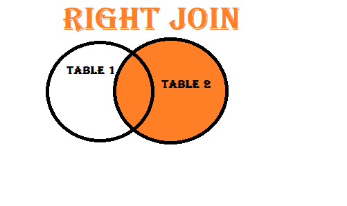

Right join
# Perform a right join on 'customer_id' in customer_data and 'customer_id' in sales_data
result_df = pd.merge(customer_data, sales_data, left_on='customer_id', right_on='customer_id', how='right')

# Display the result
print(result_df)
OUTPUT
   customer_id customer_name       customer_email  order_id  quantity  \
0          101         Alice    alice@example.com         1         3
1          101         Alice    alice@example.com         2         2
2          103       Charlie  charlie@example.com         3         5
3          103       Charlie  charlie@example.com         4         1
4          105           Eve      eve@example.com         5         4

   total_price
0          150
1          120
2          250
3           50
4          200
The code you provided performs a right join between two DataFrames, customer_data and sales_data, on the ‘customer_id’ column. Here’s an explanation of each part of the code:
- pd.merge(customer_data, sales_data, left_on=’customer_id’, right_on=’customer_id’, how=’right’): This line of code uses the pd.merge() function to perform the right join. Here’s a breakdown of the parameters used:
- customer_data and sales_data are the two DataFrames you want to join.
left_on=’customer_id’ specifies that you want to use the ‘customer_id’ column from the customer_data DataFrame as the key for the left DataFrame.
right_on=’customer_id’ specifies that you want to use the ‘customer_id’ column from the sales_data DataFrame as the key for the right DataFrame. - how=’right’ specifies the type of join, in this case, it’s a right join. This means that all rows from the right DataFrame (sales_data) will be included in the result, and matching rows from the left DataFrame (customer_data) will be included as well.
The result of the merge operation is stored in the result_df DataFrame. - print(result_df): This line of code prints the resulting DataFrame, which is the result of the right join between customer_data and sales_data.
The resulting DataFrame, result_df, will contain all the rows from the sales_data DataFrame and additional columns from the customer_data DataFrame where there is a matching ‘customer_id’. Rows from customer_data that don’t have a matching ‘customer_id’ in sales_data will be included with NaN values in the columns from sales_data.
In summary, this code is performing a right join between customer data and sales data using the ‘customer_id’ column as the key, and the result will include all sales data and associated customer data where applicable.
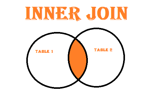

Inner Join
result_df = pd.merge(customer_data, sales_data, on='customer_id', how='inner')

# Display the result
print(result_df)
Output
customer_id customer_name       customer_email  order_id  quantity  \
0          101         Alice    alice@example.com         1         3
1          101         Alice    alice@example.com         2         2
2          103       Charlie  charlie@example.com         3         5
3          103       Charlie  charlie@example.com         4         1
4          105           Eve      eve@example.com         5         4

   total_price
0          150
1          120
2          250
3           50
4          200
- pd.merge(customer_data, sales_data, on=’customer_id’, how=’inner’): This line of code performs an inner join between customer_data and sales_data on the ‘customer_id’ column. The on=’customer_id’ parameter specifies that the ‘customer_id’ column is used as the key for the join, and how=’inner’ specifies that it’s an inner join. This means that only rows with matching ‘customer_id’ values in both DataFrames will be included in the result.
- The result of the inner join is stored in the result_df DataFrame.
- print(result_df): This line of code prints the resulting DataFrame, which contains only the rows with matching ‘customer_id’ values from both customer_data and sales_data.
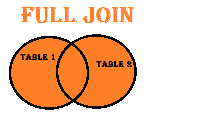

OUTER JOIN
result_df = pd.merge(customer_data, sales_data, on=’customer_id’, how=’outer’)

# Display the result
print(result_df)
output
 customer_id customer_name       customer_email  order_id  quantity  \
0          101         Alice    alice@example.com       1.0       3.0
1          101         Alice    alice@example.com       2.0       2.0
2          102           Bob      bob@example.com       NaN       NaN
3          103       Charlie  charlie@example.com       3.0       5.0
4          103       Charlie  charlie@example.com       4.0       1.0
5          104         David    david@example.com       NaN       NaN
6          105           Eve      eve@example.com       5.0       4.0

   total_price
0        150.0
1        120.0
2          NaN
3        250.0
4         50.0
5          NaN
6        200.0
Mastering OpenCV: Your Ultimate Guide to Computer Vision
Introduction to Computer Vision:
“Imagine if your computer or smartphone could ‘see’ and understand the world around it, just like you do with your eyes. That’s what computer vision is all about. It’s like giving machines the power to recognize and make sense of images and videos.
Think of it as teaching your computer to understand what’s in a picture or a video. For example, it can recognize your face in a photo, spot your pet in a video, or even understand when someone is waving their hand.
But it doesn’t stop there! Computer vision helps self-driving cars ‘see’ the road and avoid obstacles, assists doctors in diagnosing diseases from medical images, and even helps cashiers scan your groceries at the store.
In simple terms, computer vision is like giving computers the ability to ‘see’ and interpret the visual world, just like we humans do. It’s like teaching your computer to be a detective for images and videos, and it’s making our lives more convenient, safe, and fun!”
Importance of computer vision
Computer Vision: How It’s Changing the World
Imagine a world where machines can see and understand their surroundings just like we do. That’s exactly what computer vision is all about, and it’s changing the game across various fields. Here’s a glimpse of its incredible impact:
Saving Lives with Medical Magic: Picture doctors using computer vision to spot diseases in X-rays and MRIs with incredible accuracy. It’s like having a super-smart medical assistant always on hand.
Self-Driving Cars – A Visionary Revolution: Think of self-driving cars as your co-pilot. They “see” the road, detect obstacles, and make lightning-fast decisions to keep you safe. It’s like having a superhero driver who never gets tired.
Retail Therapy and Beyond: The next time you shop online, you might thank computer vision. It helps websites recognize products, making shopping a breeze. In stores, it can even speed up checkout lines – say goodbye to long queues!
Security That Never Sleeps: Ever wonder how security cameras detect intruders or unusual activities? Computer vision is the secret sauce. It’s like having a vigilant digital security guard watching over your home or business 24/7.
Quality Control Secrets: On factory assembly lines, computer vision is the eagle-eyed inspector. It checks products for flaws, ensuring that everything you buy works perfectly. It’s like a quality control superhero with laser-sharp eyes.
Augmented Reality (AR) and Virtual Reality (VR) Adventures: AR and VR are your gateways to immersive experiences. They blend the digital world with reality, all thanks to computer vision. It’s like having a magic portal to new dimensions right in your hands.
Supercharged Farming: Farmers are now equipped with computer vision to monitor crops, detect diseases, and optimize yields. It’s like having a virtual farmer’s helper that ensures your food is the best it can be.
Game On with Entertainment: In the gaming world, computer vision brings characters to life. Imagine your gestures controlling the action in a game – it’s like having your own gaming genie!
Robots that ‘See’ the World: Robots aren’t just mechanical. They’re becoming smart with computer vision, recognizing objects, navigating spaces, and lending a helping hand. It’s like having a trusty robot friend with an impressive sense of sight.
Aid for the Visually Impaired: Computer vision isn’t just about fun and games; it’s also about inclusivity. It helps the visually impaired by reading text, recognizing objects, and providing a helping hand. It’s like a digital guide, making the world more accessible.
In a world increasingly driven by technology, computer vision is the superhero that’s changing the way we live, work, and play. It’s like giving machines the power of sight, and that’s transforming our world in ways we couldn’t have imagined. So, if you’re eager to harness this incredible superpower, mastering tools like OpenCV is your ticket to a world of endless possibilities!
Mention the significance of Open Computer Vision
OpenCV (Open Source Computer Vision Library) is a popular open-source computer vision and machine learning software library that provides a wide range of tools and functions for various image and video processing tasks. OpenCV supports several programming languages, with C++ and Python being the most commonly used ones. Let’s discuss these two primary languages and touch upon some other language bindings:
C++: C++ is the original language of OpenCV and provides high performance and efficiency, making it a preferred choice for applications where real-time image and video processing is crucial. The C++ API is well-documented and is often used for developing complex computer vision applications.
Python: Python is one of the most popular programming languages for data science and machine learning, and OpenCV provides a Python wrapper for its library. This Python binding allows developers to access and use OpenCV’s functionality in a more user-friendly and accessible manner. It’s often the language of choice for quick prototyping and development.
Other programming languages that have some level of support for OpenCV include:
Java: OpenCV has Java bindings, allowing developers to use OpenCV within Java applications. This is useful for Android app development and other Java-based projects.
C#: For .NET developers, OpenCV provides a wrapper for C# as well, making it possible to integrate OpenCV into Windows-based applications.
JavaScript: There are efforts to create JavaScript bindings for OpenCV, enabling web-based computer vision applications.
Ruby: There are Ruby bindings for OpenCV, although they may not be as comprehensive or up-to-date as the primary C++ and Python interfaces.
Go: There are also Go bindings for OpenCV, which allow Go developers to leverage OpenCV’s capabilities.
Area where Open CV is used
Image and Video Processing: OpenCV provides a wide range of functions and algorithms for image and video manipulation, including filtering, feature extraction, object detection, and video analysis.
Object Detection and Recognition: OpenCV is frequently used for object detection, tracking, and recognition in images and videos. It can be applied to tasks like face detection, pedestrian detection, and license plate recognition.
Machine Learning: OpenCV provides support for machine learning, and it can be used for training and implementing machine learning models for tasks like image classification, object detection, and facial recognition.
Medical Imaging: In the field of healthcare, OpenCV is used for medical image analysis, including tasks like tumor detection, image segmentation, and diagnostics.
Robotics: OpenCV is commonly employed in robotics for tasks like object recognition, navigation, and autonomous control.
Augmented Reality (AR) and Virtual Reality (VR): OpenCV is used in AR and VR applications to track and interact with objects in the real world and create immersive experiences.
Autonomous Vehicles: OpenCV plays a vital role in computer vision systems for self-driving cars. It helps with tasks such as lane detection, object recognition, and obstacle avoidance.
Industrial Automation: OpenCV is used in industrial settings for quality control, automation, and robotics. It can inspect products, detect defects, and control manufacturing processes.
Security and Surveillance: OpenCV is employed for security and surveillance applications, including facial recognition, motion detection, and tracking.
Geospatial Imaging: OpenCV can be used in geospatial applications for tasks like satellite image analysis, GIS (Geographic Information Systems), and remote sensing.
Sports Analytics: In sports, OpenCV can analyze player movements and ball trajectories, aiding in performance analysis and coaching.
Artificial Intelligence: OpenCV is integrated with various AI frameworks, making it useful for AI-based applications that involve computer vision, such as image generation and style transfer.
Image and Video Editing: OpenCV is used in software for image and video editing to apply filters, manipulate images, and enhance or modify video content.
Academic and Research: OpenCV is widely used in computer vision research, serving as a foundation for the development of new algorithms and techniques.
Entertainment and Gaming: OpenCV can be used in game development for gesture recognition, virtual reality, and augmented reality experiences.
Agriculture: OpenCV is used for agricultural tasks, such as crop monitoring, pest detection, and yield estimation.
These are just a few examples of the many applications of OpenCV. Its flexibility and extensive set of tools make it a valuable resource for a wide range of computer vision and image processing tasks across various domains.
how to display a image in open computer vision
- Import the necessary OpenCV library.
- Load the image from your file system.
- Display the image in a window.
- Wait for the user to close the window or press a key.
- Here’s a basic example of how to display an image using
import cv2

# Load the image
image = cv2.imread(r'E:\DATA ANALYTICS\dektop\BANNER.png')


cv2.imshow('Your Image', image)

    # Wait for a key press and then close the window
cv2.waitKey(0)
cv2.destroyAllWindows()
The code you’ve provided is a Python script that uses the OpenCV library (cv2) to load an image file and display it in a window. Let me break down the code step by step:
Importing the OpenCV library:import cv2Load the image:
image = cv2.imread(r'E:\DATA ANALYTICS\dektop\BANNER.png')This line loads an image file named “BANNER.png” located at the specified file path (‘E:\DATA ANALYTICS\dektop\BANNER.png’) and stores it in the variable image. The cv2.imread() function reads the image and returns it as a NumPy array. Display the image in a window:
cv2.imshow('Your Image', image)
This line displays the loaded image in a window. The cv2.imshow() function takes two arguments: a window title (‘Your Image’ in this case) and the image itself (stored in the image variable). This will open a window with the specified title and show the image within it.
Wait for a key press:
cv2.waitKey(0)This line pauses the script execution and waits for a key press. The argument 0 passed to cv2.waitKey() means that the program will wait indefinitely until any key is pressed. Once a key is pressed, the program will continue. Close the window:
cv2.destroyAllWindows()After a key is pressed and the program continues, this line closes the image window. The cv2.destroyAllWindows() function closes all OpenCV windows that were opened during the execution of the program. In summary, this code opens and displays the “BANNER.png” image in an OpenCV window, waits for a key press, and then closes the window when a key is pressed, allowing you to view the image and interact with it using the OpenC
Import Video in Python
import cv2

video_capture = cv2.VideoCapture(r'E:\JOINS\fstring.mp4')

if not video_capture.isOpened():
    print("Sorry, there is a problem with the video")
    exit()

while True:
    ret, frame = video_capture.read()
    if not ret:
        break

    cv2.imshow('Video', frame)  # Move this line inside the loop

    if cv2.waitKey(1) & 0xFF == ord('q'):
        break

video_capture.release()
cv2.destroyAllWindows()
- import cv2: This line brings in the OpenCV library, which is a popular computer vision library in Python.
- video_capture = cv2.VideoCapture(r’E:\JOINS\fstring.mp4′): Here, you’re creating a VideoCapture object named video_capture. This object will help you interact with a video file. You’re specifying the path to a video file (in this case, “fstring.mp4”) on your computer.
- if not video_capture.isOpened():: This line checks if the video file is successfully opened. If there’s a problem (for example, if the file doesn’t exist), it prints an error message and exits the program.
- Inside the while True: loop:
- ret, frame = video_capture.read(): This line reads a frame from the video. ret is a boolean indicating if the frame was read successfully, and frame is the actual frame.
- if not ret:: This checks if the frame was not read successfully, which could mean you’ve reached the end of the video. If so, it breaks out of the loop.
- cv2.imshow(‘Video’, frame): This displays the current frame in a window with the title ‘Video’.
- if cv2.waitKey(1) & 0xFF == ord(‘q’):: This line waits for a key press. If the pressed key is ‘q’, it breaks out of the loop. This is a way to exit the program.
- video_capture.release(): After the loop, this releases the video file. It’s good practice to release resources when you’re done using them.
- cv2.destroyAllWindows(): Closes all OpenCV windows. In this case, it closes the ‘Video’ window.
In summary, this code opens a video file, reads frames from it, displays each frame in a window, and allows you to exit the program by pressing the ‘q’ key.

