Understanding Box Plots and Their Features
What is a Box Plot?
A box plot, also known as a box-and-whiskers plot, is used to display the distribution of a dataset and to highlight important features such as the median, quartiles, and range. It’s an effective way to understand the spread and variability of data.
Key Features of Box Plots
Box plots visually represent the following key features of a dataset:
- Median: The middle value of the dataset.
- First Quartile (Q1): The 25% mark of the data.
- Third Quartile (Q3): The 75% mark of the data.
- Range: The difference between the highest and lowest values.
- Interquartile Range (IQR): The range between Q1 and Q3, which covers the middle 50% of the data.
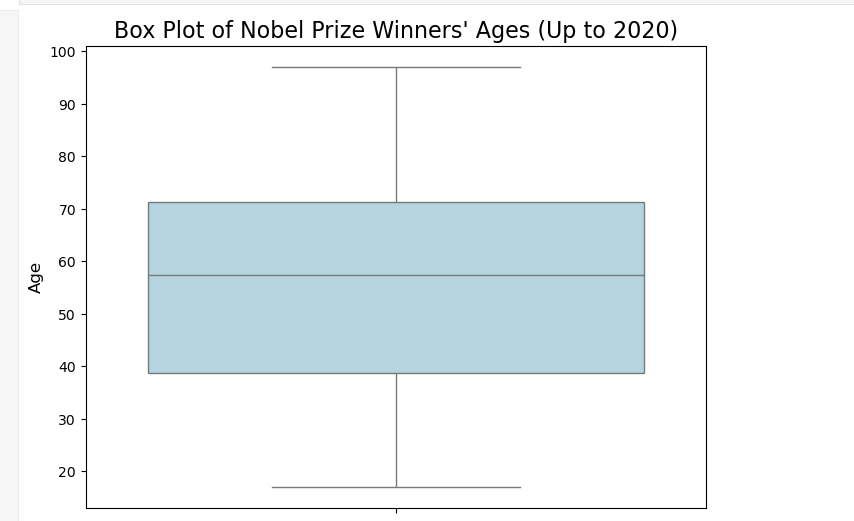
Example: Nobel Prize Winners’ Age
In the box plot of Nobel Prize winners’ ages (up to 2020), the key features of the data are as follows:
- Median age: 60 years
- First quartile: 51 years
- Third quartile: 69 years
- Range: From 17 years (youngest winner) to 97 years (oldest winner), a span of 80 years.
Understanding the Interquartile Range (IQR)
The interquartile range (IQR) is an essential measure that tells us where the middle half of the data lies. In the case of Nobel Prize winners’ ages, the IQR is the range between 51 years (Q1) and 69 years (Q3), meaning that half of the winners were between 51 and 69 years of age.