Table of Contents
ToggleStep-by-step guide to learn data analysis using Python (Hindi + English)
Data Analysis ka matlab hai raw data ko analyze karke useful insights nikalna. आसान शब्दों में, data को समझकर better decisions लेना ही data analysis है. आज हर industry data-driven बन चुकी है — isliye yeh skill highly valuable hai.
Python is one of the most powerful tools for data analysis. Easy syntax aur Pandas, NumPy, Matplotlib jaise libraries ise beginners ke liye perfect banati hain. Agar aap python data analysis tutorial search kar rahe hain, to yeh guide aapke liye best starting point hai.
Patterns aur trends identify karna seekho
Simple Hinglish explanation + examples
Analytics aur data science ke liye ready ho jao
Start your Python data analysis journey with the right tools (Hindi + English)
Before starting data analysis using Python, ek proper setup hona zaroori hai. सही environment होने से आप easily libraries install कर सकते हैं, code run कर सकते हैं aur बिना errors के data analysis सीख सकते हैं.
Latest version of Python install करें from official website. Python 3.9+ recommended है better compatibility के लिए.
Anaconda एक complete package है जिसमें Python, Jupyter Notebook और important libraries पहले से installed होती हैं — beginners के लिए best.
इन libraries से आप data cleaning, analysis aur visualization कर सकते हैं.
Setup complete होने के बाद, आप ready हैं next step के लिए — Python data analysis step-by-step tutorial 🚀
Strong foundation before learning Pandas & NumPy (Beginner Friendly)
Python is one of the most widely used programming languages in the field of data analytics. Aaj ke time mein almost हर company data-driven decisions लेती है, और Python unhe data analyze करने में help करता है.
अगर आप data analysis using Python सीखना चाहते हैं, तो सबसे पहले आपको Python basics समझने होंगे. Beginners अक्सर सीधे Pandas या Machine Learning पर jump कर जाते हैं — लेकिन बिना fundamentals के concepts clear नहीं होते.
इस tutorial section में हम step-by-step Python ke core concepts सीखेंगे — variables, data types, lists, dictionaries, conditions और loops. ये वही building blocks हैं जो हर data analyst daily use करता है real-world projects में.
Variables ka use data store करने के लिए किया जाता है. Python dynamically typed language है — मतलब आपको variable type define करने की जरूरत नहीं होती.
यहाँ:
👉 Data analytics में इनका use: – Sales numbers store करना – Customer names handle करना – Product prices analyze करना
Example: अगर आप sales dataset analyze कर रहे हैं, तो हर column एक data type represent करता है.
List ek ordered collection है जिसमें multiple values store की जा सकती हैं. Data analysis में lists बहुत important होती हैं क्योंकि datasets अक्सर collection form में होते हैं.
👉 Operations:
👉 Real-world use: – Daily sales data – Website traffic logs – Sensor readings
Example:
👉 यही calculations business analytics में use होती हैं
Dictionary key-value pairs में data store करता है. यह real-world datasets के structure को represent करता है.
👉 Access data:
👉 Real-world use: – Database records – API responses – JSON data
👉 क्यों important? क्योंकि Pandas DataFrame भी internally dictionary-like structure follow करता है.
Conditions का use data filter करने के लिए होता है. Data analytics में filtering सबसे important step है.
👉 Real-world use: – High-value customers identify करना – Fraud transactions detect करना – Performance categories बनाना
Example:
👉 यहाँ हम zero values remove कर रहे हैं → data cleaning step
Loop का use multiple data points process करने के लिए होता है. Data analytics में यह बहुत common operation है.
👉 Advanced use:
👉 यह filtering + transformation दोनों कर रहा है
👉 Shortcut (list comprehension):
🎯 अब तक आपने सीखा:
👉 ये सभी concepts मिलकर data analysis का foundation बनाते हैं.
🚀 Next Part में हम सीखेंगे: Functions, File Handling, और Real Data Processing
Functions, File Handling & Real Data Preparation (Beginner to Intermediate)
Part 1 में हमने Python ke basic concepts सीखे — variables, lists, dictionaries, loops aur conditions. अब हम अगले level पर जाएंगे और सीखेंगे कि इन concepts को real-world data analysis में कैसे use किया जाता है.
इस section में हम focus करेंगे functions, file handling (CSV/JSON), और real data processing पर. ये सभी skills किसी भी data analyst के daily workflow का हिस्सा होते हैं. अगर आप data analysis using Python सीख रहे हैं, तो यह section आपके लिए बहुत important है.
Functions reusable blocks होते हैं जो code को clean और efficient बनाते हैं. अगर आप बार-बार एक ही logic use कर रहे हैं, तो उसे function में convert करना best practice है.
👉 ऊपर का function क्या कर रहा है?
👉 Real-world example: अगर आपके पास sales dataset है जिसमें कुछ गलत values (0 या negative) हैं, तो यह function automatically data clean कर देगा.
Example:
👉 Output: [100, 300, 500]
👉 क्यों जरूरी है? क्योंकि real datasets कभी perfect नहीं होते — data cleaning सबसे important step होता है.
Data analysis की शुरुआत data पढ़ने से होती है. सबसे common formats हैं:
👉 CSV पढ़ने का example:
👉 CSV files क्यों important हैं?
👉 JSON पढ़ने का example:
👉 JSON कहाँ use होता है?
👉 Tip: Real-world में आप जल्दी ही Pandas use करेंगे (pd.read_csv), लेकिन basics समझना जरूरी है.
Data cleaning का मतलब है dataset को usable बनाना. Real-world data में बहुत problems होती हैं:
Example:
👉 Output: [100, 200, 300]
👉 यह step हर data analyst daily करता है
अब हम एक simple real-world example देखते हैं:
👉 यह example क्या दिखाता है?
👉 यही logic companies use करती हैं: – Sales analysis – Revenue calculation – Performance tracking
अगर आप professional data analyst बनना चाहते हैं, तो ये rules follow करें:
👉 Clean code = better analysis + less errors
🎯 इस section में आपने सीखा:
🚀 अब आप तैयार हैं next level के लिए: Pandas & NumPy for Data Analysis
👉 यही tools आपको real datasets handle करने और professional analytics करने में मदद करेंगे
Fast, Powerful & Essential Library for Python Data Analytics (Beginner to Advanced)
NumPy (Numerical Python) is one of the most important libraries in Python for data analysis. अगर आप data analytics using Python सीख रहे हैं, तो NumPy आपका first step होना चाहिए.
NumPy mainly use होता है arrays (ndarrays) के साथ काम करने के लिए. यह arrays Python lists से ज्यादा fast, memory-efficient और powerful होते हैं.
Simple language में: 👉 NumPy = Faster calculations + Better performance + Easy data handling
Data analysis, machine learning, AI — हर जगह NumPy use होता है क्योंकि यह large datasets को efficiently handle करता है.
Python lists flexible होती हैं लेकिन slow होती हैं. NumPy arrays optimized होते हैं numerical operations के लिए.
👉 NumPy automatically पूरे array पर operation apply करता है 👉 Loop लिखने की जरूरत नहीं होती
👉 Explanation:
👉 ये properties dataset को समझने में help करती हैं:
👉 Data extract करने के लिए यह basic step है
👉 Output: [15, 20]
👉 यह step real-world data cleaning में use होता है
Vectorization मतलब entire array पर operation apply करना without loops
👉 Fast execution + clean code
👉 NumPy automatically shape match करके operation apply करता है
👉 Data analysis में सबसे ज्यादा use यही functions होते हैं
👉 Data को different format में convert करने के लिए
👉 Machine learning aur testing में use होता है
👉 यही logic companies use करती हैं: – Sales analysis – Business insights – Revenue prediction
🚀 अब आप ready हैं next step के लिए: Pandas for Data Analysis
👉 NumPy + Pandas = Complete Data Analytics Power 🔥
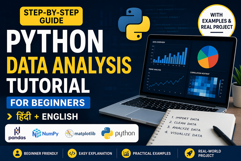
डेटा लोडिंग, एक्सप्लोरेशन और बेसिक क्लीनिंग (Beginner Friendly Guide)
Pandas Python की सबसे powerful library है जो data analysis और data manipulation के लिए इस्तेमाल होती है। अगर आप data analysis using Python सीख रहे हैं, तो Pandas आपके लिए सबसे जरूरी tool है।
सरल भाषा में समझें तो Pandas आपको Excel की तरह data handle करने की सुविधा देता है — लेकिन ज्यादा powerful तरीके से। इसमें DataFrame नाम का structure होता है जिसमें rows और columns होते हैं।
आज के समय में companies Pandas का उपयोग करके:
Data analysis का पहला step होता है data को load करना। Pandas कई formats support करता है:
👉 CSV सबसे common format है क्योंकि:
👉 Real-world example: अगर आप e-commerce company में काम कर रहे हैं, तो daily sales CSV file में आती है जिसे आप Pandas से analyze करते हैं।
Data load करने के बाद सबसे जरूरी step है उसे समझना। इसके लिए Pandas कुछ powerful functions देता है:
👉 इनका उपयोग:
👉 यह step आपको data की quality समझने में मदद करता है।
अब हम specific data निकालना सीखेंगे:
👉 Example: अगर आपको high sales वाले products चाहिए, तो filtering use करेंगे।
GroupBy का उपयोग data को categories में divide करके analysis करने के लिए होता है।
👉 Real-world use:
Real-world data हमेशा clean नहीं होता। इसमें missing values और errors होते हैं।
👉 Data cleaning के बिना analysis गलत हो सकता है।
🚀 अगले भाग में हम सीखेंगे advanced data manipulation और real-world project
Advanced Analysis + Real Project (Hindi Guide)
अब तक आपने Pandas के basics सीख लिए हैं। इस भाग में हम advanced concepts सीखेंगे
और एक real-world project करेंगे।
Top performing products निकालने के लिए use होता है।
Multiple datasets combine करने के लिए।
Custom calculations के लिए।
df = df[df[“Sales”] > 0]
total = df[“Sales”].sum()
avg = df[“Sales”].mean()
region = df.groupby(“Region”)[“Sales”].sum()
यह एक complete mini project है जो companies use करती हैं।
अब आप Pandas सीख चुके हैं — अब अगला step है:
pandas steps
Filtering, Grouping, Aggregation & Real-World Data Analysis (Hindi + English)
Pandas Python की सबसे powerful library है जो data analytics का backbone मानी जाती है। अगर आप python data analysis tutorial सीख रहे हैं, तो Pandas वह जगह है जहाँ आप सबसे ज्यादा समय spend करेंगे।
सरल शब्दों में: 👉 Pandas = Excel + SQL + Python का combination
इस section में हम सीखेंगे:
Data analysis का पहला step होता है data को system में load करना।
👉 Pandas कई formats support करता है:
👉 Real-world example: E-commerce companies daily sales CSV file में store करती हैं।
Data load करने के बाद सबसे जरूरी step है data को समझना।
👉 ये functions आपको बताते हैं:
👉 यह step skip करने से analysis गलत हो सकता है।
Real-world data हमेशा perfect नहीं होता — इसमें missing values और errors होते हैं।
👉 क्यों जरूरी है?
Filtering का मतलब है केवल important data select करना।
👉 Example: High-value sales identify करना
GroupBy data को categories में divide करता है।
👉 Use cases:
👉 Aggregation का मतलब है data को summarize करना
👉 इससे आपको deeper insights मिलते हैं
👉 Processed data को export करके reports बना सकते हैं
👉 यही process companies use करती हैं:
🚀 अब आपका data तैयार है visualization के लिए 👉 Next step: Matplotlib & Seaborn
Clean Data → Insights → Charts (Step-by-Step Flow)
अब तक आपने सीखा कि Pandas का उपयोग करके data को कैसे load, clean, filter और group किया जाता है। लेकिन data analysis यहीं खत्म नहीं होता — असली काम अब शुरू होता है।
👉 अगला step है: Data Visualization जहाँ आप data को graphs और charts में convert करके insights निकालते हैं।
Simple शब्दों में:
👉 Visualization तभी meaningful होता है जब data सही तरीके से prepare किया गया हो।
पहले हम data prepare करते हैं:
👉 अब यह data visualization के लिए ready है
अगर आप सिर्फ numbers देखें:
👉 समझना मुश्किल है
लेकिन अगर आप इसे chart में देखें:
👉 यही power है visualization की
Companies visualization का use करती हैं:
👉 बिना visualization के data सिर्फ numbers है 👉 Visualization के बाद वही data decision बन जाता है
🚀 अब आप ready हैं अगला step सीखने के लिए:
Matplotlib & Seaborn – Data Visualization in Python
👉 यहाँ आप सीखेंगे:
Matplotlib Basics + Interactive Charts (Hindi Guide)
Data visualization का मतलब है data को graphical form में represent करना ताकि patterns, trends और insights आसानी से समझ आएं।
जब आप data analytics using Python करते हैं, तो raw numbers (जैसे 120, 200, 300) देखकर decision लेना मुश्किल होता है। लेकिन जब वही data chart में दिखता है, तो instantly clear हो जाता है कि growth हो रही है या decline।
👉 Visualization का use:
Line chart सबसे important chart है जो time-based data (जैसे months, years) के trend को दिखाता है।
👉 Use case: – Sales growth track करना – Website traffic analyze करना – Stock price movement देखना
👉 Interactive charts user engagement बढ़ाते हैं (hover पर values दिखती हैं)
Bar chart categories के बीच comparison दिखाने के लिए use होता है।
👉 Use case: – Region comparison – Product performance – Category analysis
Histogram data की distribution दिखाता है — मतलब values कैसे spread हैं।
👉 Use case: – Customer age distribution – Sales spread – Data variability
Scatter plot दो variables के बीच relationship दिखाता है।
👉 Use case: – Sales vs Profit relation – Marketing spend vs revenue
Visualization बनाना आसान है — लेकिन सही insight निकालना मुश्किल होता है।
👉 Example: अगर line chart ऊपर जा रहा है → growth है अगर नीचे जा रहा है → problem है
👉 Bar chart: अगर एक bar बहुत बड़ा है → वह category best है
👉 Histogram: अगर data uneven है → outliers हो सकते हैं
👉 Scatter plot: अगर points line में हैं → strong relation है
🎯 इस section में आपने सीखा:
🚀 Next Part: Advanced Visualization + Dashboard
Advanced Charts, Dashboard & Real-World Insights (Hindi Guide)
अब तक आपने basic charts और visualization का concept समझ लिया है। इस section में हम advanced level visualization सीखेंगे, जिसमें statistical charts, dashboards और real-world data insights निकालना शामिल है।
Data visualization का main purpose सिर्फ graph बनाना नहीं होता — बल्कि data से meaningful insights निकालना होता है। अगर आप एक data analyst बनना चाहते हैं, तो आपको charts को समझना और interpret करना आना चाहिए।
👉 Example: – कौन सा month सबसे ज्यादा sales दे रहा है? – कौन सा region सबसे profitable है? – क्या sales और profit में relation है?
Seaborn Python की high-level visualization library है जो Matplotlib पर based है। यह automatically beautiful और statistical charts बनाता है।
👉 Seaborn के advantages:
👉 Real-world use: Companies dashboards में Seaborn charts का use करती हैं ताकि trends जल्दी समझ आएं।
👉 Pie chart हमें बताता है कि कौन सा region कितना contribution दे रहा है।
अब हम multiple charts combine करके एक mini dashboard बनाएंगे।
👉 Dashboard का use companies daily reports और decision making के लिए करती हैं।
अब सबसे important चीज आती है — charts को सही तरीके से समझना।
👉 Line Chart: Trend दिखाने के लिए use होता है Example: Sales बढ़ रही है या गिर रही है
👉 Bar Chart: Comparison के लिए use होता है Example: कौन सा product ज्यादा बिक रहा है
👉 Pie Chart: Percentage distribution दिखाता है Example: Region-wise sales contribution
👉 Scatter Plot: Relationship दिखाता है Example: Sales और Profit का relation
मान लीजिए आपके पास एक e-commerce dataset है जिसमें monthly sales और profit है।
आप क्या करेंगे?
👉 इससे आपको पता चलता है:
Visualization का final goal होता है insights निकालना।
👉 Example: अगर sales अचानक गिर रही है, तो इसका मतलब problem है अगर profit बढ़ रहा है, तो strategy सही है
🔥 अब आपने advanced data visualization सीख लिया है 👉 अगला step: EDA + Real Project Analysis
Pandas is the backbone of data analytics with Python. It simplifies loading, cleaning, and transforming structured datasets. If you’re following a python for data analysis tutorial, Pandas is where you’ll spend most of your time.
import pandas as pd
df_csv = pd.read_csv("sales.csv")
df_excel = pd.read_excel("sales.xlsx", sheet_name="Jan")
df_json = pd.read_json("config.json")
Pandas supports CSV, Excel, JSON, SQL, and more—ideal for real-world data.
df.head()
df.info()
df.describe()
df.columns
Quickly inspect structure, stats, and column names before analysis.
df.dropna(inplace=True) # remove nulls
df.fillna(0, inplace=True) # replace nulls with 0
df["Sales"] = df["Sales"].astype(float)
Simple commands handle missing values and enforce correct datatypes.
Select rows that meet certain conditions:
# Filter rows where 'Sales' > 1000
filtered_df = df[df["Sales"] > 1000]
Split data into categories and compute statistics:
# Group by region and calculate average profit
grouped_df = df.groupby("Region")["Profit"].mean()
Summarize values by sum, count, or custom metrics:
# Sum of Sales by Region
aggregated_df = df.groupby("Region").agg({"Sales": "sum"})
Apply multiple aggregations simultaneously:
# Region-wise mean, sum, and count of Sales
agg_multi = df.groupby("Region").agg({
"Sales": ["mean", "sum", "count"]
})
df.to_csv("cleaned_sales.csv", index=False)
df.to_excel("cleaned_sales.xlsx", sheet_name="Cleaned")
Processed datasets can be exported for reporting or further analysis.
With Pandas, you can filter, group, and aggregate data with just a few lines of code. Next, let’s visualize these insights using Matplotlib and Seaborn.
The best way to master data analytics with Python is by building projects. Below are three beginner-to-intermediate projects that combine Pandas, Matplotlib, and Machine Learning.
Predict future sales using historical data with Linear Regression:
import pandas as pd
from sklearn.linear_model import LinearRegression
# Load dataset
df = pd.read_csv("monthly_sales.csv")
X = df[["Month_Number"]] # feature
y = df["Sales"] # target
model = LinearRegression()
model.fit(X, y)
print("Prediction for Month 13:", model.predict([[13]]))
💡 Useful for retail, e-commerce, and supply chain analytics.
Use K-Means Clustering to group customers based on spending patterns:
from sklearn.cluster import KMeans
# Sample features: Annual Income & Spending Score
X = df[["Annual_Income", "Spending_Score"]]
kmeans = KMeans(n_clusters=3, random_state=42)
df["Cluster"] = kmeans.fit_predict(X)
print(df.head())
💡 Helps businesses personalize marketing and improve customer satisfaction.
Analyze customer reviews (positive/negative) using TextBlob:
from textblob import TextBlob
reviews = ["Great product!", "Very bad experience", "Loved it!"]
for r in reviews:
polarity = TextBlob(r).sentiment.polarity
print(r, "->", "Positive" if polarity > 0 else "Negative")
💡 Useful for e-commerce, social media monitoring, and brand reputation.
Building hands-on projects boosts your portfolio and confidence. Next, let’s look at the career path and resources for aspiring data analysts with Python.
Track your progress across environment, syntax, NumPy, Pandas, viz, EDA, ML, projects & more.
