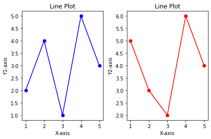
Subplots allow displaying multiple plots within the same figure.
import matplotlib.pyplot as plt
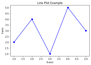
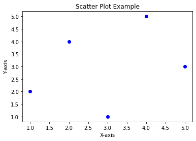
x = [1, 2, 3, 4, 5]
y1 = [2, 4, 1, 5, 3]
y2 = [5, 3, 2, 6, 4]
plt.subplot(1, 2, 1)
plt.plot(x, y1, marker='o', linestyle='-', color='b')
plt.xlabel('X-axis')
plt.ylabel('Y1-axis')
plt.title('Line Plot')
plt.subplot(1, 2, 2)
plt.plot(x, y2, marker='o', linestyle='-', color='r')
plt.xlabel('X-axis')
plt.ylabel('Y2-axis')
plt.title('Line Plot')
plt.tight_layout()
plt.show()