
Table of Contents
ToggleStatistics is the cornerstone of modern data analytics. It provides the tools and techniques to analyze, interpret, and extract meaningful insights from vast amounts of data. Without statistics, raw data remains nothing more than numbers and figures. Through statistical analysis, businesses and researchers can make informed decisions, identify patterns, and uncover hidden trends.
In today’s data-driven world, the ability to derive actionable insights from data gives organizations a competitive edge, enabling them to predict outcomes, understand customer behavior, and optimize operations.
Statistics can be broadly divided into two main categories: Descriptive Statistics and Inferential Statistics.
By combining descriptive and inferential statistics, data analysts can transform raw data into actionable knowledge, making it easier to identify patterns, test assumptions, and predict future trends.
Machine learning and predictive modeling are deeply rooted in statistical concepts. Algorithms like linear regression, decision trees, and clustering rely on statistical principles to process data and make accurate predictions.
For instance, regression models use statistical correlations to predict outcomes, while clustering algorithms leverage measures of similarity and variance. Without a solid understanding of statistics, it becomes challenging to interpret the results of machine learning models.
As data science continues to evolve, statistics will remain an essential foundation, enabling analysts and data scientists to develop advanced predictive models and solve complex real-world problems.
Ready to dive deeper into statistics for data analytics? Explore our comprehensive guides on Descriptive Statistics and Inferential Statistics!
In data analytics, understanding the type of data you’re working with is crucial for selecting the right analytical techniques. Data can be classified into two main types: structured and unstructured.
Identifying whether your data is structured or unstructured helps determine the tools and methods to use for further analysis.
Once you’ve identified your data type, the next step is collection. Data can be gathered through several methods:
Choosing the right data collection method is essential, as it directly impacts the quality and relevance of the data you will analyze.
Raw data often contains noise, inconsistencies, or errors. Data cleaning and preprocessing are essential steps in preparing data for statistical analysis. Here are the key aspects:
Preprocessing is critical because clean data leads to more reliable and accurate insights. Inconsistent or poorly prepared data can lead to misleading results, hindering the effectiveness of your analysis.
Want to learn more about data preparation techniques? Check out our comprehensive guides on Data Cleaning and Data Transformation for deeper insights!
Central tendency refers to the measures that describe the center or typical value of a dataset. The most common measures of central tendency are:
Each of these measures of central tendency provides a different perspective on the data. Depending on the dataset, one measure might be more appropriate than another.
While central tendency helps us understand the “center” of the data, measures of dispersion describe how spread out the data is. These measures are crucial for understanding the variability or consistency of the data.
By understanding variance and standard deviation, you can better interpret the consistency or variability within your data, which can be crucial when making data-driven decisions.
Visualizing data is an important part of descriptive statistics. It allows analysts to quickly identify patterns, trends, and potential outliers in the data. Common visualization techniques include:
These visualizations make complex data more accessible and can help uncover hidden patterns and relationships. By using appropriate charts, analysts can convey their findings more effectively to stakeholders.
Ready to dive deeper into these concepts? Check out our full tutorials on Data Visualization and learn how to create your own insightful charts and plots!

Probability is the foundation of statistical inference and plays a crucial role in data analytics. It helps us quantify uncertainty and make predictions based on available data. Here are the basic concepts:
These basic rules form the foundation of probability theory and will be expanded on as we look at more advanced concepts.
Conditional probability is the probability of an event occurring given that another event has already occurred. This concept is especially important in real-world analytics, where events are often dependent on prior occurrences. The formula for conditional probability is:
One of the most important results derived from conditional probability is Bayes’ Theorem, which allows us to update the probability of an event based on new evidence. Bayes’ Theorem is widely used in machine learning, fraud detection, and medical diagnostics. The formula is:
Bayes’ Theorem enables you to revise your predictions or beliefs about the probability of an event as new data or information becomes available.
Probability distributions describe how probabilities are assigned to different values in a random variable. Understanding common probability distributions is crucial for data analysts, as they help model various types of data and predict outcomes. Some common distributions include:
By understanding and applying these distributions, data analysts can make more accurate predictions and model uncertainty in data-driven decision-making processes.
Want to apply probability concepts in real-world scenarios? Check out our in-depth guide on Probability Distributions and learn how to use them for predictive analytics!
**Exploratory Data Analysis (EDA)** is a crucial step in the data analysis process that helps you gain a deeper understanding of your data before diving into complex models. One of the primary ways to uncover initial insights is by using **descriptive statistics** to identify patterns and trends.
Descriptive statistics, as discussed in the earlier sections, help summarize the key features of your dataset. Some common methods include:
By reviewing these measures, analysts can identify underlying trends and patterns, such as the presence of skewness or clusters in the data. This is an important first step in any **EDA** process.
Once you’ve summarized the data, the next step in **Exploratory Data Analysis** is to explore relationships between different variables. **Correlation analysis** is a technique that quantifies the strength and direction of the relationship between two or more variables.
The most common method for correlation analysis is the **Pearson correlation coefficient**, which measures the linear relationship between two continuous variables. It ranges from -1 (perfect negative correlation) to +1 (perfect positive correlation), with 0 indicating no correlation.
Some key points to keep in mind:
Correlation analysis helps you identify which variables are related to one another, and it can be a crucial step in feature selection for machine learning models.
**Visualization** is a powerful tool in **Exploratory Data Analysis** as it allows you to see relationships between variables, detect trends, and identify patterns more clearly. Some of the most useful visualizations in EDA include:
A **heatmap** is a data visualization technique that uses colors to represent the values in a matrix. It is particularly useful in **correlation analysis**, as it allows you to quickly see how variables are related to one another.
In a correlation heatmap, cells are colored according to the correlation coefficient between the two variables. A dark red color might represent a strong positive correlation, while dark blue represents a strong negative correlation.
A **pair plot** (or scatterplot matrix) displays scatter plots of all pairs of variables in a dataset, allowing you to easily visualize relationships between them. It also shows univariate distributions along the diagonal.
Pair plots are helpful for identifying patterns, clusters, and possible outliers in your data, making it easier to see complex relationships between multiple variables at once.
**Trend lines** are used to identify the overall direction or pattern in a dataset. They are commonly used in scatter plots to indicate the relationship between two variables. Trend lines help highlight the direction of the relationship—whether it’s increasing, decreasing, or staying constant over time.
Trend lines are particularly useful for visualizing **linear regression** or detecting **seasonality** in time series data.
Want to dive deeper into visualizing data with heatmaps, pair plots, and trend lines? Check out our guide on Data Visualization for hands-on tutorials and examples!
In **hypothesis testing**, the first step is to formulate a **null hypothesis** (H0) and an **alternative hypothesis** (HA). These hypotheses are statements or assumptions made about a population parameter, and they guide the testing process.
The goal of hypothesis testing is to gather enough evidence from sample data to reject the null hypothesis in favor of the alternative hypothesis. If the evidence is insufficient, the null hypothesis cannot be rejected.
There are several statistical tests used to test hypotheses, each suited for different types of data and research questions. Some of the most commonly used tests are:
The **t-test** is used to compare the means of two groups to determine if they are significantly different from each other. This test is commonly used when dealing with small sample sizes and is based on the **Student’s t-distribution**.
There are different types of t-tests, including:
**ANOVA** is used when you have more than two groups or categories and want to test whether there are any significant differences between their means. It helps determine if at least one group mean is different from the others.
There are different types of ANOVA, such as:
ANOVA is based on the **F-distribution** and helps determine whether the variance between group means is larger than the variance within groups, indicating statistical significance.
The **chi-square test** is used for categorical data to assess whether the distribution of sample data matches the expected distribution. It’s commonly used to test **independence** and **goodness-of-fit**.
The chi-square test works by comparing observed frequencies with expected frequencies under the assumption of independence. If the observed data significantly deviates from the expected values, we reject the null hypothesis.
After performing a hypothesis test, the next step is to interpret the **p-value**, which tells you the probability of observing the results if the null hypothesis is true. A **low p-value** indicates strong evidence against the null hypothesis, while a **high p-value** suggests weak evidence.
Typically, the following thresholds are used to interpret the p-value:
A **statistically significant** result (typically p-value < 0.05) suggests that the observed data is unlikely to have occurred under the null hypothesis, and there is evidence for the alternative hypothesis.
Ready to test your hypotheses and make data-driven decisions? Explore our detailed tutorials on Hypothesis Testing Methods and start applying statistical tests in your own analyses!
**Regression analysis** is a statistical method used to explore and model the relationships between a dependent variable (the one we are trying to predict) and one or more independent variables (the predictors or features). The simplest form of regression is **linear regression**, which aims to model a linear relationship between the variables.
In **linear regression**, the goal is to fit a straight line (the regression line) through the data points that best predicts the dependent variable based on the independent variable. The equation of a simple linear regression line is given by:
Y = β₀ + β₁X + ε
Where:
Linear regression helps answer questions like: “How does the price of a house (dependent variable) change with respect to its size (independent variable)?” The resulting regression line shows the **predicted price** of a house based on its size.
While simple linear regression models the relationship between two variables, **multiple regression** is used when there are multiple independent variables. Multiple regression helps us understand how several predictors work together to affect the dependent variable.
The equation for **multiple regression** is an extension of the simple linear regression equation:
Y = β₀ + β₁X₁ + β₂X₂ + ... + βₙXₙ + ε
Where:
**Multiple regression** is widely used when dealing with complex datasets, where multiple factors contribute to the outcome. For example, in predicting house prices, factors like location, number of bedrooms, age of the house, and square footage can all play a role. A multiple regression model helps assess the individual impact of each of these variables on the house price.
In this case, the regression coefficients represent how much each independent variable contributes to the price. The model allows analysts to predict the dependent variable (house price) based on the combination of multiple factors.
**Regression analysis** is a key tool in **predictive analytics**, where we use historical data to forecast future outcomes. Regression models help predict continuous outcomes, making them valuable in many industries.
In all these cases, regression analysis allows companies and organizations to make informed predictions, mitigate risks, and optimize their strategies based on data-driven insights.
Want to get started with regression analysis? Check out our step-by-step tutorials to learn how to apply linear and multiple regression in your own analyses!
**Inferential statistics** allows us to make predictions about a population based on sample data. Since it’s often impractical or expensive to collect data from an entire population, we rely on **sampling methods** to obtain representative subsets of data. The accuracy of these predictions depends heavily on the method used to sample the data.
Some of the most common sampling methods include:
**Random sampling** is the simplest method where each member of the population has an equal chance of being selected. This technique helps ensure that the sample is unbiased and can provide a good estimate of the population parameters.
Random sampling is ideal when the population is large and diverse, as it minimizes selection bias and ensures that all segments of the population have a chance to be represented.
In **stratified sampling**, the population is divided into subgroups or **strata** based on specific characteristics (such as age, gender, income, etc.). A random sample is then taken from each of these strata. This method ensures that all important subgroups are represented in the sample, improving the precision of estimates.
Stratified sampling is particularly useful when the population is heterogeneous and researchers want to ensure that each subgroup is proportionally represented.
**Cluster sampling** involves dividing the population into clusters (e.g., geographical regions or schools) and then randomly selecting entire clusters for study. This method can be more cost-effective than other methods, especially when dealing with large, geographically dispersed populations.
While cluster sampling is easier and less expensive to implement, it may introduce more variability into the sample, leading to less accurate estimates compared to stratified or random sampling.
When making predictions based on sample data, it’s important to quantify the uncertainty of those predictions. This is where **confidence intervals** and the **margin of error** come into play. Both help provide a range within which we expect the true population parameter to lie, along with a measure of uncertainty.
A **confidence interval** (CI) is a range of values used to estimate the true population parameter. The interval is calculated from the sample data and is associated with a confidence level, usually expressed as a percentage (e.g., 95% CI).
For example, if you are estimating the average height of adults in a city, a 95% confidence interval might be **[5’6″, 5’10”]**. This means you are 95% confident that the true population mean falls within this range.
The **margin of error** quantifies the uncertainty in an estimate and is often reported alongside a confidence interval. It represents the maximum expected difference between the sample estimate and the true population value. A smaller margin of error indicates more precision in the estimate.
For example, if a political poll reports that a candidate has 52% support with a margin of error of ±3%, the actual support level could be anywhere between 49% and 55%, with 95% confidence.
Once sample data is collected and analyzed, we can make **predictions about the population** based on statistical models. These predictions are accompanied by a degree of uncertainty, often expressed in terms of confidence intervals and margins of error.
One common method for making predictions is using **hypothesis testing** to draw inferences about population parameters, such as means or proportions. Another method involves using **regression analysis** (discussed earlier) to model relationships between variables and predict future outcomes.
For example, in marketing analytics, if you collect a sample of customer data and find that a particular promotional offer led to a 20% increase in sales in the sample group, you can infer that the same promotional offer might yield similar results for the entire population. However, this inference comes with an associated confidence interval and margin of error, which helps account for sampling variability.
Curious about how sampling and predictions work in practice? Check out our interactive tutorials to apply these concepts to your own datasets and make more accurate predictions!
Lorem ipsum dolor sit amet, consectetur adipiscing elit. Ut elit tellus, luctus nec ullamcorper mattis, pulvinar dapibus leo.
Time series analysis involves studying data points collected or recorded at specific time intervals. It is crucial for understanding trends, seasonality, and making future predictions.
Use cases for time series analysis include predicting stock prices, weather patterns, and sales trends.
Clustering is an unsupervised learning technique used to group similar data points into clusters. It helps in identifying natural groupings and patterns in data.
Clustering techniques are commonly applied in marketing, image segmentation, and anomaly detection.
Decision trees and classification models are used to make predictions or classify data into predefined categories. These models are intuitive and easy to interpret.
Want to dive deeper into statistical modeling? Explore our interactive guides and tutorials to learn how to implement these techniques in your projects!
Statistics plays a crucial role in helping businesses understand their customers better. **Customer segmentation** involves dividing a target audience into groups based on shared characteristics such as demographics, behavior, or preferences.
For example, an e-commerce platform may use statistical models to identify high-value customers who are likely to respond to premium product offers or promotions.
In finance, statistics is integral to predicting market trends, assessing risks, and making informed investment decisions. Economists also rely heavily on statistical analysis to forecast economic indicators such as GDP, inflation, and unemployment rates.
For instance, banks use statistical methods to calculate credit scores and assess the creditworthiness of borrowers.
In healthcare, statistics is vital for evaluating the effectiveness of treatments and drugs through clinical trials. Researchers use statistical tests to determine whether a treatment significantly improves patient outcomes compared to a placebo.
For example, pharmaceutical companies rely on statistical analyses to gain regulatory approval for new drugs by demonstrating statistically significant benefits over existing treatments.
Ready to see how these applications can transform your industry? Check out our case studies to explore real-world examples of statistics in action.
•Descriptive Statistics
•Inferential Statistics
•Probability
•Sampling Methods
•Correlation and Regression:
•Data Distributions
•Hypothesis Testing
Descriptive Statistics,
The primary properties of a dataset have been identified and described using descriptive statistics. They give a brief overview of the data, enabling analysts to understand its distribution, change, and core a pattern. The following are a few typical metrics in descriptive statistics:
Measures of Central Tendency
are employed to identify the average or centre value within a dataset. The “centre” of the data distribution is represented by a single value that they offer. The three standard central tendency measures
Mean:
Consider the following dataset representing the scores of 10 students on a test:
{85, 90, 78, 92, 88, 95, 82, 86, 91, 89}. To find the mean, we sum up all the values and divide by the total number of observations:
(85 + 90 + 78 + 92 + 88 + 95 + 82 + 86 + 91 + 89) / 10 = 876 / 10 = 87.6. Therefore, the mean score is 87.6.
Median:
Let’s consider the same dataset as above:
{85, 90, 78, 92, 88, 95, 82, 86, 91, 89}.
To find the median, we first arrange the values in ascending order:
78, 82, 85, 86, 88, 89, 90, 91, 92, 95. Since there are 10 observations, the median is the middle value, which is the 5th value, 88. Therefore, the median score is 88.
Mode:
Take a look at the dataset below, which shows the number of pets that each home in a neighbourhood owns
{0, 1, 2, 2, 3, 1, 4, 0, 2, 1}.
To find the mode, we identify the value(s) that occur most frequently. In this case, both 1 and 2 occur three times, which makes them the modes of the dataset.
Therefore, the modes for this dataset are 1 and 2.
Let’s use a sample dataset to describe metrics of variability:
Look at the dataset below, which shows the ages of 10 people: {20, 25, 22, 28, 30, 21, 24, 27, 26, 23}.
VARANCE
Calculate the mean:
(165 + 170 + 172 + 168 + 175 + 169 + 171 + 174) / 8 = 1374 / 8 = 171.75.
1.Subtract the mean from each value and square the differences:
(165 – 171.75)^2, (170 – 171.75)^2, (172 – 171.75)^2, (168 – 171.75)^2, (175 – 171.75)^2, (169 – 171.75)^2, (171 – 171.75)^2, (174 – 171.75)^2.
2.The squared differences are: (39.0625, 3.0625, 0.5625, 12.5625, 14.0625, 5.0625, 0.5625, 6.0625).
3.Calculate the sum of these squared differences:
39.0625 + 3.0625 + 0.5625 + 12.5625 + 14.0625 + 5.0625 + 0.5625 + 6.0625 = 81.4375.
4.Divide the sum by the total number of observations minus 1 (8 – 1 = 7)
5.to get the sample variance:
81.4375 / 7 = 11.6339285714.
1.Calculate the variance (as explained in the previous response): Variance = 11.6339 square centimeters.
2.Take the square root of the variance to obtain the standard deviation: Square root of 11.6339 ≈ 3.4112.
Therefore, the standard deviation of the dataset is approximately 3.4112 centimeters.
Measures of Shape and Distribution:
Shape and distribution metrics give information about the distributional properties of a dataset. They aid in understanding the data’s uniformity, specific form, and tail behavior. Here are some typical metrics for distribution and shape:
Consider a dataset with the following values for the income levels of a population’s members (in thousands of dollars): 20, 25, 30, 35, 40, 45, 50, and 150.
Positive skewness is indicated by the distribution’s right-side longer tail.
The majority of people’s incomes are concentrated in the lower range, whereas only a small number of people have much higher wages.
In this positively skewed distribution, the mean income is higher than the median income.
Let’s consider a dataset representing the waiting times (in minutes) at a doctor’s office:
{50, 40, 30, 20, 15, 10, 5, 1}.
The distribution has a longer tail on the left side, indicating negative skewness.
Most individuals experience shorter waiting times, with a few outliers experiencing longer waiting times.
The mean waiting time is lower than the median waiting time in this negatively skewed distribution.
Consider a dataset representing the heights (in centimeters) of individuals in a sample:
{160, 165, 170, 175, 180, 185}.
1.The distribution is symmetric, with no significant imbalance in the tails.
2.The data is equally distributed around the mean, and there are no substantial skewness effects.
These examples illustrate the concept of skewness in different datasets. Positive skewness indicates a longer or fatter tail on the right side, negative skewness indicates a longer or fatter tail on the left side, and skewness of zero suggests a symmetric distribution.
Kurtosis helps measure whether the data points in a dataset have more or fewer extreme values (outliers) compared to a normal distribution. It indicates the peakedness or flatness of the distribution.
Let’s break down the process of calculating kurtosis with a dataset:
Dataset:
X={−3,2,1,−1,0,1,4,2}X = \{-3, 2, 1, -1, 0, 1, 4, 2\}X={−3,2,1,−1,0,1,4,2}
The mean is the sum of all data points divided by the total number of data points.
Mean = (ΣX) / n
Mean=(−3+2+1+−1+0+1+4+2)/8=6/8=0.75Mean = (-3 + 2 + 1 + -1 + 0 + 1 + 4 + 2) / 8 = 6 / 8 = 0.75Mean=(−3+2+1+−1+0+1+4+2)/8=6/8=0.75
Variance measures how much the data points differ from the mean.
Variance = (1/n) * Σ(X - Mean)^2
Variance = (1/8) × [(-3 - 0.75)^2 + (2 - 0.75)^2 + (1 - 0.75)^2 + (-1 - 0.75)^2 + (0 - 0.75)^2 + (1 - 0.75)^2 + (4 - 0.75)^2 + (2 - 0.75)^2]
Simplifying the calculations:
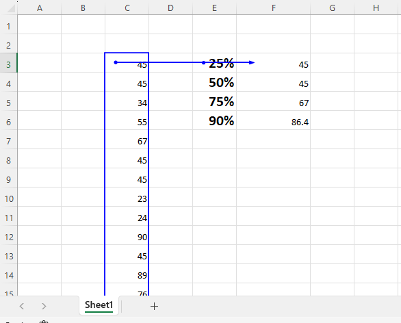
Percentile :
75th percentile is the value below which 75% of the data falls. This means that 75% of the data values in the dataset are less than or equal to the 75th
Range, an easy measure of variability, shows the difference between a dataset’s highest and minimum values. It gives an elementary understanding of how the data are distributed.
Use these steps to determine a dataset’s range:
The dataset should be sorted ascending.
Take the least value and subtract it from the maximum value.
Range
For example, consider the following dataset representing the heights (in centimeters) of a group of individuals: {160, 165, 170, 175, 180, 185}.
To calculate the range:
Sort the dataset in ascending order: {160, 165, 170, 175, 180, 185}.
Subtract the minimum value (160) from the maximum value (185):
Range = 185 – 160 = 25.
Therefore, the range of the dataset is 25 centimeters. It indicates that there is a 25-centimeter difference between the tallest and shortest individuals in the group.
While the range provides a simple measure of variability, it has limitations as it only considers the extremes of the dataset. It does not provide information about the distribution or variability within the dataset. Other measures, such as variance and standard deviation, offer more comprehensive insights into the spread of data.
Consider the following dataset representing the scores of students in a class: {75, 80, 65, 70, 85, 90, 75, 80, 75, 85, 80, 70, 75}.
To create a frequency distribution table:
Sort the dataset in ascending order: {65, 70, 70, 75, 75, 75, 75, 80, 80, 80, 85, 85, 90}.
Identify the unique values in the dataset and determine their frequencies (number of occurrences).
Frequency Distribution
Count how many times each value appears in the dataset.
Value | Frequency
65 | 1
70 | 2
75 | 4
80 | 3
85 | 2
90 | 1
This frequency distribution table shows the unique values in the dataset and their corresponding frequencies. For example, the value 75 appears four times, while the values 65 and 90 appear only once.
Frequency distribution tables provide a summary of the distribution of values in a dataset. They help identify the most common values and provide an overview of the frequency or occurrence of different values. This information can be useful for further analysis and understanding of the dataset.
Inferential statistics is an area of statistics that deals with making inferences or conclusions about a wider population based on sample data. It helps investigators in generalizing from small data sets and making predictions. Here is an illustration of the idea of inferential statistics:
Let’s imagine a business wishes to gauge how satisfied its staff members are with their jobs. There are 10,000 people working for the company. They choose to get information from a randomly selected sample of 500 employees rather than conducting time-consuming and unrealistic surveys of every employee.
Out of a total workforce of 10,000 employees, 500 are chosen at random by the corporation. By doing this, bias in the sample is diminished and every employee has an equal chance of getting chosen.
A job satisfaction survey is given to the 500 employees that were chosen. The survey includes inquiries about respondents’ general job satisfaction, work-life balance, pay, chances for career advancement, and other pertinent issues.
s.
In order to summarise the sample data, descriptive statistics are utilised. For the 100 cars in the sample, the manufacturer computes the mean, median, and standard deviation of the fuel efficiency figures.
Based on the sample data, inferential statistics are used to make inferences about the typical fuel efficiency of the 1,000 cars.
To determine the range within which the actual population mean fuel economy lies, the manufacturer calculates a confidence interval, such as a 95% confidence interval. Suppose they discover that the sample’s average fuel economy is 50 MPG, with a 95% confidence range ranging from 48 MPG to 52 MPG. Since the genuine population mean fuel efficiency falls within this range, they may be 95% confident in this.
Let’s use an example to calculate inferential statistics. Let’s say we’ve gathered the MPG (miles per gallon) information for a sample of 50 cars. These are the data:
45, 42, 50, 48, 43, 47, 52, 55, 49, 51, 46, 44, 53, 47, 49, 48, 50, 45, 46, 52, 50, 48, 45, 47, 51, 49, 52, 54, 46, 47, 49, 48, 50, 45, 43, 51, 48, 50, 47, 49, 46, 52, 49, 44, 47, 48, 51, 50, 48, 46, 49, 51.
Step 1: Descriptive Statistics
Let’s figure out the sample’s mean, median, and standard deviation.
The sum of all the values divided by the total number of values is the mean.
Sum = 2,417
Mean = Sum / Number of values = 2,417 / 50 = 48.34 MPG
Median: Arrange the values in ascending order and find the middle value:
42, 43, 43, 44, 45, 45, 45, 46, 46, 46, 46, 47, 47, 47, 47, 47, 48, 48, 48, 48,
48, 48, 48, 49, 49, 49, 49, 49, 49, 49, 50, 50, 50, 50, 50, 51, 51, 51, 51, 52,
52, 52, 52, 53, 54, 55
Median = 48 MPG
Let’s go through each step of calculating variance and standard deviation with copiable formulas.
First, calculate the mean (average) of the data points using this formula:
Mean = (ΣX) / n
Where:
Given the dataset:
X=15,10,12,18,25,30,14,20X = 15, 10, 12, 18, 25, 30, 14, 20X=15,10,12,18,25,30,14,20
Sum of X:
15+10+12+18+25+30+14+20=14415 + 10 + 12 + 18 + 25 + 30 + 14 + 20 = 14415+10+12+18+25+30+14+20=144
Mean:
Mean=144/8=18Mean = 144 / 8 = 18Mean=144/8=18
To calculate the deviation, subtract the mean from each data point:
Deviation = X - Mean
a
For each data point:
15−18=−310−18=−812−18=−618−18=025−18=730−18=1214−18=−420−18=2\begin{align*} 15 – 18 &= -3 \\ 10 – 18 &= -8 \\ 12 – 18 &= -6 \\ 18 – 18 &= 0 \\ 25 – 18 &= 7 \\ 30 – 18 &= 12 \\ 14 – 18 &= -4 \\ 20 – 18 &= 2 \\ \end{align*}15−1810−1812−1818−1825−1830−1814−1820−18=−3=−8=−6=0=7=12=−4=2
The deviations are:
(−3,−8,−6,0,7,12,−4,2)(-3, -8, -6, 0, 7, 12, -4, 2)(−3,−8,−6,0,7,12,−4,2)
Now, square each deviation to remove negative values:
Sum of Squared Deviations = Σ(Squared Deviation)
a
Now, sum up all the squared deviations:
Sum of Squared Deviations = Σ(Squared Deviation)
Sum of Squared Deviations = Σ(Squared Deviation)
Example:
9
+
64
+
36
+
0
+
49
+
144
+
16
+
4
=
322
9+64+36+0+49+144+16+4=322
The sum of squared deviations is 322.
To calculate variance, divide the sum of squared deviations by the number of data points (nnn):
Variance = (Σ(Squared Deviation)) / n
a
StandardDeviation=√40.25≈6.34Standard Deviation = √40.25 ≈ 6.34StandardDeviation=√40.25≈6.34The standard deviation is 6.34.
By following these steps, you can easily calculate the variance and standard deviation for any dataset!
Probability is a fundamental concept in statistics and data analytics that deals with the likelihood or chance of events occurring. It quantifies the uncertainty associated with outcomes and enables us to make predictions and make informed decisions based on data.
Here are some key topics typically covered in a probability section:
This is a general overview of the topics covered in a probability section. The level of depth and complexity can vary depending on the course or program. It’s important to practice solving probability problems and working with probability distributions to gain a solid understanding of the subject.
For more in-depth learning and hands-on experience, join our training program today! Enhance your skills in data analysis, statistics, and much more with expert guidance. Don’t miss this opportunity to excel in your career!
Enroll now and take the next step in your journey to success!
In today’s data-driven world, mastering data analytics is more important than ever. Vista Academy, located in Dehradun, offers a Master Program in Data Analytics, designed to equip learners with the skills and tools necessary to excel in the competitive field of analytics.
Vista Academy stands out with its comprehensive curriculum, hands-on training, and expert faculty. Here are some highlights:
To gain a deeper understanding of data analytics, explore these resources:
Enrolling in Vista Academy’s Master Program in Data Analytics prepares you for roles like Data Analyst, Business Intelligence Analyst, and Machine Learning Engineer. You’ll gain:
Ready to advance your career in data analytics? Enroll in Vista Academy’s Master Program today!