Mastering Data Visualization with Matplotlib: A Comprehensive Guide
What is Matplotlib ?
Matplotlib is a popular Python package for creating static, interactive, and animated data visualizations. It offers a versatile and strong framework for creating numerous types of plots and charts, making it an essential tool for data scientists, researchers, and anybody involved in data analysis and visualization.
Matplotlib's key features include:
- Matplotlib supports a wide range of plot types, including line plots, bar plots, scatter plots, histograms, pie charts, box plots, heatmaps, 3D graphs, and others.
- Users can change practically every component of their plots, including colors, markers, line styles, fonts, labels, legends, and comments, resulting in extremely personalized visualizations.
- Matplotlib is meant to generate high-quality plots suitable for publication, presentations, and other professional purposes.
- Matplotlib works easily with popular libraries such as NumPy and Pandas, allowing for easy viewing of data saved in arrays or data frames.
- Matplotlib can save plots in a variety of formats, including PNG, PDF, SVG, and others, making it useful for a variety of use cases.
- Interactivity: Using methods such as “matplotlib.pyplot.show()” or “matplotlib.pyplot.ion()”, users can interact with plots, edit them in real-time, and build interactive visualizations.
Here are ten common use cases of Matplotlib in Python:
Line Plots
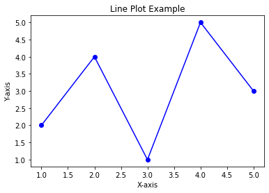
Using straight lines to connect data points allows you to visualize patterns and correlations. It’s commonly used to visualize trends and relationships in data.
import matplotlib.pyplot as plt

x = [1, 2, 3, 4, 5]
y = [2, 4, 1, 5, 3]

plt.plot(x, y, marker='o', linestyle='-', color='b')
plt.xlabel('X-axis')
plt.ylabel('Y-axis')
plt.title('Line Plot Example')
plt.show()
Bar Plot:
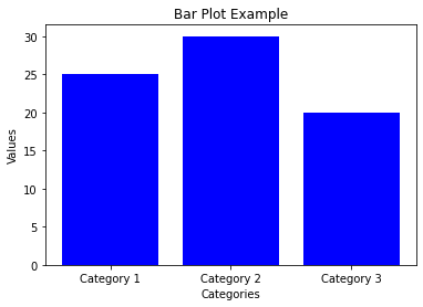
A bar plot is used to represent data using rectangular bars. It’s useful for comparing different categories or groups.
import matplotlib.pyplot as plt

categories = ['Category 1', 'Category 2', 'Category 3']
values = [25, 30, 20]

plt.bar(categories, values, color='b')
plt.xlabel('Categories')
plt.ylabel('Values')
plt.title('Bar Plot Example')
plt.show()
Histogram:
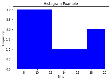
A histogram is used to visualize the distribution of numerical data.
import matplotlib.pyplot as plt

data = [12, 8, 15, 10, 20, 7, 14, 9, 18, 11]

plt.hist(data, bins=5, color='b')
plt.xlabel('Bins')
plt.ylabel('Frequency')
plt.title('Histogram Example')
plt.show()
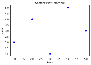
Scatter Plot:
When two variables have a correlation, individual data points are plotted on a scatter plot without any connecting lines.
import matplotlib.pyplot as plt

x = [1, 2, 3, 4, 5]
y = [2, 4, 1, 5, 3]

plt.scatter(x, y, marker='o', color='b')
plt.xlabel('X-axis')
plt.ylabel('Y-axis')
plt.title('Scatter Plot Example')
plt.show()
Pie Chart:
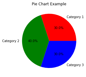
A pie chart is used to show the proportion of each category as a slice of a circular pie.
import matplotlib.pyplot as plt

categories = ['Category 1', 'Category 2', 'Category 3']
sizes = [30, 40, 30]

plt.pie(sizes, labels=categories, autopct='%1.1f%%', colors=['r', 'g', 'b'])
plt.title('Pie Chart Example')
plt.show()
Box Plot:
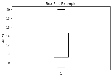
A box plot is used to visualize the distribution of data through quartiles.By using quartiles to represent data distribution, it is possible to see how spread out and skewed the dataset is.
import matplotlib.pyplot as plt

data = [12, 8, 15, 10, 20, 7, 14, 9, 18, 11]

plt.boxplot(data)
plt.ylabel('Values')
plt.title('Box Plot Example')
plt.show()
Heatmap:
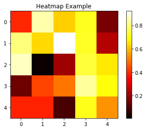
A heatmap is used to represent data in a tabular format with colors indicating the values.
import matplotlib.pyplot as plt
import numpy as np

data = np.random.rand(5, 5)

plt.imshow(data, cmap='hot', interpolation='nearest')
plt.colorbar()
plt.title('Heatmap Example')
plt.show()
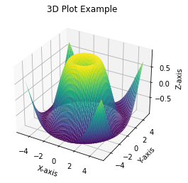
3D Plot:
A 3D plot is used to create three-dimensional visualizations.
import matplotlib.pyplot as plt
import numpy as np

x = np.linspace(-5, 5, 100)
y = np.linspace(-5, 5, 100)
X, Y = np.meshgrid(x, y)
Z = np.sin(np.sqrt(X**2 + Y**2))

fig = plt.figure()
ax = fig.add_subplot(111, projection='3d')
ax.plot_surface(X, Y, Z, cmap='viridis')
ax.set_xlabel('X-axis')
ax.set_ylabel('Y-axis')
ax.set_zlabel('Z-axis')
ax.set_title('3D Plot Example')
plt.show()
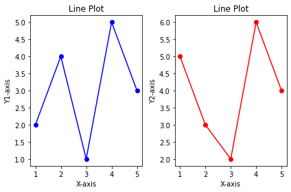
Subplots:
Subplots allow displaying multiple plots within the same figure.
import matplotlib.pyplot as plt

x = [1, 2, 3, 4, 5]
y1 = [2, 4, 1, 5, 3]
y2 = [5, 3, 2, 6, 4]

plt.subplot(1, 2, 1)
plt.plot(x, y1, marker='o', linestyle='-', color='b')
plt.xlabel('X-axis')
plt.ylabel('Y1-axis')
plt.title('Line Plot')

plt.subplot(1, 2, 2)
plt.plot(x, y2, marker='o', linestyle='-', color='r')
plt.xlabel('X-axis')
plt.ylabel('Y2-axis')
plt.title('Line Plot')

plt.tight_layout()
plt.show()
Customization and Styling:
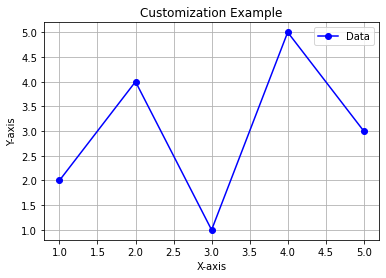
Matplotlib allows customizing colors, markers, labels, legends, and other elements of the plots.
import matplotlib.pyplot as plt

x = [1, 2, 3, 4, 5]
y = [2, 4, 1, 5, 3]

plt.plot(x, y, marker='o', linestyle='-', color='b', label='Data')
plt.xlabel('X-axis')
plt.ylabel('Y-axis')
plt.title('Customization Example')
plt.legend()
plt.grid(True)
plt.show()
