📘 Definition
A data chart is a visual representation of data that makes patterns and comparisons easy to understand. It replaces rows of numbers with visuals that reveal meaning faster.
Optimized for: “what is a data chart”
 Line Chart — Best for Time Trends & Data Visualization Chart Types
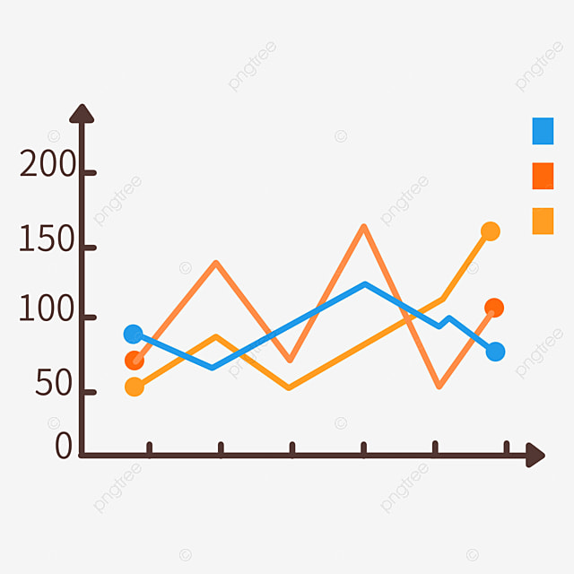
A line chart plots ordered data points connected by lines to show how values change (usually over time). Use it to reveal trends, seasonality, turning points, and comparative series at a glance.
A line chart connects ordered values (for example monthly revenue) with straight or smoothed lines. It emphasises direction and rate of change and is the standard choice when you want to show how a metric moves over time.
| Visualization | Best for |
| Line chart | Trends over time |
| Area chart | Emphasize totals or stacked composition |
| Sparkline | Mini inline trend |
Use an area chart when you want to emphasise the magnitude of totals over time or show stacked components. Use a line chart when the primary goal is to show the trend shape (rate of change) without filled areas.
A line chart is the most common choice to show trends over time. For categorical ordered sequences (like age buckets), a line can still be useful if the order has meaning.
 Bar Chart (Best for Categorical Comparison)
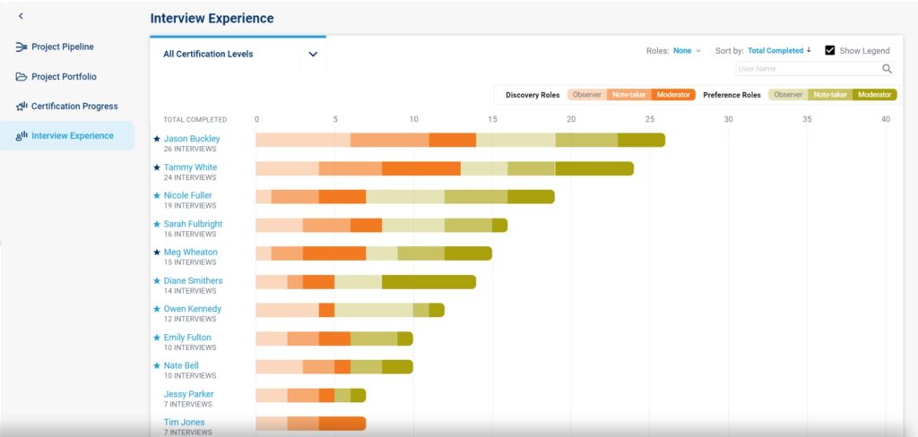
A bar chart uses horizontal or vertical bars to compare discrete categories. Use bars when you need clear, accurate comparisons — especially when category names are long or when exact values matter.
A bar chart displays categorical data as rectangular bars whose length is proportional to the value they represent. Vertical bars (column charts) are common for time-ordered categories; horizontal bars are best for long labels or ranking lists.
| Chart | Best for |
| Bar chart (vertical) | Category comparisons, short labels |
| Bar chart (horizontal) | Long labels, ranking lists |
| Stacked bar | Composition within categories |
Use stacked bars to show composition across categories (e.g., sales by product split by channel). If precise comparisons between segments are required, consider grouped bars instead.
Use a bar chart for accurate comparisons across categories. Use a pie chart only when categories are few (2–6) and you want to show part-to-whole at a glance.
 Scatter Plot (Show Relationships)
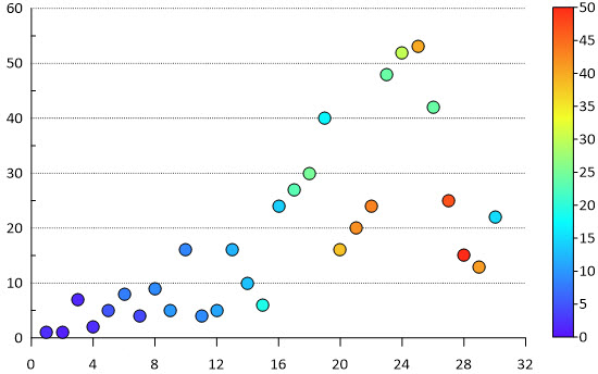
A scatter plot displays individual data points on an X and Y axis to reveal relationships, clusters, and outliers between two continuous variables (e.g., price vs rating).
A scatter plot maps pairs of numeric values (x,y) as points on a 2D plane. It’s ideal to detect correlations (positive, negative, none), clusters, and unusual observations that merit investigation.
| Visualization | Best for |
| Scatter plot | Relationships between two numeric variables |
| Hexbin / Density plot | Dense data — shows concentration |
Add a regression line to summarize the relationship and help quantify direction/strength. For non-linear patterns use a LOESS/smoothing curve instead.
Use color, marker size, or shape to encode a third variable (e.g., region by color, volume by size). Keep legend concise and test for readability.
 Pie Chart — Composition & Shares (data visualization chart types)
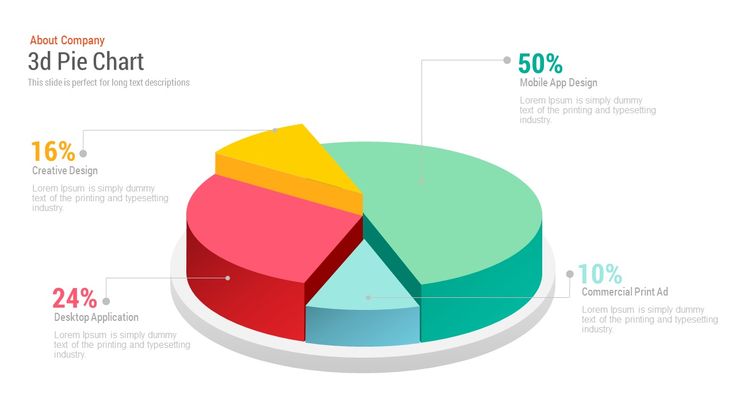
A pie chart shows how a whole is split into parts. Best for simple part-to-whole comparisons when you have 2–6 meaningful categories. For many slices prefer treemap or stacked bars.
Ensure text alternatives (captions, aria labels) and high-contrast patterns for color-blind users. Don’t rely on color alone — provide labels and a legend.
Avoid pie charts when there are many small categories or when precise comparisons between slices are needed — use bar charts or treemaps instead.
Donut charts are usually better on small screens because the center can hold a clear label (total or percent) and the visual is easier to scan.
 Histogram — Distribution & Frequency (data visualization chart types)
A histogram groups continuous data into bins to show frequency distribution. Use histograms to analyse spread, skewness, clusters, and outliers — essential when exploring numeric variables in data analytics.
Common heuristics include Sturges’ rule and Freedman–Diaconis. Start with 8–12 bins for moderate datasets and adjust to reveal meaningful patterns without overfitting noise.
Histograms are for continuous numeric data grouped into bins (no gaps between bars). Bar charts are for discrete/categorical data (with gaps). Use histograms to show distribution shape.
 Treemap (Hierarchy & Composition)
A treemap shows part-to-whole relationships using adjacent rectangles sized proportionally to values. Use treemaps for many categories or hierarchical data where a pie chart would be unreadable.
<desc> and readable text for SERP friendliness.If many categories are very small (visual area too tiny for labels) group them into “Other” to avoid unreadable slivers and improve clarity.
Use treemap for dense categorical displays and hierarchies. Use stacked bars when exact across-category comparisons for each group are required — bars make precise comparisons easier.
 Area Chart (Emphasize Totals & Trends)
An area chart fills the space beneath a line to emphasize volume or cumulative totals across time. Use area charts to show how totals evolve, compare stacked contributions, or highlight the magnitude of change.
An area chart is like a line chart but with the area under the line filled. It emphasizes the total size or cumulative value over an ordered axis (usually time) and is useful for showing stacked contributions from multiple series.
Use a line chart when trend shape and precise comparison between series matter. Use an area chart when you want to emphasize accumulated volume or totals (e.g., cumulative customers).
Yes — stacked area charts show how each series contributes to the total over time. Keep the series number small and the color contrasts subtle but distinct.
Area Chart (Emphasize Totals & Trends)
An area chart fills the space beneath a line to emphasize volume or cumulative totals across time. Use area charts to show how totals evolve, compare stacked contributions, or highlight the magnitude of change.
An area chart is like a line chart but with the area under the line filled. It emphasizes the total size or cumulative value over an ordered axis (usually time) and is useful for showing stacked contributions from multiple series.
Use a line chart when trend shape and precise comparison between series matter. Use an area chart when you want to emphasize accumulated volume or totals (e.g., cumulative customers).
Yes — stacked area charts show how each series contributes to the total over time. Keep the series number small and the color contrasts subtle but distinct.
 Radar Chart (Compare Multi-dimensional Profiles)
A radar chart (spider chart) visualizes multivariate profiles across several axes. Use it to compare strengths and weaknesses across metrics when relative patterns matter.
Use radar charts for profile comparison across several metrics. Use bar charts for clearer, exact comparisons per metric.
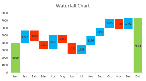
 Waterfall Chart (Show Stepwise Changes)
A waterfall chart (bridge chart) visualizes how sequential positive and negative values (adds and subs) move a metric from a starting value to an ending total. Use for P&L walkthroughs, reconciling balances, or explaining incremental impacts.
Use a waterfall when you need to show sequential changes and reconciliation. Use stacked bars when you want to compare part-to-whole composition at points in time.
 Funnel Chart (Conversion & Drop-off)
A funnel chart visualizes staged processes and conversion/drop-off between steps (e.g., visitors → signups → trials → customers). It highlights where the largest losses occur so teams can prioritize improvements.
Use funnels for simple linear step processes. Use Sankey when you need to show flows between many nodes or branches.
 Sankey Chart (Flow & Volume Between Nodes)
A Sankey chart visualizes flows between nodes where the width of the flow represents volume. Use it to show traffic paths, resource allocation, or how users move between steps when branches and proportions matter.
Use funnels for linear step-by-step conversion. Use Sankey when users branch between multiple destinations and you want to show branch volumes visually.
 Gantt Chart (Project Timeline & Progress)
A Gantt chart visualizes tasks along a timeline showing start, end, and progress — ideal for project plans, release schedules, and tracking dependencies at a glance.
Use thin connector arrows between task ends and dependent task starts; for static images show simplified arrows or list dependencies in a table below.
Bubble Chart (Three-variable relationships)
A bubble chart plots two numeric variables on x/y axes and uses bubble size (and optionally color) for a third variable — ideal for showing relationships plus magnitude (e.g., revenue vs growth with market size as bubble area).
Always scale area proportionally to the value. Scaling radius leads to misleading visual comparisons.