
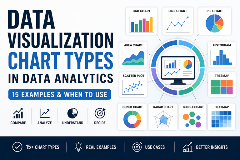
Learn 15 chart types with examples—bar, line, pie, scatter & more. Understand when to use each chart in data analytics.
👉 Explore real chart examples with use cases below
Master charts, dashboards & real-world case studies
 Treemap (Hierarchy & Composition)
A treemap shows part-to-whole relationships using adjacent rectangles sized proportionally to values. Use treemaps for many categories or hierarchical data where a pie chart would be unreadable.
<desc> and readable text for SERP friendliness.If many categories are very small (visual area too tiny for labels) group them into “Other” to avoid unreadable slivers and improve clarity.
Use treemap for dense categorical displays and hierarchies. Use stacked bars when exact across-category comparisons for each group are required — bars make precise comparisons easier.
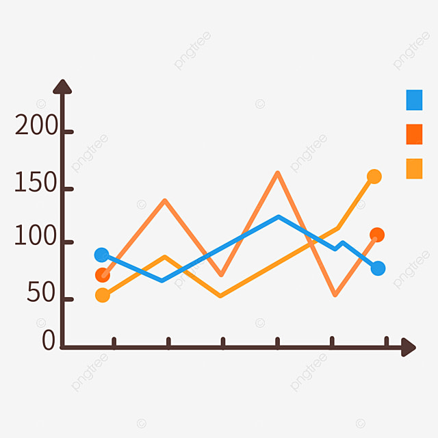
 Area Chart (Emphasize Totals & Trends)
An area chart fills the space beneath a line to emphasize volume or cumulative totals across time. Use area charts to show how totals evolve, compare stacked contributions, or highlight the magnitude of change.
An area chart is like a line chart but with the area under the line filled. It emphasizes the total size or cumulative value over an ordered axis (usually time) and is useful for showing stacked contributions from multiple series.
Use a line chart when trend shape and precise comparison between series matter. Use an area chart when you want to emphasize accumulated volume or totals (e.g., cumulative customers).
Yes — stacked area charts show how each series contributes to the total over time. Keep the series number small and the color contrasts subtle but distinct.
Area Chart (Emphasize Totals & Trends)
An area chart fills the space beneath a line to emphasize volume or cumulative totals across time. Use area charts to show how totals evolve, compare stacked contributions, or highlight the magnitude of change.
An area chart is like a line chart but with the area under the line filled. It emphasizes the total size or cumulative value over an ordered axis (usually time) and is useful for showing stacked contributions from multiple series.
Use a line chart when trend shape and precise comparison between series matter. Use an area chart when you want to emphasize accumulated volume or totals (e.g., cumulative customers).
Yes — stacked area charts show how each series contributes to the total over time. Keep the series number small and the color contrasts subtle but distinct.
 Radar Chart (Compare Multi-dimensional Profiles)
A radar chart (spider chart) visualizes multivariate profiles across several axes. Use it to compare strengths and weaknesses across metrics when relative patterns matter.
Use radar charts for profile comparison across several metrics. Use bar charts for clearer, exact comparisons per metric.
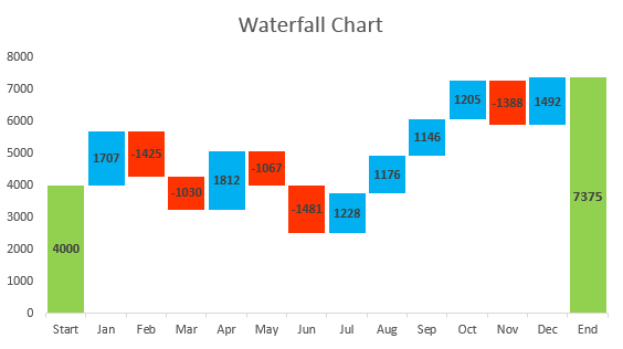
 Waterfall Chart (Show Stepwise Changes)
A waterfall chart (bridge chart) visualizes how sequential positive and negative values (adds and subs) move a metric from a starting value to an ending total. Use for P&L walkthroughs, reconciling balances, or explaining incremental impacts.
Use a waterfall when you need to show sequential changes and reconciliation. Use stacked bars when you want to compare part-to-whole composition at points in time.
 Funnel Chart (Conversion & Drop-off)
A funnel chart visualizes staged processes and conversion/drop-off between steps (e.g., visitors → signups → trials → customers). It highlights where the largest losses occur so teams can prioritize improvements.
Use funnels for simple linear step processes. Use Sankey when you need to show flows between many nodes or branches.
 Sankey Chart (Flow & Volume Between Nodes)
A Sankey chart visualizes flows between nodes where the width of the flow represents volume. Use it to show traffic paths, resource allocation, or how users move between steps when branches and proportions matter.
Use funnels for linear step-by-step conversion. Use Sankey when users branch between multiple destinations and you want to show branch volumes visually.
 Gantt Chart (Project Timeline & Progress)
A Gantt chart visualizes tasks along a timeline showing start, end, and progress — ideal for project plans, release schedules, and tracking dependencies at a glance.
Use thin connector arrows between task ends and dependent task starts; for static images show simplified arrows or list dependencies in a table below.
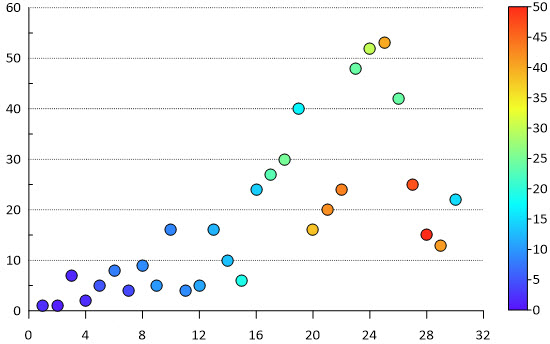
 Bubble Chart (Three-variable relationships)
A bubble chart plots two numeric variables on x/y axes and uses bubble size (and optionally color) for a third variable — ideal for showing relationships plus magnitude (e.g., revenue vs growth with market size as bubble area).
Always scale area proportionally to the value. Scaling radius leads to misleading visual comparisons.