
Table of Contents
ToggleLearn 15 chart types with examples—bar, line, pie, scatter & more. Understand when to use each chart in data analytics.
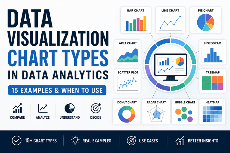
👉 Explore real chart examples with use cases below
Master charts, dashboards & real-world case studies
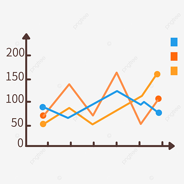
A line chart is used to show trends over time. It helps identify growth, decline, and patterns in data analytics.
📊 Example: Monthly revenue trend (Jan–Jun)
A line chart connects data points with a line to show how values change over time. It is one of the most important data visualization chart types used in analytics.
A line chart is best for showing trends over time.
A bar chart is best for comparing categories. It helps visualize differences between products, regions, or groups.
👉 Example: Product sales comparison (A, B, C)
A bar chart represents data using rectangular bars. It is one of the most used data visualization chart types for comparing different categories.
A bar chart is the best chart for comparing categories in data analytics.
Use bar chart for comparison and pie chart for percentage distribution.
A scatter plot shows relationships between two variables like marketing spend vs sales. It helps detect correlation, trends, and outliers.
👉 Example: Marketing spend vs sales correlation
Static Example (SEO Friendly)
A scatter plot is used in data visualization to show relationships between two numeric variables.
A scatter plot is used to show relationships between two variables.
Upward trend = positive correlation, downward = negative correlation.
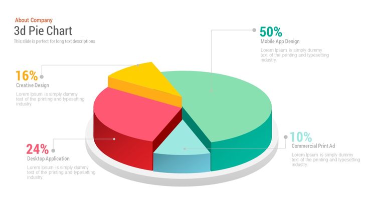
A pie chart shows percentage contribution of categories. Best for part-to-whole comparisons in data analytics.
👉 Example: Market share distribution
Static Example (SEO Friendly)
A pie chart is a circular chart used in data visualization to show proportions of categories.
A pie chart is best for showing percentage distribution.
Avoid when there are many categories. Use bar chart instead.
A histogram shows how data is distributed across ranges. It helps identify patterns, spread, and frequency in data analytics.
👉 Example: Frequency distribution of values
Static Example (SEO Friendly)
A histogram is used in data visualization to show the distribution of continuous data by grouping values into ranges (bins).
A histogram shows frequency distribution of continuous data.
Histogram shows distribution, bar chart compares categories.
👉 Example: Distribution of values (frequency by range)
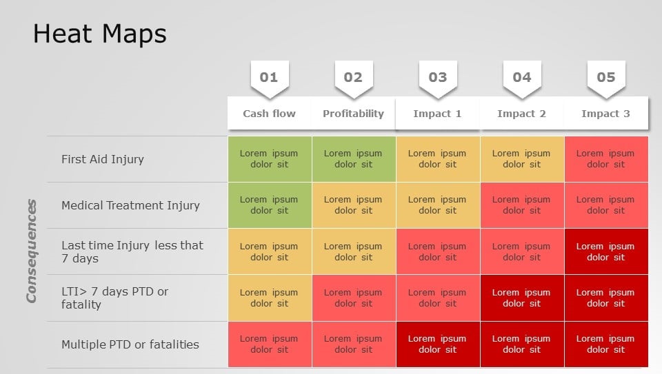
A heatmap is used in data visualization to show data using colors. Higher values appear darker, helping identify patterns and correlations.
A heatmap shows data intensity using color variations.
Heatmaps are used in analytics, websites, and correlation analysis.
👉 Darker color = higher value
👉 Example: Revenue growth over time
👉 Example: Product comparison across features
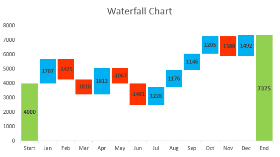
A waterfall chart shows how values increase and decrease across stages — commonly used in financial analysis like profit & loss.
👉 Quick interactive representation
👉 Green = Increase | Red = Decrease | Blue = Final Result
A waterfall chart visualizes how a starting value changes through increases and decreases to reach a final value.
It shows how values change step-by-step.
Finance, revenue analysis, cost breakdown.
Values flow up and down like a waterfall.
A funnel chart shows how users move through stages and where drop-offs happen. It is widely used in marketing and sales analytics.
👉 Width decreases as users drop at each stage
A funnel chart visualizes the step-by-step journey of users through a process. Each stage becomes smaller, showing where users drop off.
A funnel chart is used to track conversion stages and identify drop-offs in a process.
It gets narrower because users drop off at each stage of the process.
A funnel chart shows process flow and drop-offs, while a bar chart compares categories.
A Sankey chart visualizes how data flows between stages, where the width of each link represents volume. It is widely used in data analytics, marketing funnels, and resource flow analysis.
👉 Flow width represents volume between nodes
A Sankey chart is a flow diagram where the thickness of links represents quantity. It helps visualize how data moves across multiple paths.
A Sankey chart is used to visualize flow between stages where width represents volume.
Funnel charts show linear steps, while Sankey charts show branching flows.
It is used in traffic analysis, marketing funnels, energy flow, and financial data.
👉 Flow visualization with real data
A Gantt chart is a timeline-based visualization used in project management to show task duration, start & end dates, and progress.
It is used to plan, schedule, and track project timelines.
A Gantt chart shows tasks and progress, while a timeline only shows dates.
Project managers, developers, and teams use it to manage projects.
👉 Example: Project timeline with tasks
👉 Bars show task duration & progress across weeks
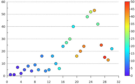
A bubble chart visualizes relationships between three variables: X-axis, Y-axis, and bubble size (third variable like market size or users).
👉 Bubble size represents market size or volume
A bubble chart is an extension of a scatter plot where each point is represented as a bubble. The size of the bubble represents a third variable.
A bubble chart is used to visualize relationships between three variables.
Scatter plot shows 2 variables, bubble chart shows 3 variables.
Bubble size represents a third variable such as volume or market size.
Test your knowledge — choose the correct answer 👇
Learn Data Analytics, Python, SQL & Power BI with real-world guides
Complete beginner guide with steps & tools
Step-by-step career path for 2025
Skills, salary & responsibilities explained
Latest salary trends in India
Descriptive to predictive analytics explained
Learn data processing step-by-step
Explore all blogs and build real-world skills.
Explore All Blogs →