Table of Contents
ToggleLearn data cleaning in Python using powerful libraries like Pandas and NumPy. This beginner-friendly tutorial covers how to clean datasets, handle missing values, and prepare your data for in-depth analysis.
🧹 From removing nulls to type conversion, we’ll walk you through practical data cleaning techniques step-by-step. Understand key tools and data cleaning python libraries used by professionals in real-world projects.
📊 Once your data is clean, learn how to build beautiful visualizations using Matplotlib vs Seaborn. We’ll compare both libraries and show you how to create pie charts, bar plots, line graphs, and more — including using autopct='%.1f%%' for precise labeling.
🎓 Whether you’re starting out or enhancing your skills, this complete Python data cleaning tutorial will help you visualize your cleaned dataset with ease. Let’s turn raw data into insightful stories!
🚀 Start the Python Cleaning & Visualization Tutorial
After installing the Pandas library, you must import it into your Python script or Jupyter Notebook before using its powerful data cleaning features. The standard convention is to import it as pd:
import pandas as pd
This step is essential for using Pandas’ methods to clean datasets in Python — like handling missing values, fixing data types, filtering rows, and much more. If you’re looking to learn how to clean datasets using Pandas, this is the very first line you’ll need!
One of the first steps in data cleaning using Python is to load your dataset. Pandas allows you to read data from multiple sources including CSV, Excel, SQL databases, and more.
In this example, we’ll load a messy dataset from an Excel file using pd.read_excel():
import pandas as pd

df = pd.read_excel(r'C:\Users\yogesh\Desktop\excel files for practice\messeydataset.xlsx')

# Display the DataFrame
print(df)
This command loads your dataset into a Pandas DataFrame, allowing you to begin the data preprocessing and cleaning process. For CSV files, simply use pd.read_csv('filename.csv') instead.
When working on data cleaning in Python, it’s important to understand the structure of your dataset. To retrieve all the column names of a DataFrame, use the df.columns attribute in Pandas.
print(df.columns)
This command returns a Pandas Index object containing the labels of each column in your dataset.
Index(['Name', 'Age', 'Gender', 'City', 'Salary'], dtype='object')
Use this technique to inspect, rename, or select columns during the data preprocessing or data cleaning phase in your Python project.
fillna() in Pandas
During data cleaning in Python, missing values are a common issue. One of the most popular techniques to handle this is using the fillna() method provided by Pandas.
df['Name'].fillna('Unknown', inplace=True)
This line replaces all missing (NaN) values in the 'Name' column of the DataFrame df with the word ‘Unknown’. It is an efficient way to fill gaps when you want to retain rows without deleting them.
Use this method when performing data cleaning using Pandas to make your datasets ready for visualization or machine learning.
print(df.Name)Output
0        John
1        Alex
2         Bob
3        Mary
4        Alex
5     Unknown
6         Tim
7     Unknown
8       Alice
9         Sam
10       navi
11      Sarah
12       roja
13       Mike
14     Olivia
15    Unknown
16       maya
17        Zoe
18    Unknown
Name: Name, dtype: object
One of the most common techniques in data cleaning using Pandas is replacing missing numerical values with the mean of that column. This is especially useful when you don’t want to drop rows and prefer to retain data consistency.
mean_age = df['Age'].mean()
df['Age'].fillna(mean_age, inplace=True)
print(df.Age)
🔹 df['Age'].mean() calculates the average age from the available (non-null) values.
🔹 fillna(mean_age, inplace=True) fills the missing values directly in the original DataFrame.
✅ This is an efficient way to fill missing values with mean in Pandas while preserving the shape of your dataset.
0     30.000000
1     25.000000
2     29.071429
3     32.000000
4     28.000000
5     29.071429
6     29.000000
7     31.000000
8     27.000000
9     29.071429
10    35.000000
11    33.000000
12    29.071429
13    26.000000
14    24.000000
15    28.000000
16    29.071429
17    30.000000
18    29.000000
Name: Age, dtype: float64
When cleaning categorical columns like Gender, it’s common to replace missing values with the mode — the most frequent category. Here’s how to do that using Pandas:
mode_gender = df['Gender'].mode().values[0]

# Fill missing 'Gender' values with the mode (most frequent) gender
df['Gender'].fillna(mode_gender, inplace=True)

# Print the DataFrame to see the updated values
print(df['Gender'])
mode_gender = df['Gender'].mode().values[0] → Calculates the most frequent value (mode) from the ‘Gender’ column.df['Gender'].fillna(mode_gender, inplace=True) → Replaces all missing values in the column with the mode value.print(df['Gender']) → Displays the updated ‘Gender’ column with no null values.0 Male 1 Female 2 Male 3 Female 4 Female 5 Female 6 Male 7 Female 8 Female 9 Female 10 Male 11 Female 12 Female 13 Male 14 Female 15 Female 16 Male 17 Female 18 Female Name: Gender, dtype: object
✅ This is one of the best practices in data cleaning with Pandas when handling missing categorical data. Using the mode keeps the data consistent and avoids dropping valuable rows.
During data cleaning in Python, you may encounter wrong values in categorical fields — like 'Seattle' appearing in a 'Gender' column. You can use the .replace() method in Pandas to fix this issue efficiently.
df['Gender'].replace({'Seattle': 'Female'}, inplace=True)
print(df['Gender'])
0       Male
1     Female
2       Male
3     Female
4     Female
5     Female
6       Male
7     Female
8     Female
9     Female
10      Male
11    Female
12    Female
13      Male
14    Female
15    Female
16      Male
17    Female
18    Female
Name: Gender, dtype: object
🔁 Use replace() for fast and targeted replacements in Pandas DataFrames, especially when correcting mislabeled or dirty categorical data.
When working on data cleaning in Python, it’s common to encounter missing values in columns like 'City'. One effective way to handle this is by replacing nulls with the most frequent city using the mode() function in Pandas.
mode_city = df['City'].mode().values[0]

# Fill missing 'City' values with the mode (most frequent) city
df['City'].fillna(mode_city, inplace=True)

# Print the DataFrame to see the updated values
print(df['City'])
mode_city = df['City'].mode().values[0] → Finds the most frequent city in the column.df['City'].fillna(mode_city, inplace=True) → Replaces all NaN values with that city.print(df['City']) → Displays the cleaned column.0 LA 1 San Fran 2 LA 3 Chicago 4 Houston 5 Chicago 6 LA 7 Houston 8 Boston 9 Miami 10 Miami 11 Houston 12 new york 13 Houston 14 Houston 15 Houston 16 Houston 17 Dallas 18 Dallas Name: City, dtype: object
✅ This technique is great for cleaning categorical columns such as city names, ensuring your dataset is ready for accurate visualization or machine learning analysis.
Missing salary values can affect calculations and insights. A common technique in data cleaning using Python is to replace missing values in a numerical column like 'Salary' with the column’s mean. Here’s how to do it with Pandas:
mean_salary = df['Salary'].mean()

# Fill missing 'Salary' values with the mean salary
df['Salary'].fillna(mean_salary, inplace=True)

# Print the DataFrame to see the updated values
print(df['Salary'])
0     50000.0
1     60000.0
2     55000.0
3     50375.0
4     52000.0
5     45000.0
6     50375.0
7     48000.0
8     52000.0
9     42000.0
10    49000.0
11    51000.0
12    54000.0
13    47000.0
14    50375.0
15    52000.0
16    49000.0
17    51000.0
18    49000.0
Name: Salary, dtype: float64
✅ This method is a best practice for handling missing salary data in Pandas, especially when you want to keep the dataset intact for further analysis or modeling.
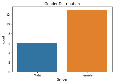
Once your data is cleaned, you can use Seaborn and Matplotlib to create beautiful visualizations. Here’s how to build a simple bar chart showing the distribution of Gender in your dataset:
# Bar chart of Gender distribution:
import matplotlib.pyplot as plt
import seaborn as sns

sns.countplot(x='Gender', data=df)
plt.title('Gender Distribution')
plt.show()
import matplotlib.pyplot as plt → Imports the Matplotlib library for creating charts.import seaborn as sns → Imports Seaborn, a high-level API built on Matplotlib for statistical graphics.sns.countplot(x='Gender', data=df) → Plots a bar chart of frequency counts for the ‘Gender’ column.plt.title('Gender Distribution') → Adds a title to the chart.plt.show() → Renders and displays the final chart.
✅ Make sure your 'Gender' column is cleaned (no nulls or invalid values) before plotting. This chart is helpful for understanding class imbalance in datasets and is often used during exploratory data analysis (EDA).

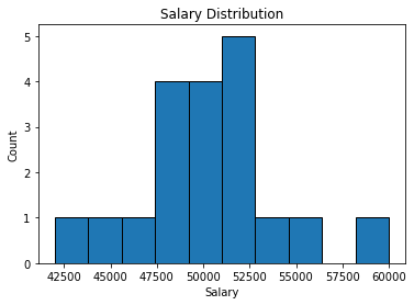
A histogram is a great tool for visualizing the distribution of numerical data. Below is a simple way to plot a salary distribution chart using Matplotlib in Python:
plt.hist(df['Salary'], bins=10, edgecolor='black')
plt.xlabel('Salary')
plt.ylabel('Count')
plt.title('Salary Distribution')
plt.show()
plt.hist(df['Salary'], bins=10, edgecolor='black') → Creates the histogram of salaries. Divides data into 10 bins with visible black edges for clarity.plt.xlabel('Salary') → Labels the x-axis as ‘Salary’.plt.ylabel('Count') → Labels the y-axis as ‘Count’, representing the frequency in each bin.plt.title('Salary Distribution') → Sets the chart title.plt.show() → Renders and displays the plot.✅ This method is commonly used during exploratory data analysis (EDA) to understand salary ranges, detect outliers, or examine data skewness.

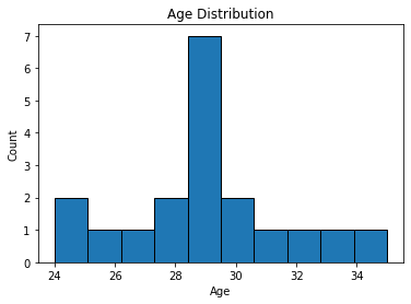
Visualizing the age distribution in your dataset is a great way to understand demographic trends. Here’s how to plot a histogram of the Age column using Matplotlib:
plt.hist(df['Age'], bins=10, edgecolor='black')
plt.xlabel('Age')
plt.ylabel('Count')
plt.title('Age Distribution')
plt.show()
plt.hist(df['Age'], bins=10, edgecolor='black') → Plots the histogram for age values with 10 bins and black borders.plt.xlabel('Age') → Labels the x-axis as “Age”.plt.ylabel('Count') → Labels the y-axis to show how many entries fall into each age range.plt.title('Age Distribution') → Adds the chart title.plt.show() → Displays the plot.✅ This histogram helps you quickly identify which age groups are most represented in your dataset — an essential step during exploratory data analysis (EDA).

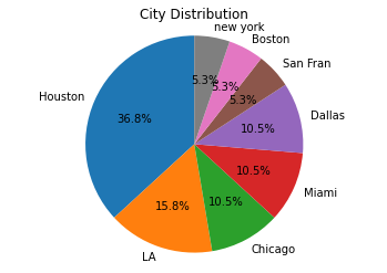
Pie charts are a great way to visualize categorical data like the distribution of users across different cities. Below is an example of how to plot a City Distribution Pie Chart using Matplotlib and Pandas:
city_counts = df['City'].value_counts()
plt.pie(city_counts, labels=city_counts.index, autopct='%1.1f%%', startangle=90)
plt.title('City Distribution')
plt.axis('equal')
plt.show()
df['City'].value_counts() → Counts occurrences of each city.plt.pie(...) → Plots the pie chart using these counts.labels=city_counts.index → Uses city names as labels for each slice.autopct='%1.1f%%' → Shows percentage values on each slice with 1 decimal point.startangle=90 → Rotates the start of the first slice to 12 o’clock for aesthetic balance.plt.axis('equal') → Ensures a perfect circle pie chart.plt.show() → Displays the final visualization.✅ This pie chart is especially useful for quickly identifying the city with the highest user base or customer concentration in your dataset — perfect for dashboards and reports.

Both terms are often used interchangeably. However, data cleaning usually refers to removing or correcting inaccurate records, while data cleansing can include more holistic processes like standardization and enrichment of data.
Popular Python libraries for data cleaning include Pandas (handling missing data, filtering), NumPy (handling numerical arrays), and OpenRefine (for data standardization).
You can use Pandas to identify missing values, fill them using fillna(), remove duplicates using drop_duplicates(), and standardize text with str.lower(), etc. This tutorial covers all such techniques in detail.
autopct='%1.1f%%' in pie charts?This argument in Matplotlib’s plt.pie() displays percentage values on each slice. '%1.1f%%' shows percentages with one decimal place (e.g., 25.0%).
Matplotlib is a low-level plotting library that gives you full control over visualizations. Seaborn is built on top of Matplotlib and provides a high-level API for more attractive and statistical plots with less code.
Use plt.plot(), plt.bar(), plt.hist() in Matplotlib. In Seaborn, use sns.countplot(), sns.boxplot(), or sns.heatmap() for powerful statistical plots.
Use Seaborn for quick and beautiful plots. Use Matplotlib when you need complete control and customization. Often, they are used together in data science projects.
