Table of Contents
Toggle| Duration | Average_Pulse | Max_Pulse | Calorie_Burnage | Hours_Work | Hours_Sleep |
|---|---|---|---|---|---|
| 30 | 80 | 120 | 240 | 10 | 7 |
| 30 | 85 | 120 | 250 | 10 | 7 |
| 45 | 90 | 130 | 260 | 8 | 7 |
| 45 | 95 | 130 | 270 | 8 | 7 |
| 45 | 100 | 140 | 280 | 0 | 7 |
| 60 | 105 | 140 | 290 | 7 | 8 |
| 60 | 110 | 145 | 300 | 7 | 8 |
| 60 | 115 | 145 | 310 | 8 | 8 |
| 75 | 120 | 150 | 320 | 0 | 8 |
| 75 | 125 | 150 | 330 | 8 | 8 |
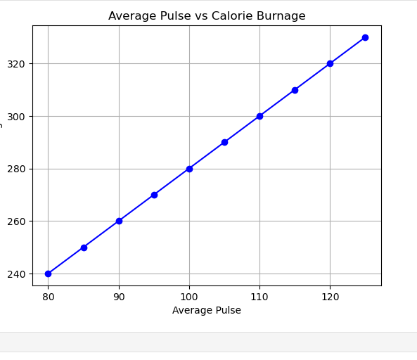
The graph below shows the relationship between Average Pulse and Calorie Burnage. As the Average Pulse increases, Calorie Burnage tends to increase as well. This suggests a linear relationship between the two variables.
In this section, we will explore the relationship between Average Pulse and Calorie Burnage. As Average Pulse increases, Calorie Burnage increases proportionally. This shows a linear relationship that can be represented visually with a graph.
As the Average Pulse increases by 10 beats per minute, the Calorie Burnage increases by 20 calories.
In the above graph, the data points represent the relationship between Average Pulse (x-axis) and Calorie Burnage (y-axis). As Average Pulse increases from 80 to 125, the Calorie Burnage also increases. The pattern suggests that for every 10 increase in Average Pulse, the Calorie Burnage increases by approximately 20 calories.
For example:
