Table of Contents
ToggleCorrelation Matrix
A matrix is an array of numbers arranged in rows and columns. In statistics, a correlation matrix is simply a table that shows the correlation coefficients between multiple variables. It helps us understand how different variables are related to each other.
In a correlation matrix, the variables are listed in both the first row and first column. Each cell of the matrix represents the correlation coefficient between the corresponding variables from the rows and columns. The values in the table range from -1 to 1, where:
Let’s look at a correlation matrix created using data from the full health data set. Here are some observations from the matrix:
At this point, we might wonder: does this mean Average_Pulse does not affect Calorie_Burnage? Not necessarily. We will revisit this question later, but the lack of a strong linear correlation doesn’t mean there’s no relationship at all!
We can easily create a correlation matrix in Python using the corr() function. Additionally, we can use the round() function to limit the output to two decimal places for easier readability.
import pandas as pd

# Load the full health data set
full_health_data = pd.read_csv("data.csv")

# Create the correlation matrix and round the results
Corr_Matrix = round(full_health_data.corr(), 2)

# Print the correlation matrix
print(Corr_Matrix)
When you run the code, it will produce a correlation matrix, showing how all the variables in your data set are correlated with each other. Here’s an example of what the matrix might look like:
| Variable | Duration | Average_Pulse | Max_Pulse | Calorie_Burnage | Hours_Work | Hours_Sleep |
|---|---|---|---|---|---|---|
| Duration | 1.00 | 0.25 | 0.30 | 0.89 | 0.12 | 0.05 |
| Average_Pulse | 0.25 | 1.00 | 0.60 | 0.02 | -0.15 | 0.08 |
| Max_Pulse | 0.30 | 0.60 | 1.00 | 0.10 | 0.05 | 0.01 |
| Calorie_Burnage | 0.89 | 0.02 | 0.10 | 1.00 | 0.16 | 0.03 |
| Hours_Work | 0.12 | -0.15 | 0.05 | 0.16 | 1.00 | 0.11 |
| Hours_Sleep | 0.05 | 0.08 | 0.01 | 0.03 | 0.11 | 1.00 |
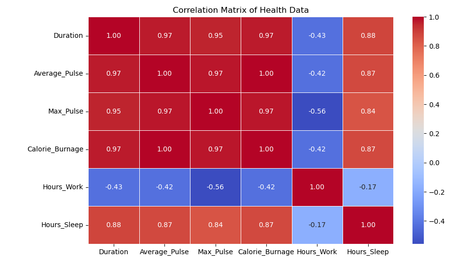
To better understand the relationships between variables, we can visualize the correlation matrix using a heatmap. This heatmap helps to quickly identify the strength of correlations between variables.
import seaborn as sns
import matplotlib.pyplot as plt

# Plot a heatmap of the correlation matrix
sns.heatmap(Corr_Matrix, annot=True, cmap="coolwarm", linewidths=0.5)

# Show the plot
plt.show()
The code above will generate a heatmap with annotated values that represent the correlation coefficients. The colors will help you quickly identify which variables are strongly correlated and which ones are not.
A correlation matrix is a powerful tool in data science that allows us to examine the relationships between multiple variables at once. It helps to identify patterns, uncover hidden relationships, and guide feature selection for predictive models. By using Python, we can easily compute and visualize the correlation matrix, helping to make data analysis more intuitive and efficient.